***
## description: Horizontal Bar Chart
# Bar
Horizontal Bar charts display values for multiple dimensions, with two measures displayed as the width and color of the bar for each dimension group.
Bar charts are useful for showing relative values based on categories of information, particularly when the category label is long.
You can convert Bar charts to the New Combo chart format. For more information, see [New Combo charts](/immerse/immerse-chart-types/new-combo#duplicating-and-upgrading-other-chart-types-to-new-combo-charts).
### Sort By
You can sort by any chosen dimension or measure in ascending or descending order.
### # Of Groups
Display up to 100 groups of records. You can enter a value or use the slider to visually set the number of groups.
### Null Dimensions
Choose whether to show or hide Null values for your chosen dimension.
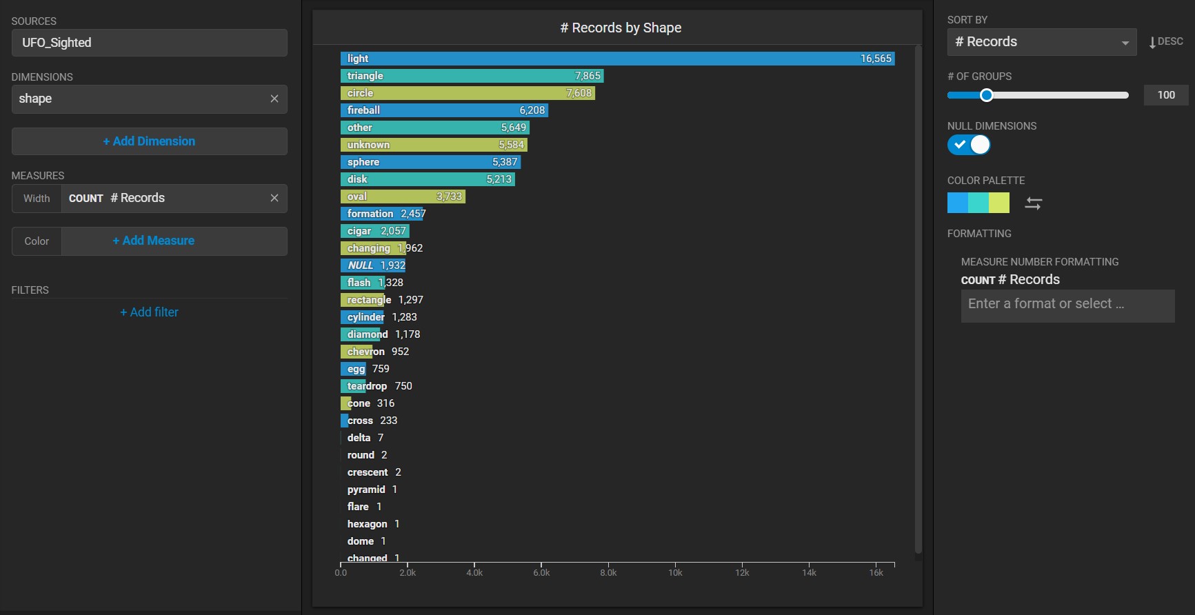
### Color Palette
You can use a custom palette to visually group values in your chart. By default, data points are colored arbitrarily with the same solid color. You can change the color for all columns, or apply colors to individual Dimension values.
If you set the **Color** measure, you can choose a gradient to visually express relative quantitative values.
### Custom Measure Formatting
You can also use custom measure formats for the values in your chart. See [Customizing Measure and Date Formats](/immerse/measures-and-dimensions#customize-formats).
## Bar Chart Examples
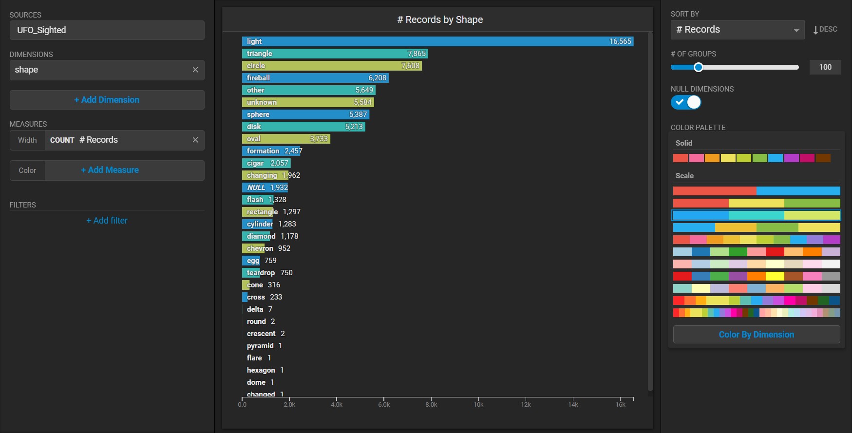
Create a new Bar chart. Choose a **Data Source**. This example uses the official database of [UFO sightings](https://github.com/planetsig/ufo-reports/tree/master/csv-data)
Bar charts require a minimum of one dimension and one measure. For example, this chart categorizes on the **Dimension** of shape and uses the count of each *shape* as the **Measure**.
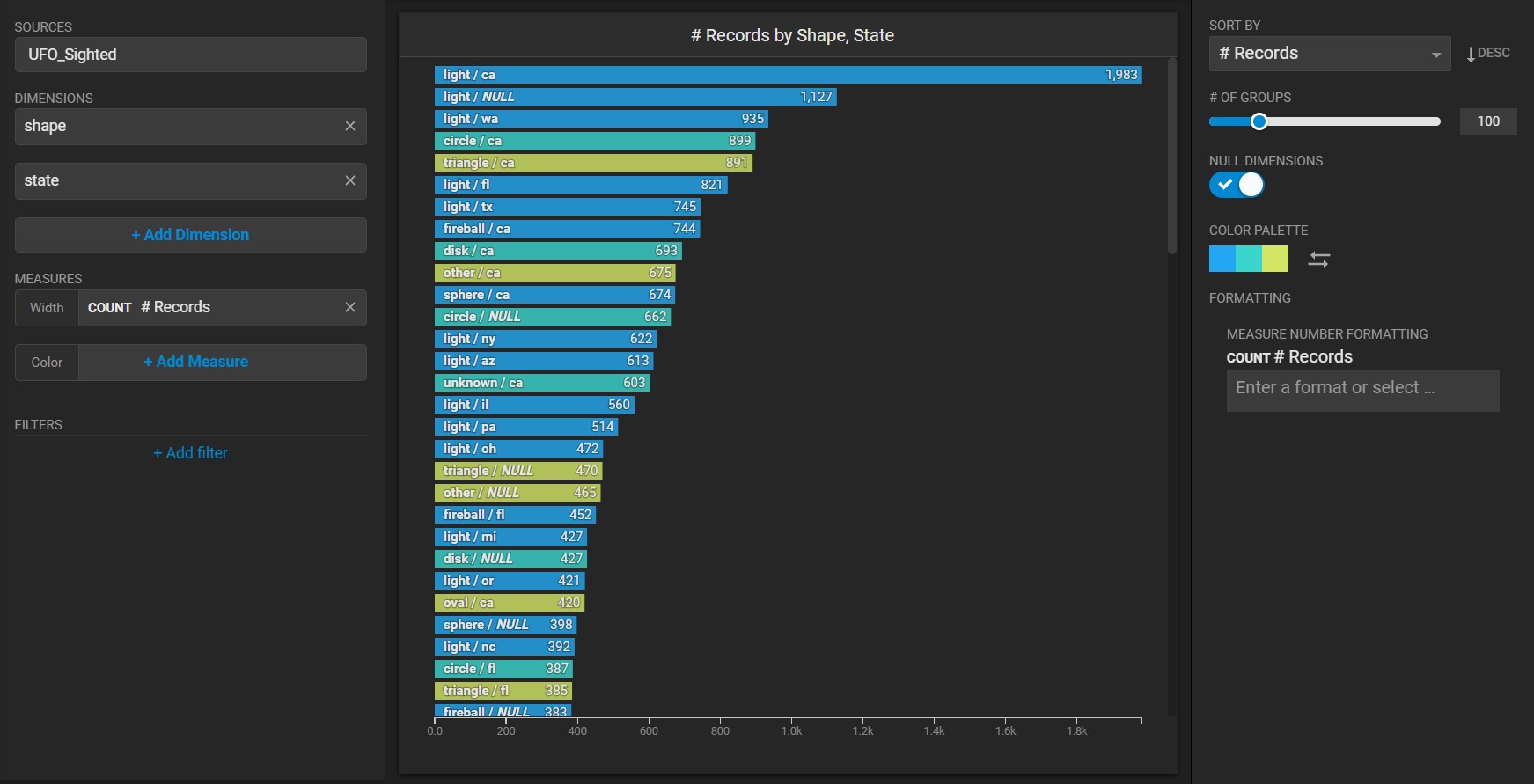
You can add any number of dimensions to your Bar chart. For example, you can combine the *shape* with the *state* where they were seen.
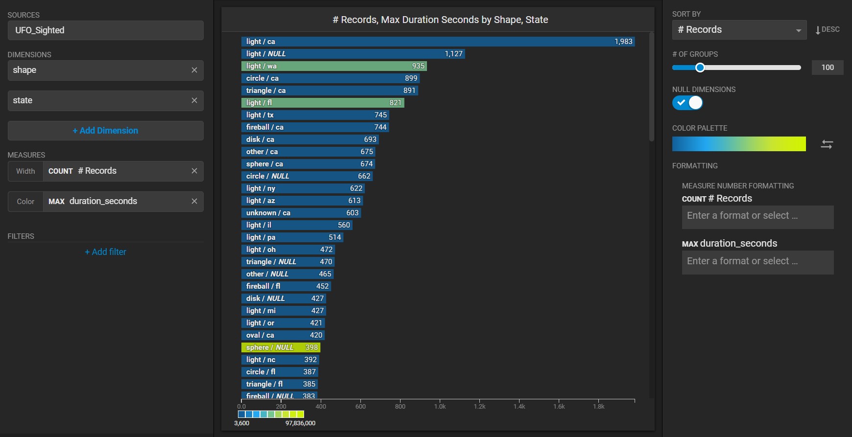
When you use two measures, the first measure (*shape*) is indicated by the width of the bar, while the second measure (*Duration\_Seconds*) is indicated by the color of the bar. Reversing the **Color Palette** makes the labels easier to read, in this example.
You can use a custom palette to color by dimension and visually group values in your bar chart. For example, this chart assigns colors to similar shapes (for example, rounded shapes such as *disk*, *circle*, *sphere*, and *oval* are all colored orange).