# Pointmap
To learn more about pointmap charts and how to create one, please view this [video](https://youtu.be/0hR7UXh1m_8?si=C1nCqF9zpW6w4rLx).
The Pointmap plots geographic latitude/longitude data to visualize the location of data on a map.
| Features | Quantity | Notes |
| ------------------------------------------------------------------ | -------- | --------------------------------------------------------------------------------------------------------------------------------------------------------------------------------------------- |
| Required [Dimensions](/immerse/measures-and-dimensions#dimensions) | 0 | Dimensions are optional. |
| Required [Measures](/immerse/measures-and-dimensions#measures) | 0-5 | Longitude and latitude (or POINT defined by longitude and latitude) are required. Point size, color, and angle are optional. OmniSci stores POINT data as longitude first, and then latitude. |
The Pointmap, by default, presents each record as an individual point on the map.
## Size Domain
**Size Domain** sets the minimum and maximum bounds for the size measure. The size domain does not exclude values outside of those bounds from the dataset. The minimum value sets the smallest point size: any values lower than the minimum value uses the same point size. Maximum value sets the size of the largest point. For example, if you set the maximum **Size Domain** to 5,000, any value 5,000 or greater is shown the same size.
The practical effect of Size Domain is to reduce the impact of outliers and create a more informative map for the most meaningful range of values.
## Size Range
**Size Range** represents sizes of the smallest and largest points on the map, measured in pixels. Points can range in size from 1 to 20 pixels. Note that if you set very large pixel values for the top of the range (for example, 20), the largest points might cover smaller points beneath them. Setting the size range is a balance between making it easy to spot large values while still displaying all significant information.
When **POINT AUTOSIZE** is turned on, when you zoom in to focus on an area of the map, the points become smaller, and can be difficult to see. If you turn off **POINT AUTOSIZE** and manually increase the **POINT SIZE** setting, you can enhance the visibility of the points on your map.
## Mark Shape
**Mark Shape** lets you choose from a variety of shapes to use as data point markers in your Pointmap. Choosing the correct shape can make data values stand out more clearly, and help to differentiate values on layered charts.
## Density Gradient
Use **Density Gradient** to toggle density accumulation on and off. Density accumulation performs a count aggregation by pixel and allows you to color a pixel by normalizing the count and applying a color to it. For more information about density accumulation, see Density Mode in [Example: Vega Accumulator](/apis-and-interfaces/vega/vega-tutorials/tutorial-vega-accumulator).
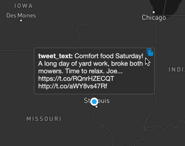
## Chart Popup Information
When you hover over a Pointmap chart, a popup box appears that contains the column information for the highlighted area. You can copy this information to the clipboard. If the column information includes a URL, you can click the URL to open it in a browser.
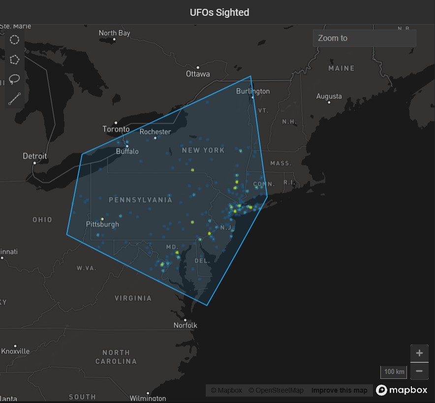
## Pointmap Example
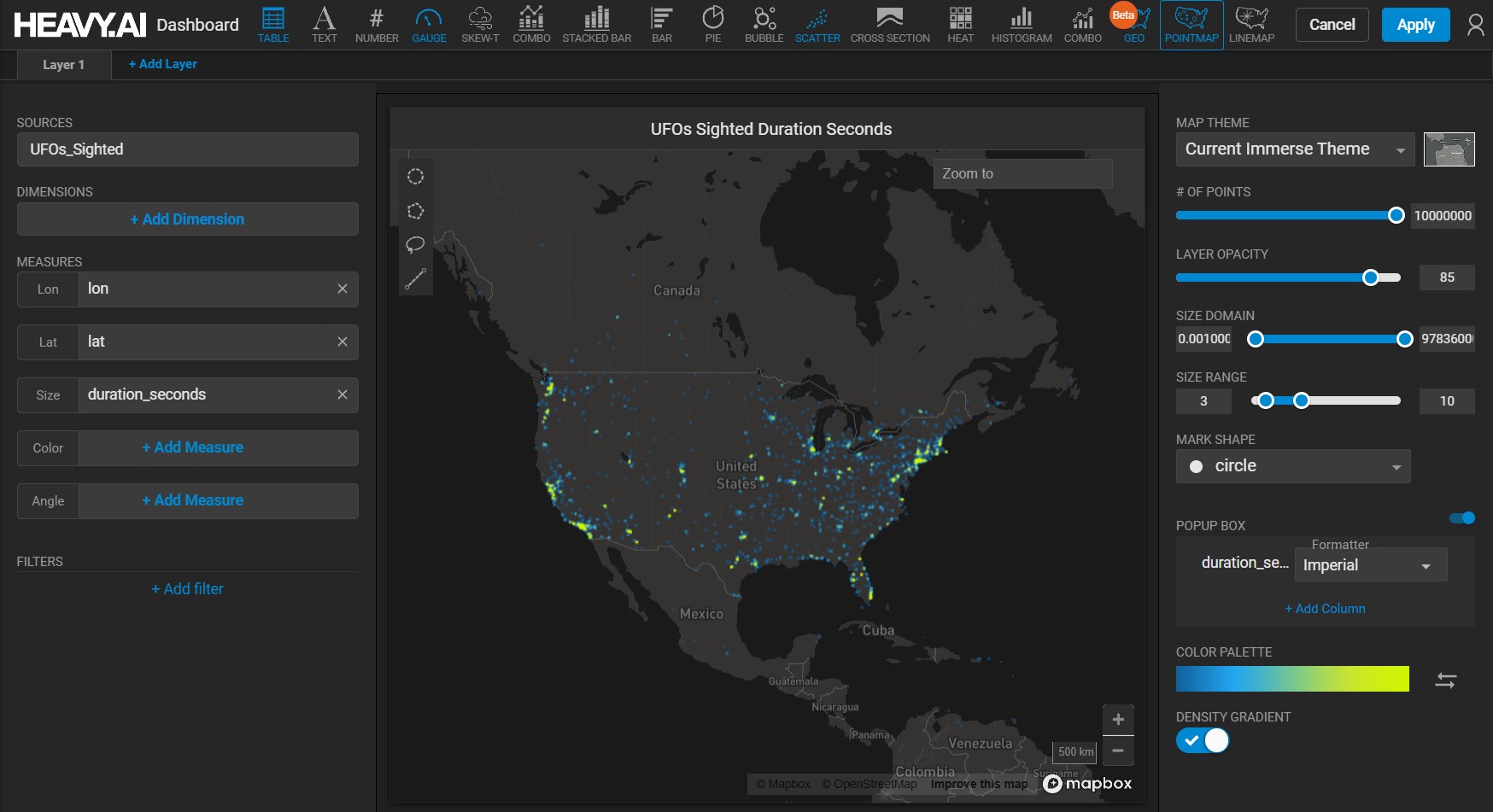
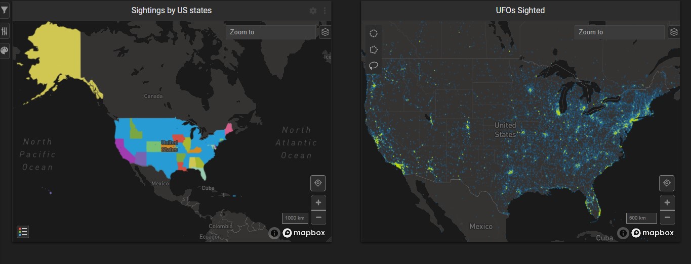
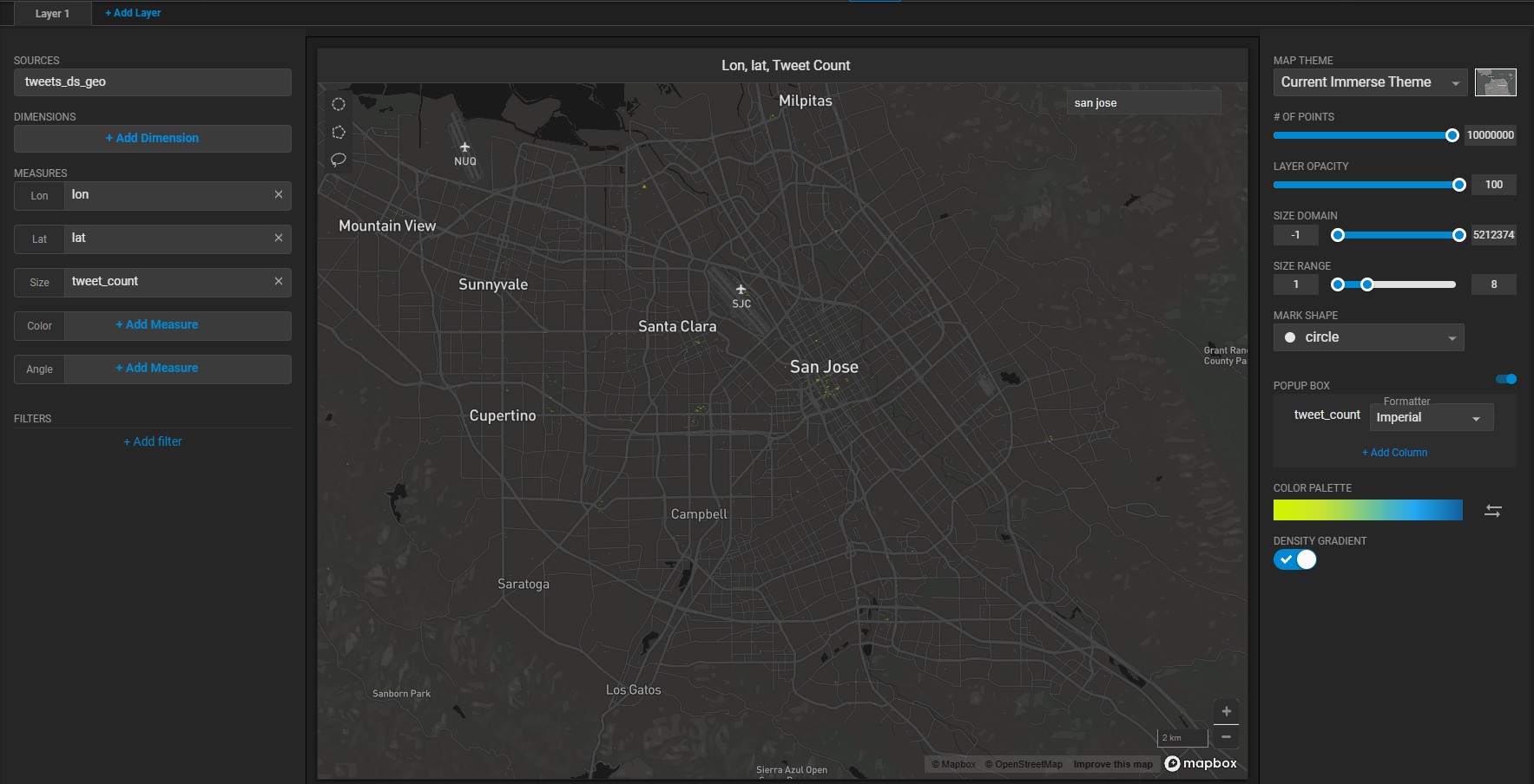
Create a new Pointmap. For the **Data Source**, use the official database of [UFO sightings](https://github.com/planetsig/ufo-reports/tree/master/csv-data).
Set the **Lon** measure to *longitude* and **Lat** measure to *latitude*. Set the **Size** measure to *duration\_seconds*.
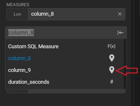
You can also use POINT data (generated from longitude/latitude) for **LON** and **LAT**; for example, **column\_9** contains point data:
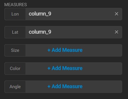
When you select data of type POINT, **Lon** and **Lat** are both populated with the values for the point data:
Keep the defaults for **THEME**, **# OF POINTS**, **SIZE DOMAIN**, **SIZE RANGE**, and **MARK SHAPE** . Change the **LAYER OPACITY** to 75, and under **POPUP BOX**, click **+ ADD COLUMN** and choose **shape**. Then, click **Apply**.
On the dashboard, you can compare the Pointmap, which can display detailed information for each sighting, versus a Choropleth, which displays only aggregate values (for example, total sightings) for a geographic region (for example, a state).
## Multilayer Geospatial Maps
Pointmap and Geo Heatmap charts can be layered on top of one another to allow visual comparison of datasets. See [Creating Multi-layer Geospatial Charts](/immerse/multilayer-charts).
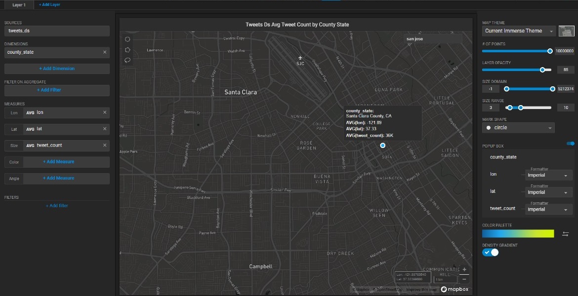
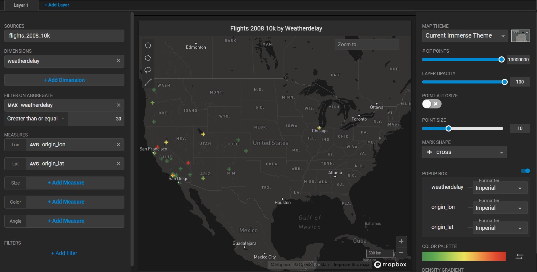
## Using Dimensions to Aggregate Results
Instead of plotting every individual point in a dataset, you can aggregate your results using a dimension setting.
For example, the Pointmap chart below shows the location of hundreds of tweets in Santa Clara County, California.
When you add the dimension *county\_state*, the map displays a single point representing the average of all the points in Santa Clara County and the total number of “tweets”. When you hover over the point, a pop-up box shows the average longitude and latitude, with a summary of the results. In the POPUP BOX section on the right side, you can adjust the popup box contents to change the formatting, and you can change the order that the measures appear by dragging them to the desired location in the measures list.
You can also filter the results of your aggregation. When you add a **Dimension** to your chart, the **Filter On Aggregate** field displays. Choose a field on which to filter your data (or create a custom dimension), then add the filter criteria. Only the records that meet your criteria are plotted on the chart.
For example, this Pointmap shows the origin points of flights that experienced a weather delay.
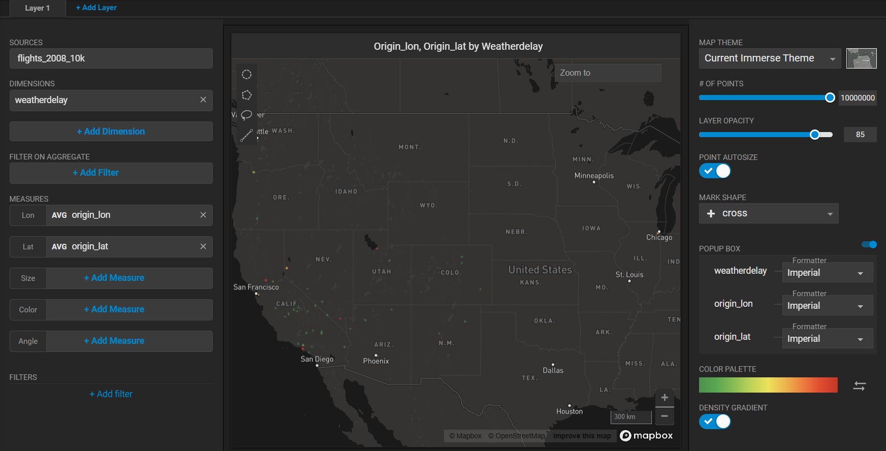
If you are not concerned with trivial delays, you can filter the aggregated results to show only the delays greater than 30 minutes.
## Zoom and Select
Pointmap charts have additional features for zooming in and selecting details.
You can zoom in and out of a Pointmap chart in the following ways:
* Using the mouse scrolling wheel.
* Selecting an area by holding down the Shift key and using the mouse to select the zoom area.
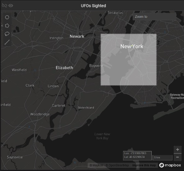
* Using the Zoom To box in the upper right of the map.
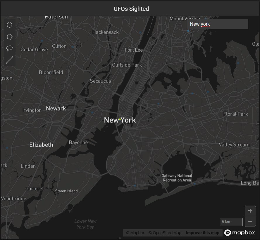
You can type the name of a geographic location (address, city, state, or country) and optional zoom level. For example, **Denver, CO, !8** zooms to Denver, Colorado, with a zoom level of 8.
You can also enter latitude and longitude coordinates, and optional zoom level. For example, **39.26911, -76.54068, !9** takes you to Baltimore, MD, at zoom level 9.
### Select
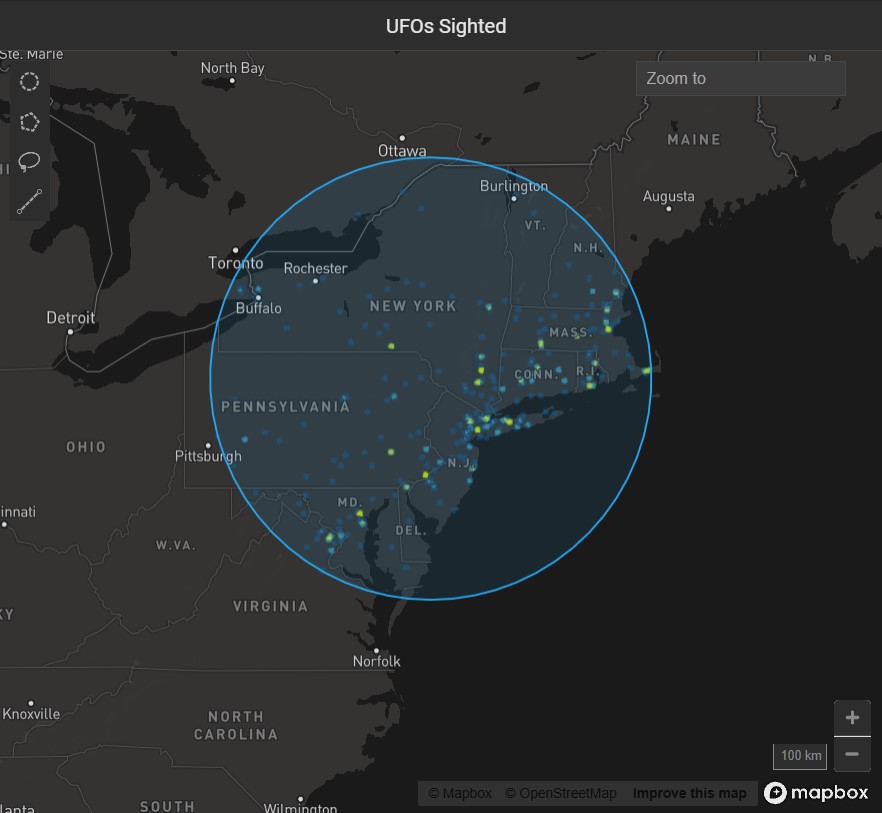
You can select geographic regions based on proximity or defined boundaries using the Circle, Polygon, and Lasso selection tools.
!\[]\(../../../../../assets/SS\_96 (1).jpg)
#### **Circle Selector**
Use the Circle tool to select an area around a specific central point. Click the Circle tool icon, then click anywhere on the map to create a circular selection.
To move the circle, click anywhere inside the selected area to select the circle. Drag the circle to the new location.
To resize the circle, click anywhere inside the selected area, then drag any of the white squares to scale the circle up or down.
Due to the distortion inherent in Mercator map projections, the circumference of the selection is reduced as you get closer to the equator, and increased as you approach the poles. In the example below, all of the areas are the same number of meters in diameter, with the size of the selection circle adjusted to allow for Mercator distortion.
#### **Polygon Selector**
Use the Polygon tool to select an area with noncomplex angles. Click to set each point. As you draw the selection, you can hold the Shift key to contrain each line to 45° angle increments relative to the previous line.
To complete the selection, do one of the following:
* Double-click
* Click the starting point a second time
* Press Enter
To change the size of the selection, click anywhere in the selected region. Drag any of the white corner dots to resize the selection. Hold the Shift key to constrain the relative proportions of the selection. Hold the Alt key to scale the selection from the center.
To rotate the selection, mouse hover over any corner to display a curved arrow. Click and drag to rotate. Hold the Shift key to rotate in 45° increments.
To edit the endpoints in the selection, double-click anywhere in the region. Drag the white endpoints to new locations. To add an endpoint, click one of the small orange dots in the middle of a line segment; it becomes a new endpoint that you can drag to your desired position. To delete an endpoint, hold the Alt key and click the endpoint.
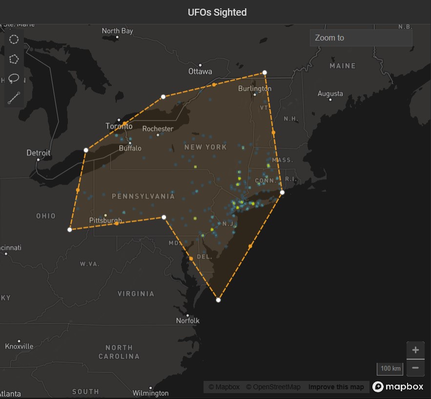
Note that if you create a selection where lines intersect the behavior is undefined and has unpredictable results.
#### **Lasso Selector**
Use the Lasso tool to trace around an area with curves or complex angles. Click to start, drag to draw the outline of your desired area, then release the mouse at any time to complete the selection with a straight line.
Once you have created your selection, the selection points are simplified, and the selection becomes effectively the same as a selection made with the Polygon tool.