Flow Analysis
Create a flow analysis to sample data from TCP and UDP flows in your environment and to review latency and buffer utilization statistics across network paths.
Flow analysis is supported on NVIDIA Spectrum-2 switches and above. It requires a switch fabric running Cumulus Linux version 5.0 or above. You must enable Lifecycle Management (LCM) to use the flow analysis. If LCM is disabled, you will not see the flow analysis icon in the UI. LCM is enabled for on-premises deployments by default and disabled for cloud deployments by default. Contact your local NVIDIA sales representative or submit a support ticket to activate LCM on cloud deployments.
Create a New Flow Analysis
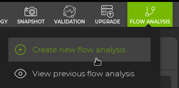
To start a new flow analysis, click the Flow analysis icon and select Create new flow analysis.
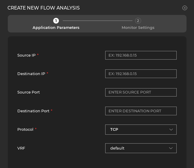
In the dialog, enter the application parameters, including the source IP address, destination IP address, source port, and destination port of the flow you wish to analyze. Select the protocol and VRF for the flow from the dropdown menus.
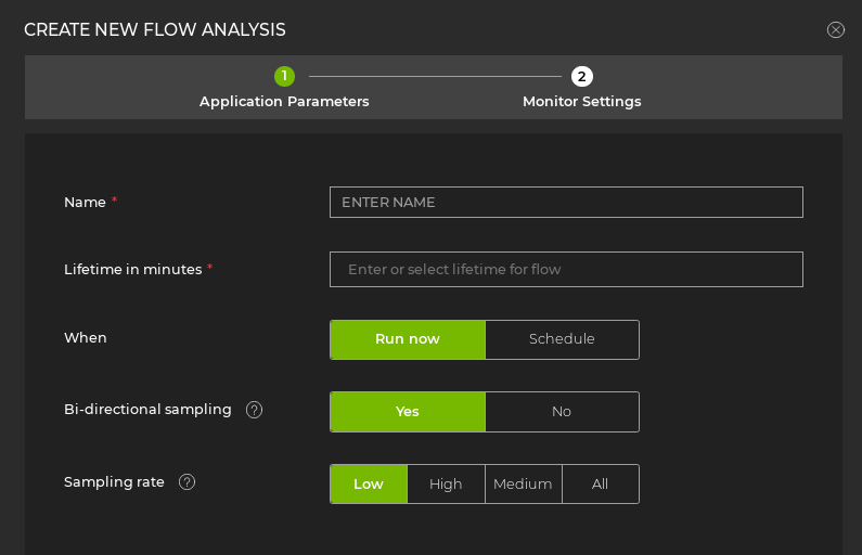
After you enter the application parameters, enter the monitor settings, including the sampling rate and time parameters.
If you attempt to run a flow analysis that includes switches assigned a default, unmodified access profile, the process will fail. Create a unique access profile (or update the default profile with unique credentials), then assign the profile to the switches you want to include in the flow analysis.
Running a flow analysis will affect switch CPU performance. For high-volume flows, set a lower sampling rate to limit switch CPU impact.
View Flow Analysis Data
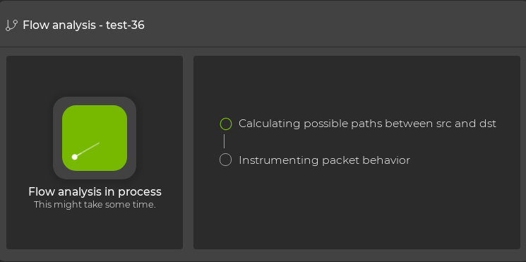
After starting the flow analysis, a flow analysis card will appear on the NetQ Workbench.
View a previous flow analysis by selecting Flow analysis and View previous flow analysis.
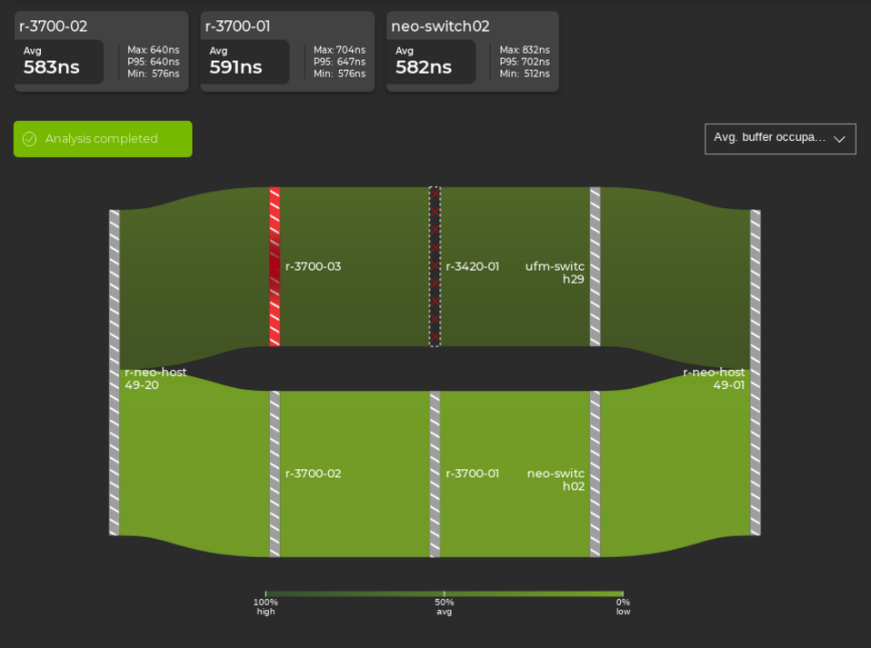
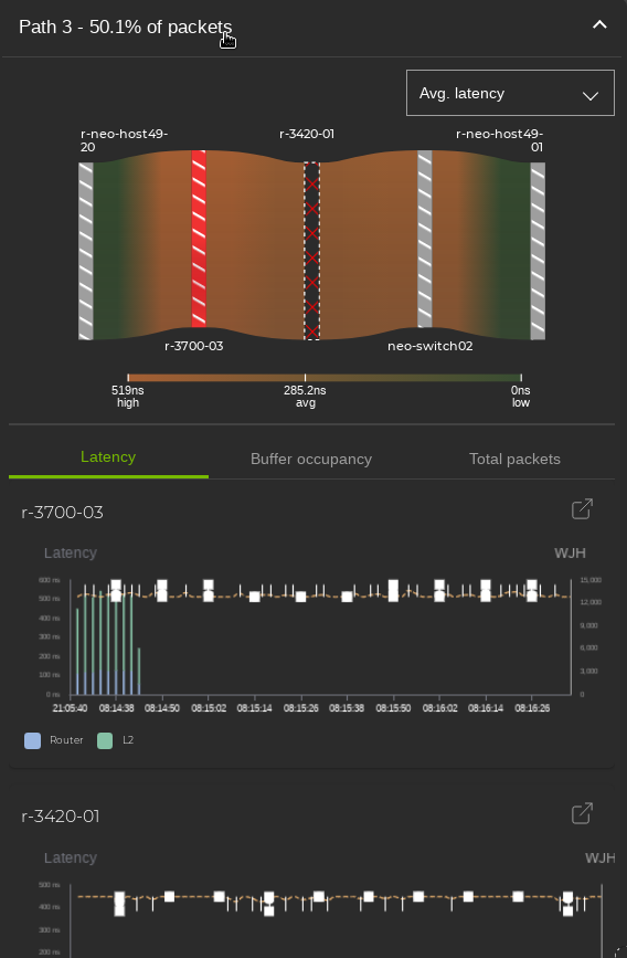
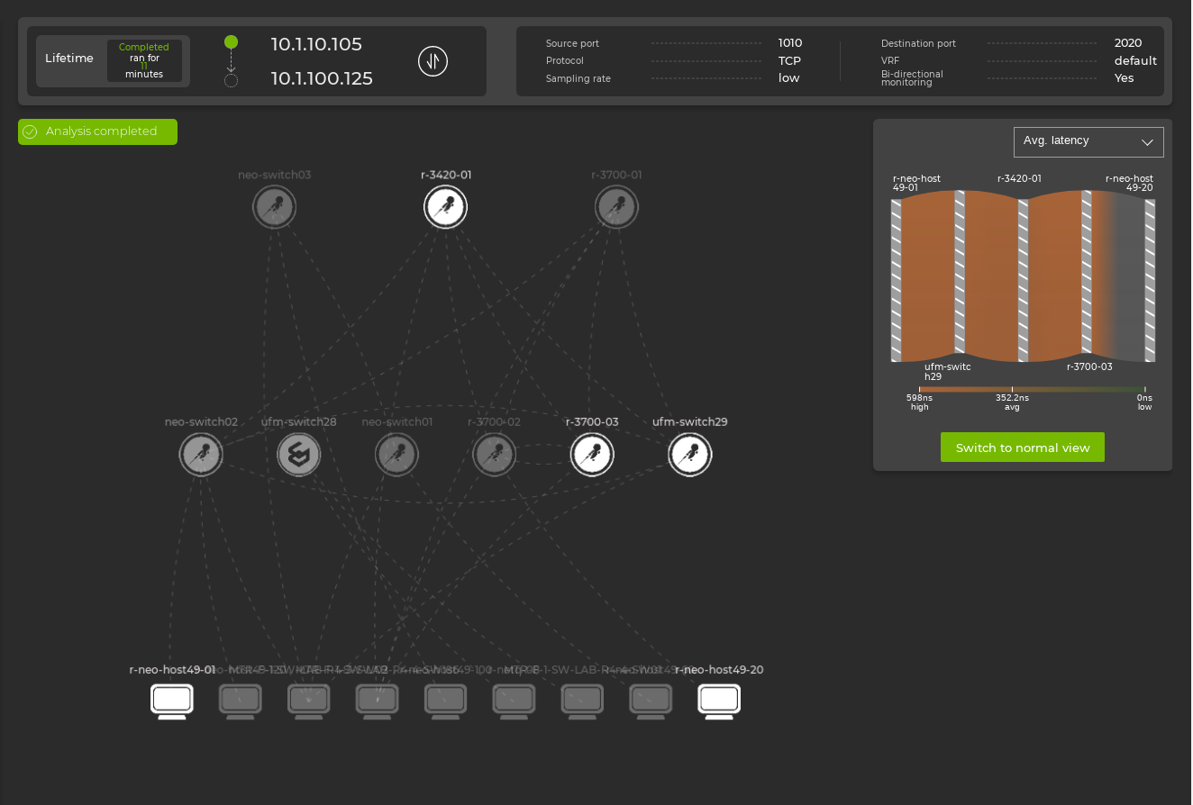
Select View details next to the name of the flow analysis to display the analysis dashboard. You can use this dashboard to view latency and buffer statistics for the monitored flow. If bi-directional monitoring was enabled, you can view the reverse direction of the flow by selecting the ![]() icon. The following example shows flow data across a single path:
icon. The following example shows flow data across a single path:
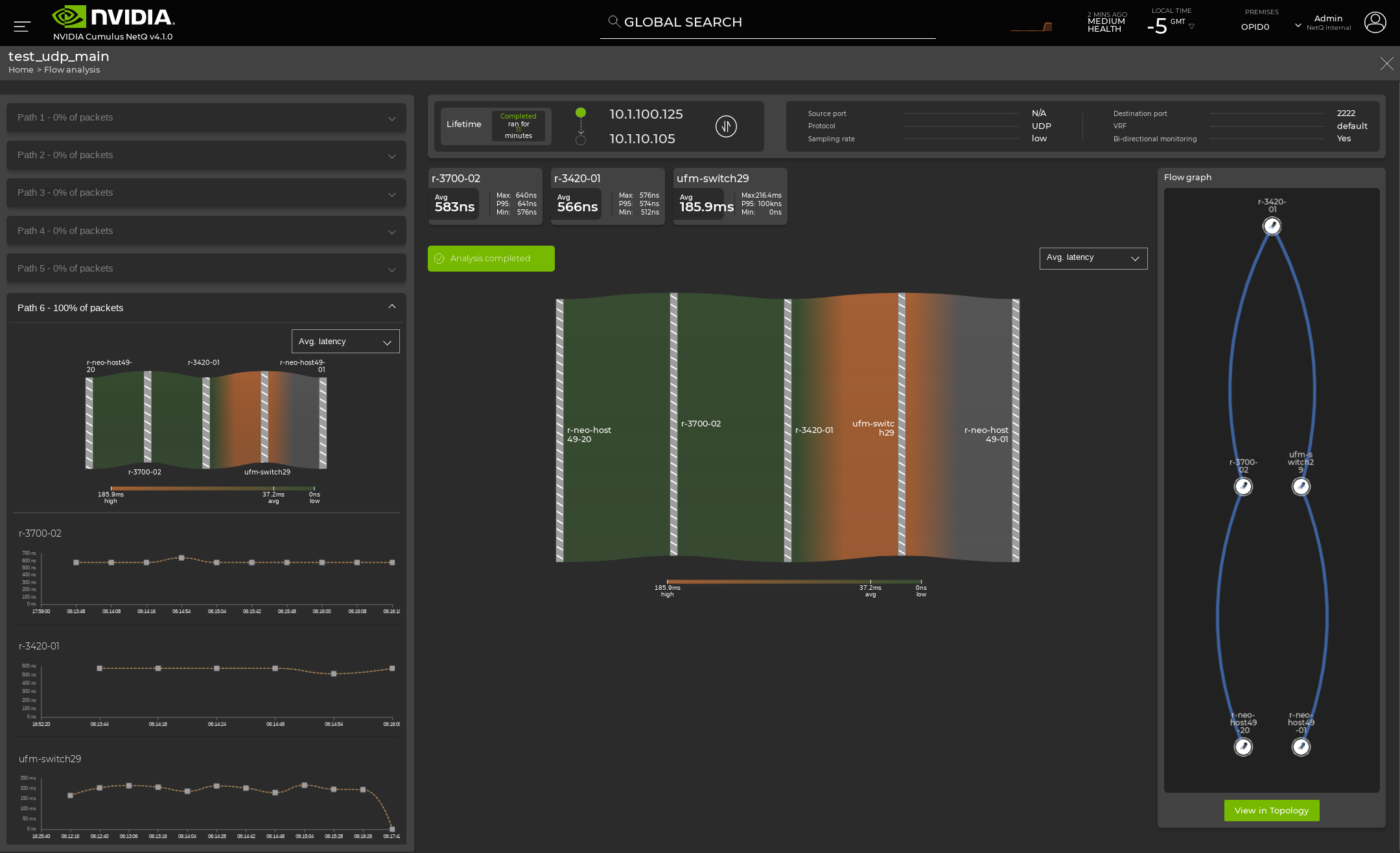
The dashboard header shows the monitored flow settings:

| Flow Settings | Description |
|---|---|
| Lifetime | The lifetime of the flow analysis. This example completed in 11 minutes. |
| Source IP | The source IP address of the flow. In this example it is 10.1.100.125. |
| Destination IP | The destination IP address of the flow. In this example it is 10.1.10.105. |
| Source Port | The source port of the flow. In this example it displays N/A because it was not set. |
| Destination Port | The destination port of the flow. In this example it is 2222. |
| Protocol | The protocol of the monitored flow. In this example it is UDP. |
| Sampling Rate | The sampling rate of the flow. In this example it is low. |
| VRF | The VRF the flow is present in. In this example it is the default VRF. |
| Bi-directional Monitoring | This determines if the flow is monitored in both directions between the source IP address and the destination IP address. In this example it is enabled. Click |
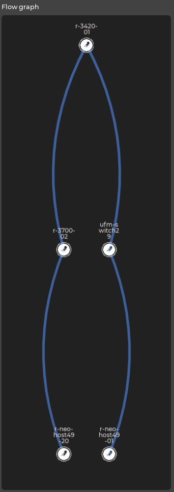
Understanding the Flow Analysis Graph
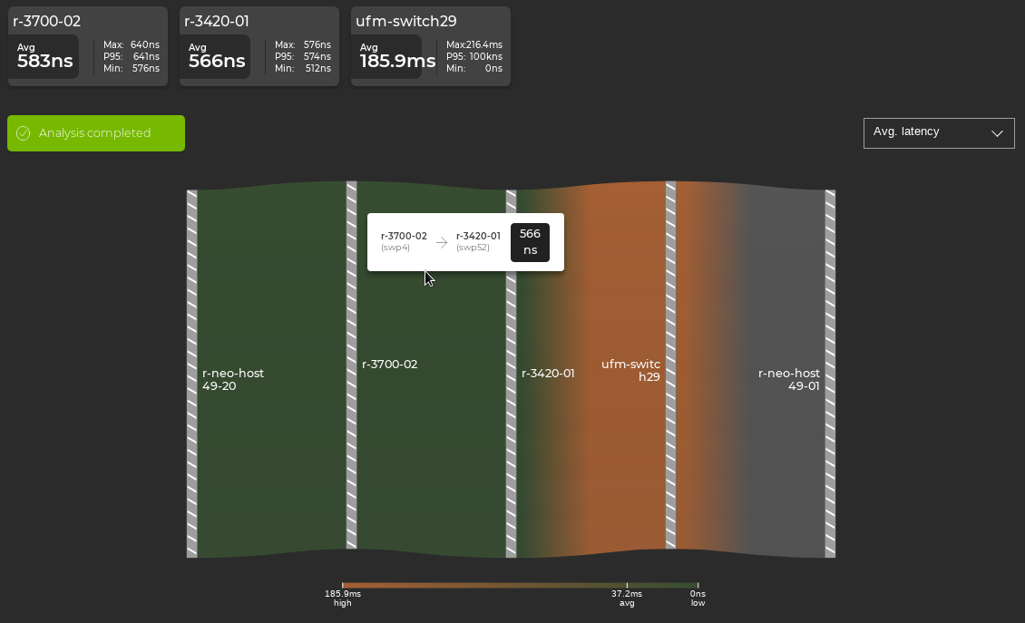
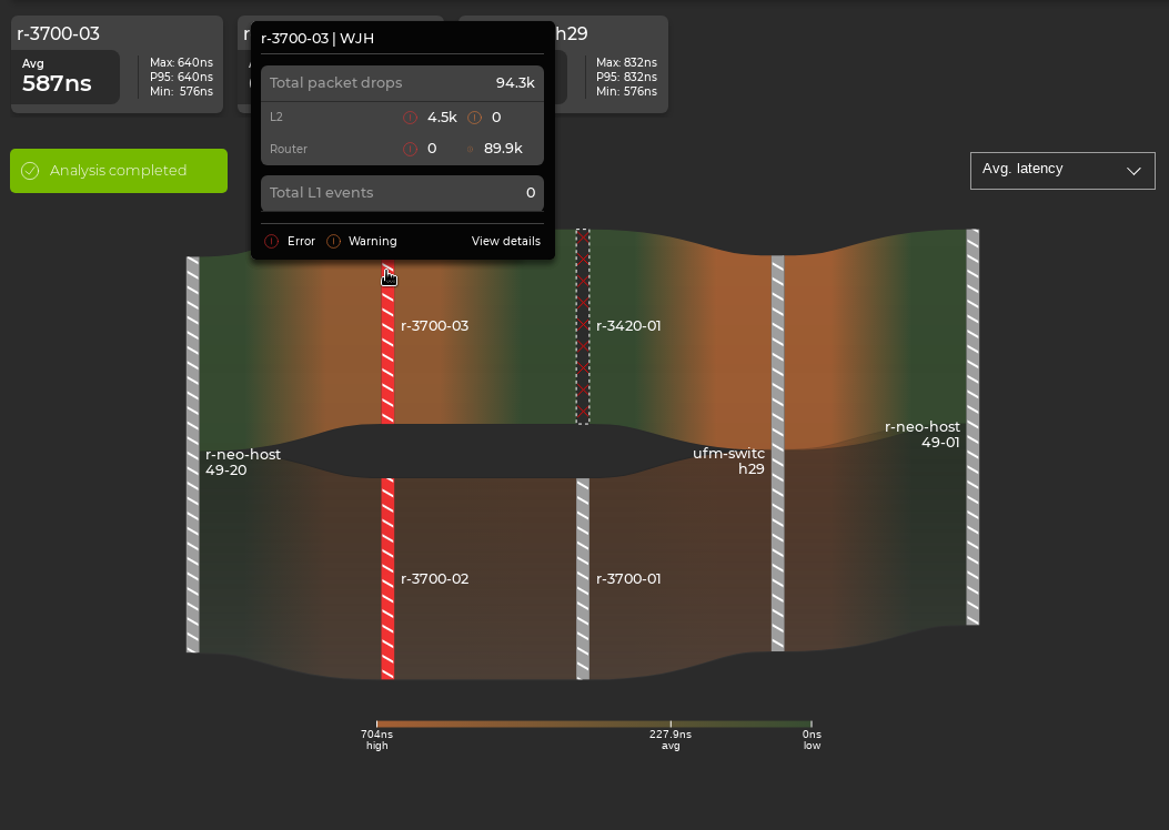
The flow analysis graph is color coded relative to the values measured across devices. Lower values are displayed in green, and higher values are displayed in orange. The color gradient is displayed below the graph along with the low and high values from the collected flow data. Each hop in the path is represented in the graph with a vertical, gray-striped line labeled by hostname. The following example shows a single path:
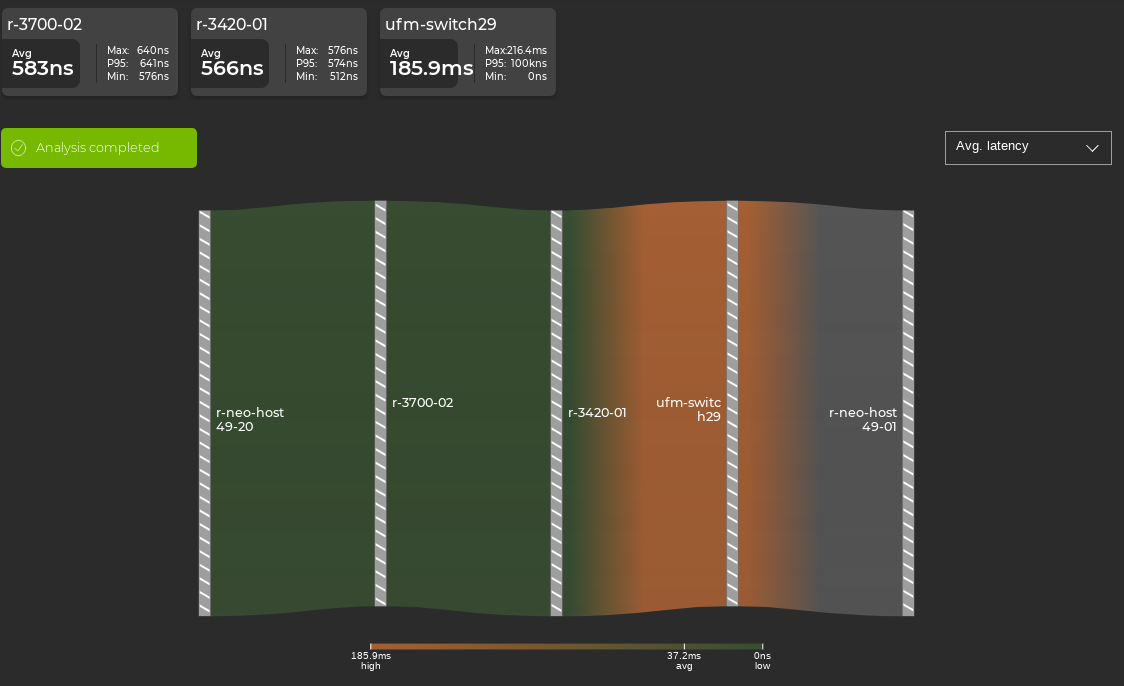
The flow graph panel on the right side of the dashboard displays the devices along the selected path.
View Flow Latency
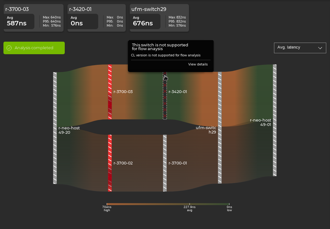
The latency measured by the flow analysis is the total transit time of the sampled packets through individual devices. A summary of measured latency for each device is displayed above the main flow analysis graph.
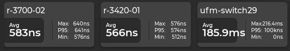
The average latency for packets in the flow is displayed under the hostname of each device, along with the minimum and maximum latencies observed during the analysis lifetime. The 95th percentile (P95) latency value for sampled packets is also displayed. The P95 calculation means that 95% of the sampled packets have a latency value less than or equal to the calculation.
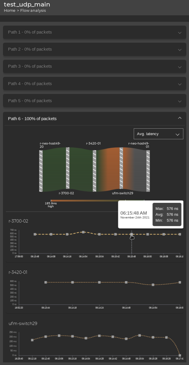
Use your cursor to hover over sections of the main analysis graph to view average latency values for each device in a path.
The left panel of the flow analysis dashboard also displays a timeline of measured latency for each device on that path. Use your cursor to hover over the plotted data points on the timeline for each device to view the latency measured at each time interval.
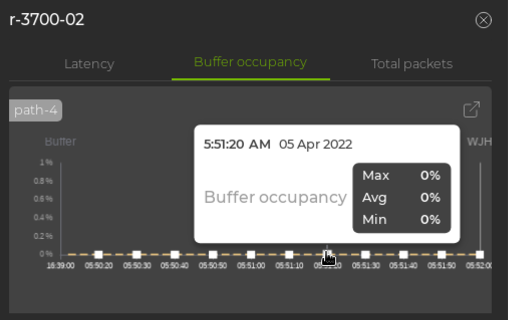
View Buffer Occupancy
The main flow analysis dashboard also displays the buffer occupancy of each device along the path. To change the graph view to display buffer occupancy for the flow, click ![]() next to Avg. flow latency and select Avg. buffer occupancy. You can view an overview graph of buffer occupancy or select each device to see the buffer occupancy for the analyzed flow:
next to Avg. flow latency and select Avg. buffer occupancy. You can view an overview graph of buffer occupancy or select each device to see the buffer occupancy for the analyzed flow:
The percentages represent the amount of buffer space on the switch that the analyzed flow occupied while the analysis was running.
View Multiple Paths
When packets matching the flow settings traverse multiple paths in the topology, the flow graph displays latency and buffer occupancy for each path:
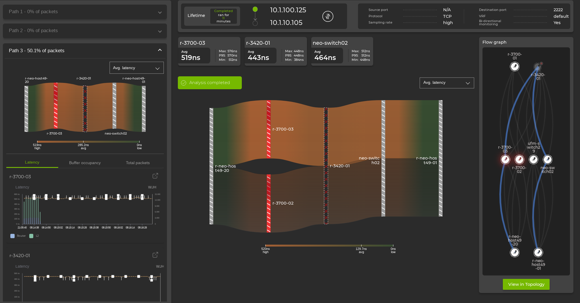
You can switch between paths by clicking on an alternate path in the Flow graph panel, or by clicking on an unselected path on the main analysis graph:
In the detail panel on the left side of the dashboard, you can select a path to view the percent of packets distributed over each path.
Partial Path Support
Some flows can still be analyzed if they traverse a network path that includes switches lacking flow analysis support. Partial-path flow analysis is supported in the following conditions:
- The unsupported device cannot be the initial ingress or terminating egress device in the path of the analyzed flow.
- If there is more than one consecutive transit device in the path that lacks flow analysis support, the path discovery will terminate at that point in the topology and some devices will not be displayed in the flow graph.
An unsupported device is represented in the flow analysis graph as a black bar lined with red x’s. Flow statistics are not displayed for that device.
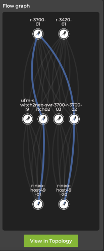
Unsupported devices are also designated in the flow graph panel:
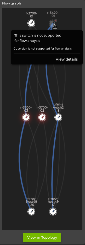
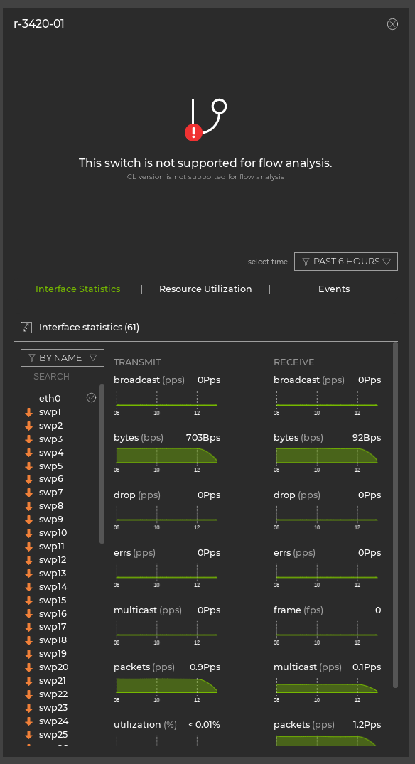
Selecting the unsupported device displays device statistics in the left panel if they are available to NetQ. Otherwise, the display will indicate why the device is not supported:
Path discovery will terminate if multiple consecutive switches do not support flow analysis. When additional data is available from switches outside of discovered paths, you can view data from those devices from the menu at the top of the page:
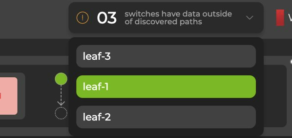
The left panel displays the data, along with ingress and egress ports.
View Device Statistics
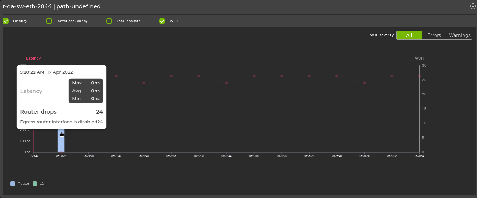
You can view latency, buffer occupancy, interface statistics, resource utilization, and WJH events for each device by clicking on a device in the Flow Graph panel, or by clicking on the line associated with a device in the main flow analysis graph. The left panel will then update to reflect statistics for the respective device.
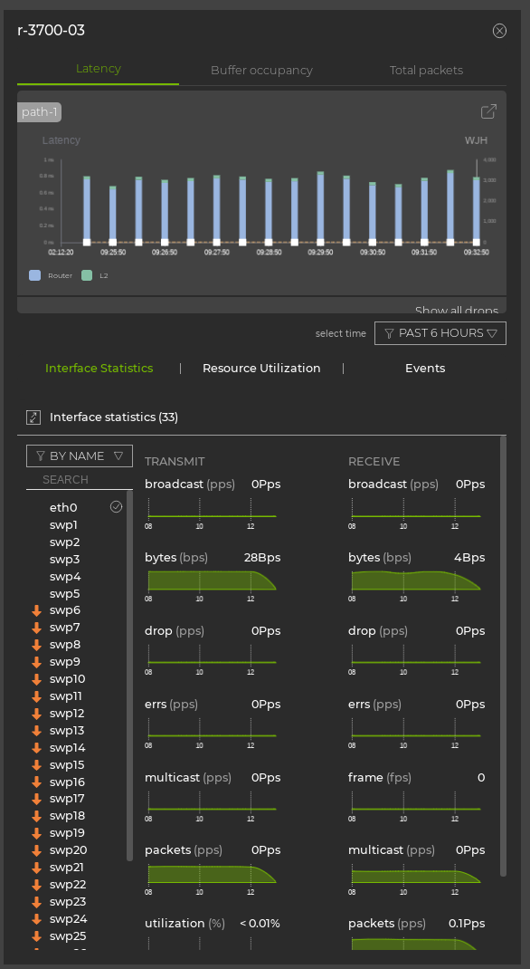
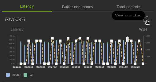
After selecting a device, click ![]() to expand the statistics chart:
to expand the statistics chart:
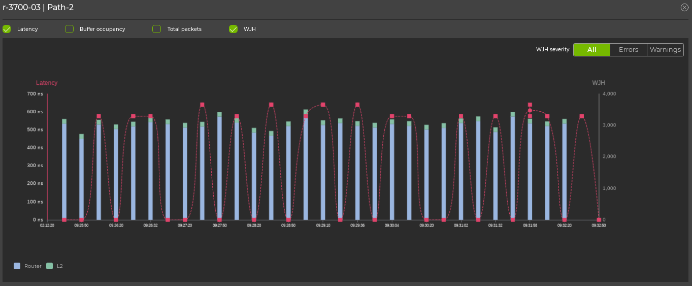
In this view, you can select additional categories to add to the chart:
The Flow Graph panel allows you to access the topology view, where you can also click the paths and devices to view statistics. Click View in topology to switch to the topology view.
View WJH Events
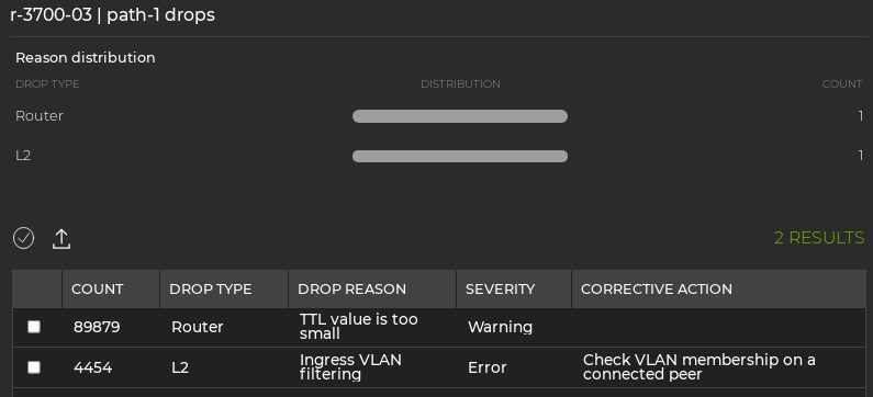
Flow analysis monitors the path for WJH events and records any drops for the flow. Switches with WJH events recorded are represented in the flow analysis graph as a red bar with white stripes. Hover over the device to see a WJH event summary:
You can also view devices with WJH events in the flow graph panel:
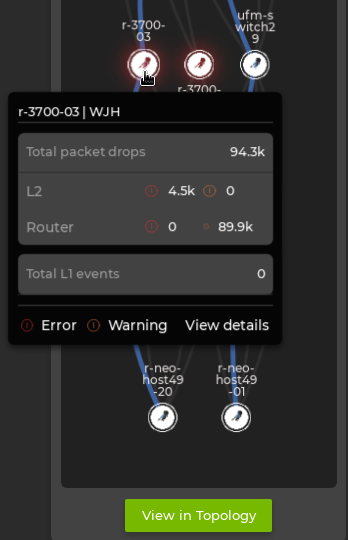
Click on a device with WJH events to see the statistics in the left panel. Hover over the data to reveal the type of drops over time:
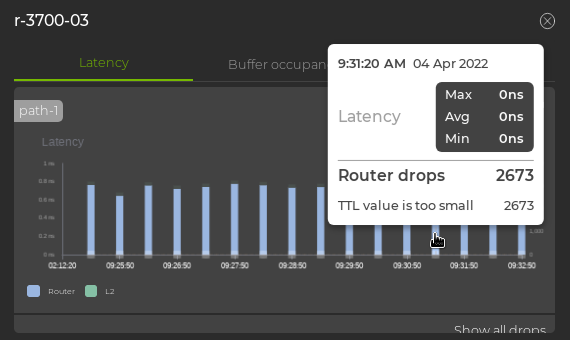
WJH drops can also be viewed from the expanded device chart by selecting the WJH category:
Select Show all drops to display a list of all WJH drops for the device: