Access Data with Cards
Cards present information about your network for monitoring and troubleshooting; each card describes a particular aspect of the network. Cards are collected onto a workbench where all data relevant to a task or set of tasks is visible. You can add and remove cards from a workbench, increase or decrease their sizes, change the time period of the data shown on a card, and make copies of cards to show different levels of data at the same time.
Available Cards
Each card focuses on a particular aspect of your network. They include:
- Validation summary: overview of your network’s health
- Events: system anomalies and threshold-crossing events
- What Just Happened: network issues and packet drops
- Device groups: distribution of device components
- Trace request: discovery workflow for paths between two devices in the network fabric
- MAC move commentary: info about changes to a MAC address on a specific VLAN
- Network services cards: BGP, MLAG, EVPN, OSPF, and LLDP
- Inventory cards: Devices, Switches, DPUs, and Hosts
Card Sizes
Cards are available in 4 sizes. The granularity of the content on a card varies with the size of the card, with the highest level of information on the smallest card to the most detailed information on the full-screen card.
Card Size Summary
| Card Size | Small | Medium | Large | Full Screen |
|---|---|---|---|---|
| Primary Purpose |
|
|
|
|
Card Actions
Add Cards to Your Workbench
Click
 Add card in the header.
Select the card(s) you want to add to your workbench.
When you have selected the cards you want to add to your workbench, select Open cards:
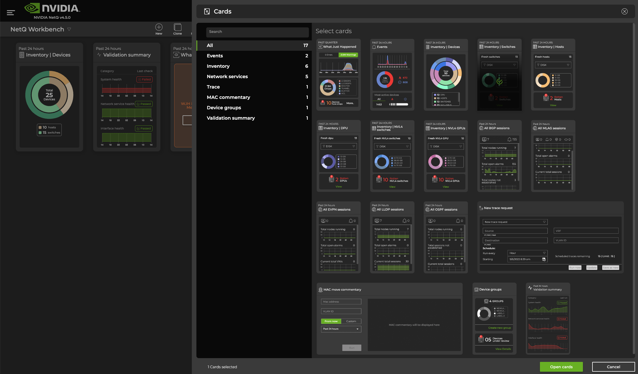
The cards are placed at the end of the set of cards currently on the workbench. You might need to scroll down to see them. Drag and drop the cards on the workbench to rearrange them.
Add Switch Cards to Your Workbench
You can add switch cards to a workbench through the Devices icon on the header or by searching for it in the Global Search field. To add a switch card from the header:
Click
 Devices, then select Open a device card.
Select the device from the suggestions that appear:
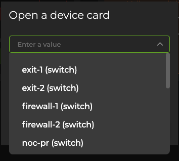
Choose the card’s size, then select Add.
Remove Cards from Your Workbench
To remove all the cards from your workbench, click the Clear icon in the header. To remove an individual card:
Hover over the card you want to remove.
Click
 (More Actions menu).
Select Remove.
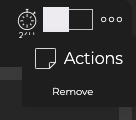
The card is removed from the workbench, but not from the application.
Change the Size of the Card
Hover over the top portion of the card until you see a rectangular box divided into four segments.
Move your cursor over the box until the desired size option is highlighted.
One-quarter width opens a small card. One-half width opens a medium card. Three-quarters width opens a large card. Full width opens a full-screen card.
Select the size. When the card changes to the selected size, it might move to a different area on the workbench.
Change the Time Period for the Card Data
All cards have a default time period for the data shown on the card, typically the last 24 hours. You can change the time period to view the data during a different time range to aid analysis of previous or existing issues.
To change the time period for a card:
Hover over the top portion of the card and select the clock icon
 .
.Select a time period from the dropdown list.
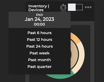
Changing the time period in this manner only changes the time period for the given card.
Table Settings
You can manipulate the tabular data displayed in a full-screen card by filtering and sorting the columns. Hover over the column header and select it to sort the column. The data is sorted in ascending or descending order: A-Z, Z-A, 1-n, or n-1. The number of rows that can be sorted via the UI is limited to 10,000. To reposition the columns, drag and drop them using your mouse.
Select  Export to download and export the tabular data. You can sort and filter tables that exceed 10,000 rows by exporting the data as a CSV file and opening it in a spreadsheet program.
The following icons are common in the full-screen card view:
| Icon | Action | Description |
|---|---|---|
 | Select All | Selects all items in the list. |
 | Clear All | Clears all existing selections in the list. |
 | Add Item | Adds item to the list. |
 | Edit | Edits the selected item. |
 | Delete | Removes the selected items. |
 | Filter | Filters the list using available parameters. |
 , ,  | Generate/Delete AuthKeys | Creates or removes NetQ CLI authorization keys. |
| Open Cards | Opens the corresponding validation or trace card(s). |
 | Assign role | Opens role assignment options for switches. |
| Export | Exports selected data into either a .csv or JSON-formatted file. |
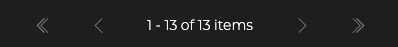
When there are many items in a table, NetQ loads up to 25 rows by default and provides the rest in additional table pages, accessible through the pagination controls. Pagination is displayed under the table.