Cyber-AI Analytics
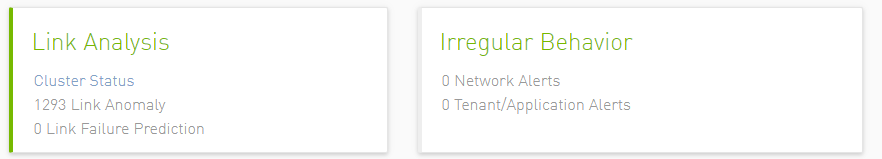
Cluster Status: Collects information about the links periodically.
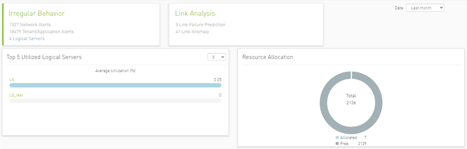
Link Anomaly: Detects anomalous behavior in the cluster with a probability indicator. It detects the most significant influencers on the anomaly notice.
Link Failure Prediction: Prediction of future link failures 1-to-24 hours in advance using machine learning algorithms with a probability indicator.
Network Alerts: Alerts for the entire cluster. The algorithm checks for unusual changes in several important metrics and notifies the user.
Tenant/Application Alerts: Triggered by PKey monitoring in the cluster. It checks the most congested PKeys for a better understanding of applications health.
Network Alerts
The purpose of this tab is to detect abnormal behavior at the level of the entire cluster.
An ETL process runs hourly and calculates network aggregated statistics while another process checks how the current statistics compare to statistics aggregated over the previous month. If over 20% of the difference is detected (default value that can be changed) the system triggers an alert with relevant information. It is also possible to see recommended action by clicking the relevant icon per alert.
The web UI provides a list of alerts as shown in the following:
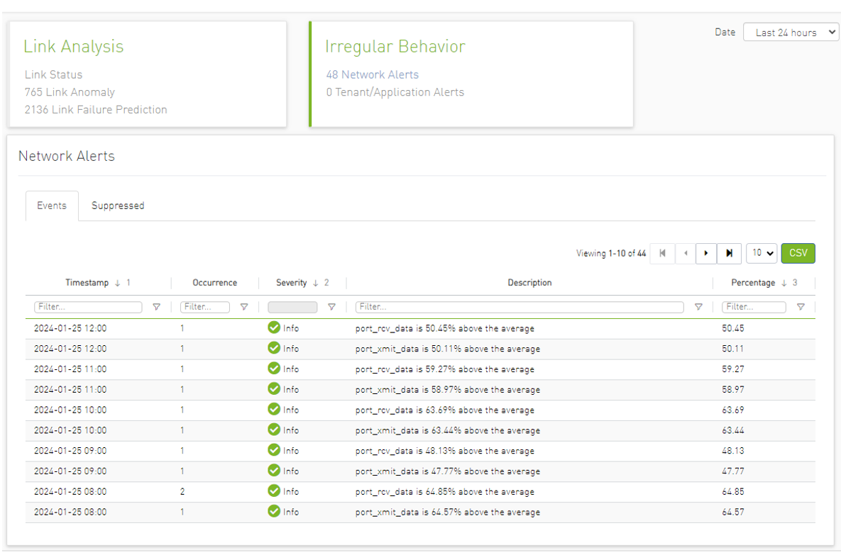
Clicking any alert provides an additional layer of analysis that shows the recommended actions related to the selected alert anomalous parameter over three different time ranges.


Also, users can add more graphs for more counters by clicking the "Add More" button below the graphs.
Tenant/Application Alerts
The ETL process of UFM Cyber-AI combines a partitioning key (PKey) topology with network telemetry to monitor PKey performance.
Based on normalized congestion measurements (the default is greater than 70%) the system detects the most congested PKeys. This is done by counting the amount of time when the alert is received.
In addition, a resource allocation pie is available which shows allocated nodes for PKey via free nodes.
Detailed event information is provided to the user regarding PKey alerts, where the user can see PKey details and descriptions of the alert.

Clicking any PKeys alert shows six graphs representing network statistics in general and per selected Pkey.
This way the user can see the impact of a specific PKey throughout the entire network and can see if PKey activity is normal both from a performance and from a duration of usage (if the activity is happening in a reasonable time) point of view.

Link Failure Prediction
UFM Cyber-AI trains machine learning algorithms to predict future failures by collecting monitoring information (i.e. training data for the machine learning algorithms) over a time duration (e.g. 1-24 hours) in advance of (retrospectively known) previous failures that occurred and having the algorithms learn the connection between different parameters over time.
Using the machine learning algorithm, the processor derives the potential failure pattern by, for example, alerting future failure times of components. The processor repeatedly updates the alerted future failure times based on newly collected failures.
The dashboard displays a table showing 'Switch to Switch' and 'Switch to Host' link failure prediction alerts, along with the relation between Alerted and the Total number of devices in the cluster.
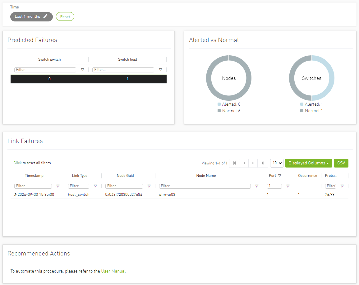
In the “Predicted Failures” table, the user can filter the alerts table below by clicking any value on the table to add the appropriate filters to the table.
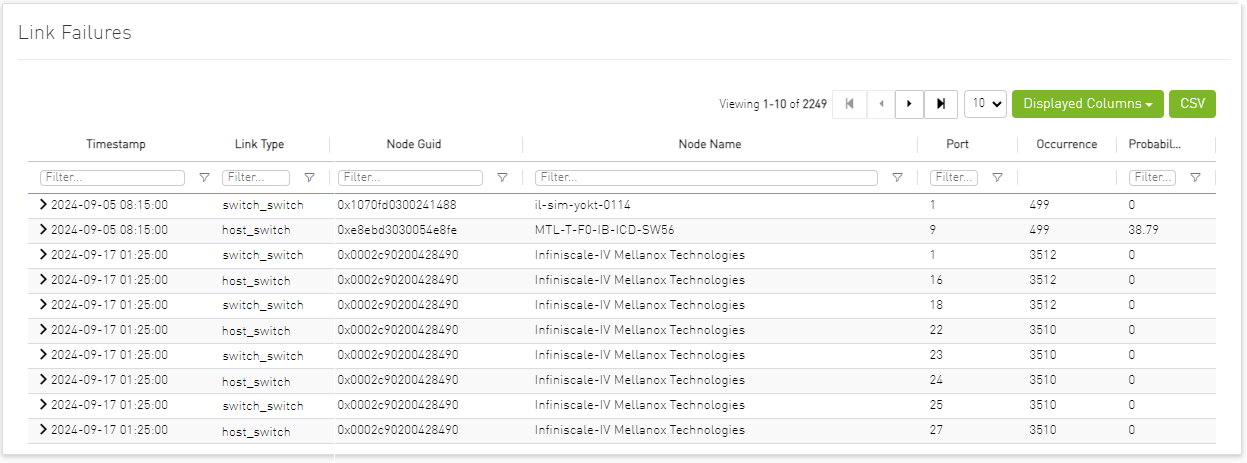
Users may see the detailed events through an event list where alert details like Node Name, Port, Occurrence and Probability are available.
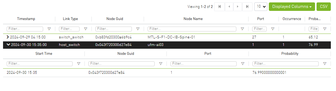
When clicking on the arrow icon in the alert row, the table will expand and will show the history for the specific link.
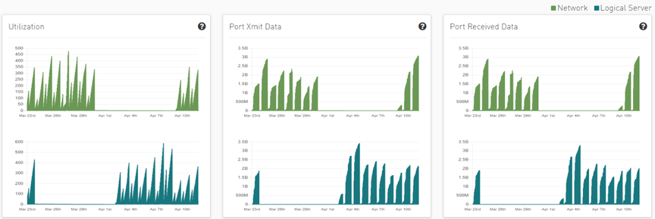
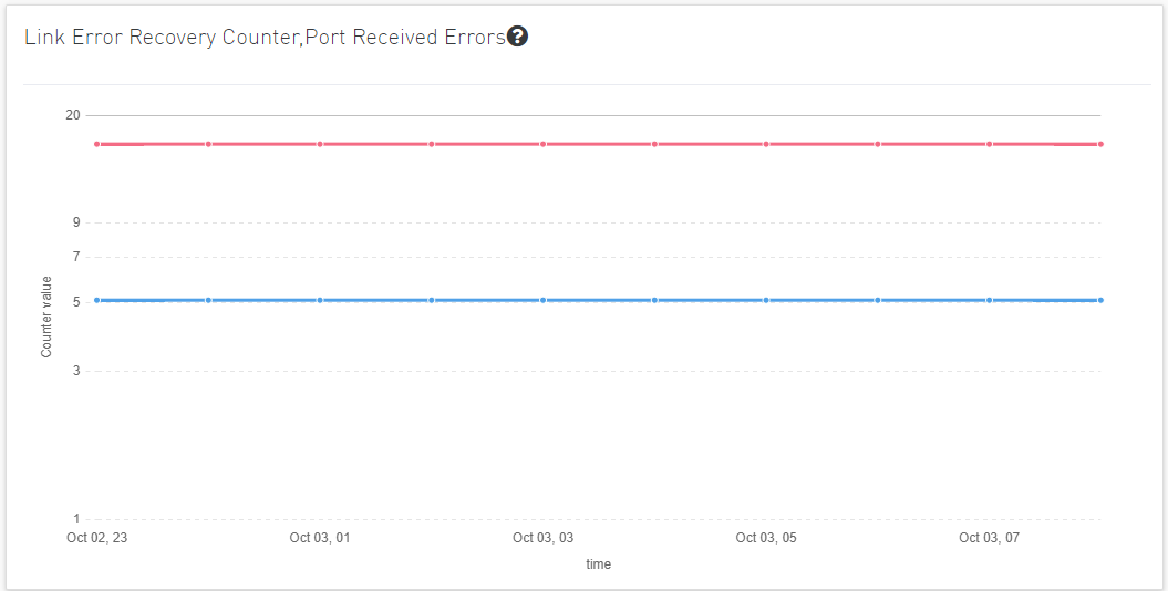
Clicking on any alert in the list displays five graphs representing the counters that influenced the alert's triggering, with several time ranges available.
The default view provides two lines for each graph: one for the current data, and another for the calculated historical data based on average values from the prior week.
Users can choose to switch between Weekly average (default) to Day of Week average.
Day of Week Average is based on the calculation of the statistics in the same hours and day of the week of the past month. For example The average for 8AM–9AM on Mondays during the past month.
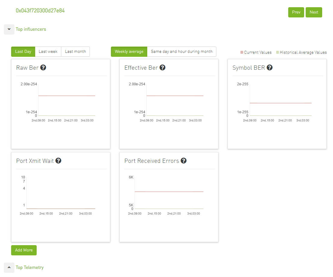
Also, users can add more graphs for more counters by clicking the "Add More" button below the graphs.
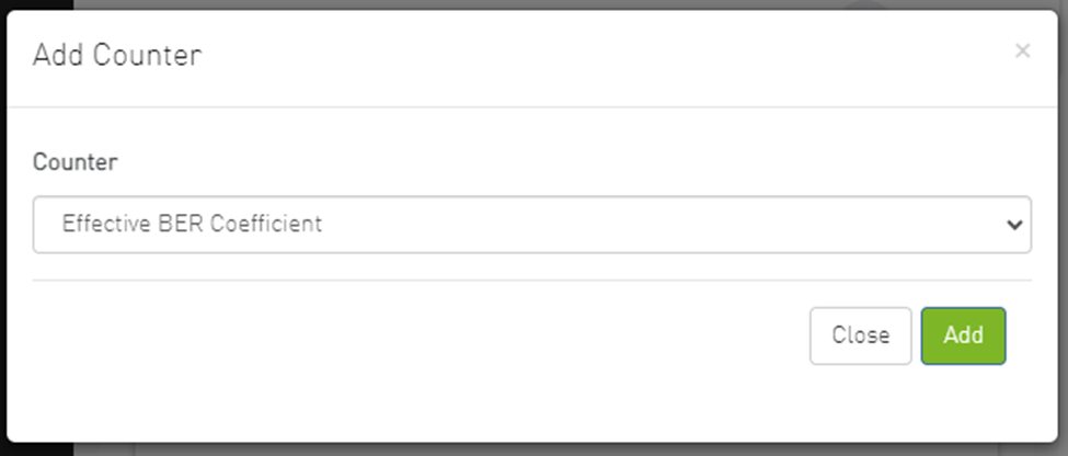
Then a new counter could be chosen, and a new graph for that counter will be added.
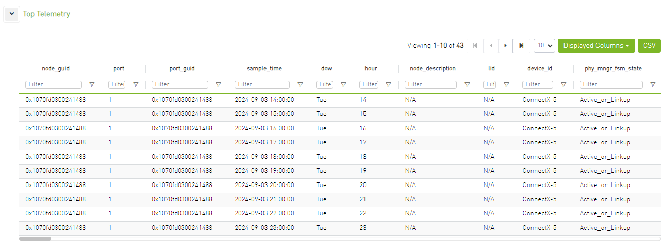
Additionally, it shows the top telemetry table, which is collapsed by default.
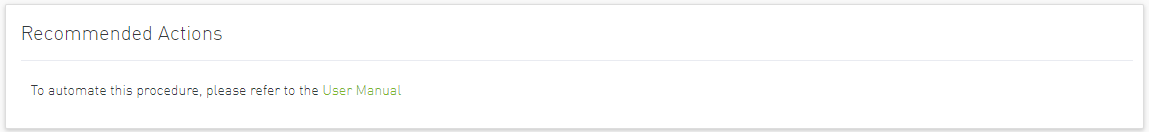
The recommended actions section will always appear at the bottom of the page with a reference to the user manual.
Link Anomaly
Port anomaly detection is based on defining composite metrics to reliably detect anomalies, where such metrics dynamically change, for example, according to a baseline that is determined and subsequently updated by a system.
In addition, there is a process for defining an anomaly score that provides a statistical estimation, such as the number of standard deviations, or the number of Mean Absolute Errors (MAEs) from a baseline value of the feature (i.e., metrics value), and assigning a degree of severity according to the number of standard deviations or MAEs.
The dashboard provides the following views:
Time Filter
Users can filter link anomaly data by time via searching for either an absolute or relative time.

Event Flow Charts
Event flow charts display anomalies between devices, with each link in the chart describing the number of anomalies between two devices.
The width of the link reflects the number of anomalies that occurred between the two devices.
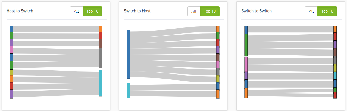
By default, the 'Top 10' button is selected, displaying the top 10 devices with the highest occurrences of anomalies.
Clicking on link/device filters the table below.
Anomaly Details
The table below represents the anomaly details such as Last Anomaly time, Number of Occurrences, Node and Partner Node.
Users can filter the anomaly details table by clicking on either a device or a link in the event flow charts.

Clicking on the arrow icon in the anomaly node, the table will expand and will show all the history for the specific alert.

Total Anomalies Over Time
When clicking on any anomaly node, an overtime graph will appear, showing all counters related to that anomaly.
The chart will display the number of anomalies over time, with the time scale based on the selected filter.
When clicking on a counter from the expanded table, the chart will display the counter values over time.
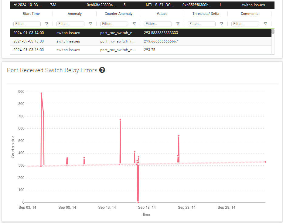
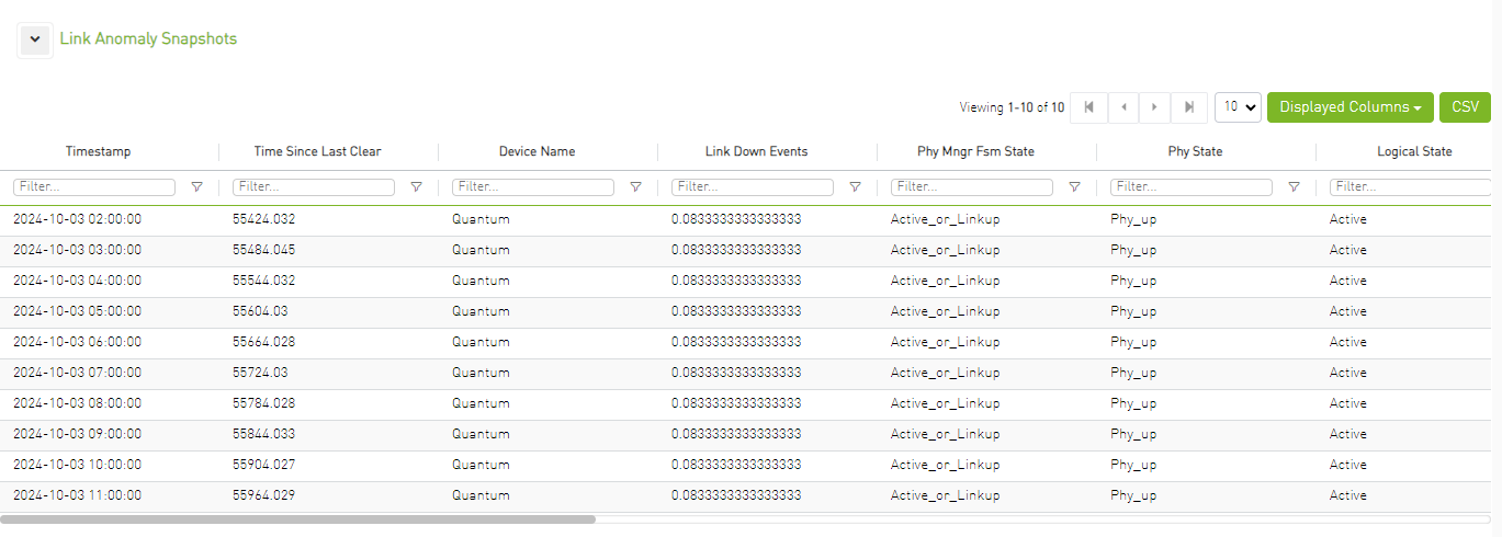
Link Anomaly Snapshots
Clicking on the anomaly node will display all telemetry counters for the selected port, starting from the selected time range, the table is collapsed by default.
Cluster Status
Provides information about the cluster and the distribution of the attributes value according to the selected time range.
The dashboard provides the following views:
Filters
Users can filter link status data by time by searching for either an absolute or relative time, or by link attribute by clicking on the 'All Filters' button.

Clicking on the 'All Filters' button will open the following modal:

This modal filters the link status dashboard by the selected attribute values. Each attribute represents a dropdown containing the available values.
Additionally, clicking on the reset button will reset all filters.
Attributes
The most important attributes will be displayed as histograms and donut charts.
By clicking on a graph, the entire link status dashboard will be filtered based on the selection in the graph.
For example, clicking on "Disabled" in the " Physical Mngr Fsm State " graph will filter all the other graphs and tables by this selection.
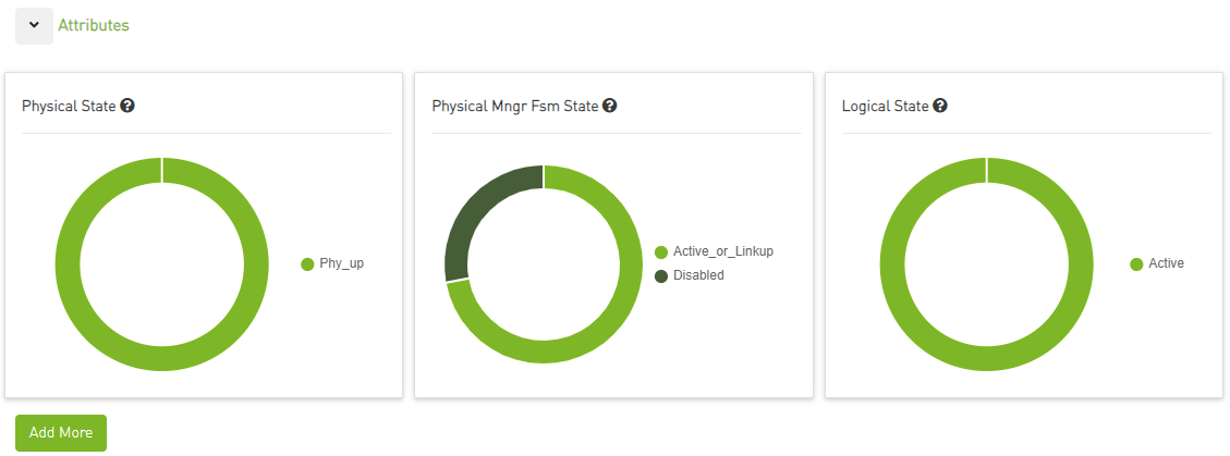
Users can add more graphs for more attributes by clicking the "Add More" button below the graphs.

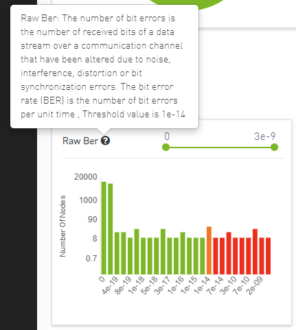
Counters
The most important counters will be displayed as histograms.
By clicking on a graph, the entire link status dashboard will be filtered based on the selection. Users can also filter the x-axis values (counter values) using the slider above.
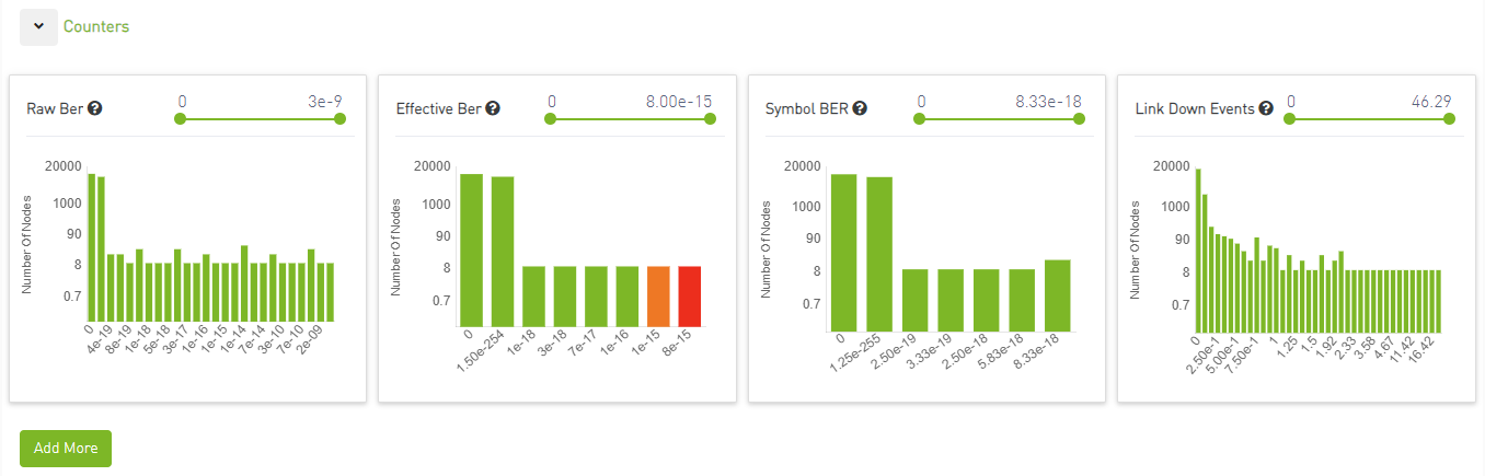
Additional graphs for more counters can be added by clicking the "Add More" button below the graphs.

Counters Threshold
The user can assign a threshold value for each counter, with a new file added under /opt/ufm/cyber-ai/conf/counters_threshold.cfg for this purpose:
            [raw_ber]
threshold= 1E-4

[eff_ber]
normal_range = 1E-8

[symbol_ber]
normal_range = 1E-10
Any value equal to the threshold will be highlighted in orange, while any value exceeding the threshold will be highlighted in red.
Users can view the threshold value by hovering over the question mark icon next to the counter name, which will display a popover containing a short description of the chart and the threshold value.
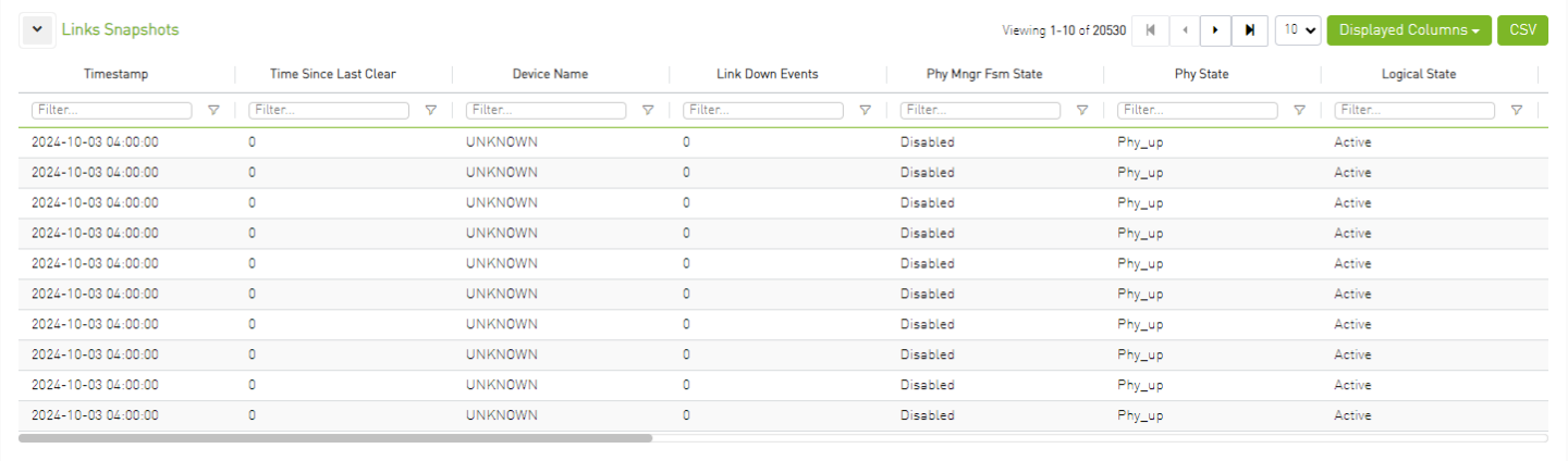
Links Snapshots
The table below shows the link snapshot details, including the device name, node GUID, port number, and related counters. By default, the table is collapsed and will automatically expand when a new counter or attribute is added, or when the user clicks on a chart to filter the data. When new attributes or counters are added, they will be included as columns in the table.
Anomalies
Clicking on a snapshot in the Links Snapshots table will display the most important counters as time graphs. These charts will show the counter values over time, with the time scale corresponding to the selected time filter.

Users can add more graphs for more counters by clicking the "Add More" button below the graphs.

Logical Server Alerts
Logical server data collection and analytic jobs are disabled by default. To enable this, the related flags should be updated in the scheduler_settings.cfg file:
            [analytics_job::logical_server_port_join]
interval = 300
delay = 720
max_input = 12
standard_timeout = 180
enabled = true

[analytics_job::logical_server_aggr]
interval = 300
delay = 780
max_input = 12
standard_timeout = 180
enabled = true

[data_prep_ufm::logical_server]
interval = 60
delay = 60
skip_collection = false
json_collection = false
The ETL process of UFM Cyber-AI combines the topology of the logical server, with network telemetry allowing the monitoring of logical servers' performance.
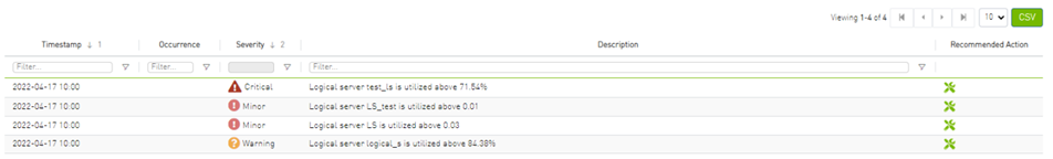
Based on utilization measurements (the default is greater than 70%) the system detects the most utilized logical server. This is done by counting the amount of time when the alert is received.
In addition, a resource allocation pie is available which shows allocated nodes for logical servers compared to free nodes.
Detailed event information is provided to the user regarding logical server alerts, where the user can see logical server details and a description of the alert.
Clicking any logical server alert shows six graphs representing network statistics in general and per selected logical server.
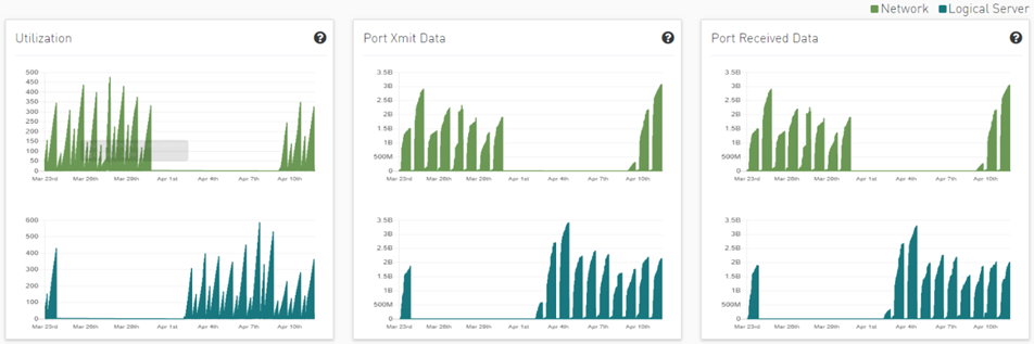
This way the user can see the impact of a specific logical server throughout the entire network and can see if logical server activity is normal both from a performance and from a duration of usage (i.e., if the activity is happening in a reasonable time) point of view.
Recommended Actions
A recommended action is available for all alert types. The user can click on any alert from alerts table in each page to see the recommended actions for the alert.

Specification Description
The present invention generally relates to the detection anomaly over cables and understanding degradation mechanisms for improving stability in data centers.
This innovation includes the detection of trends, intrusion, and any abnormal behavior of cables.
Moreover, with analysis of degradation over time we can determine better future performance strategies.
Customer Output
Threshold Alerts Tab


Deviation from Usual Behavior Tab


Background Art
Cable Anomaly Detection
There are 5 measurements from the management tool (IB) with four thresholds per measure; see the Ethernet example below.
            module_voltage
Channel_*_ tx_power
Channel_*_rx_power
Channel_*_tx_bias
       module_temp
There is a 5D (dimensions) GMM model which clusters channel and threshold behavior.
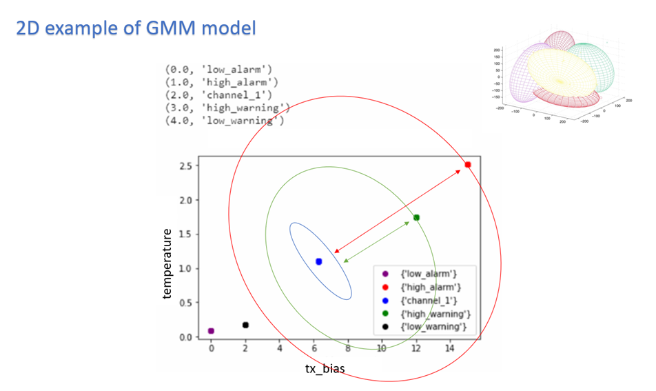
To indicate alert: UFM Cyber-AI is calculating for every new data entry its deviation from channel centroid probabilistically per measurement.
The system is defining the probability rate for the indication above deviation
Each event per measurement is unique to node, port, and SN.
For user convenience, there is the representation of the current measure via pre-defined thresholds in the tachometer
For every chosen entry in the table, the trend graph is updated
The trend graph represents the trend for the chosen measure to detect abnormal behavior over time
Introduction
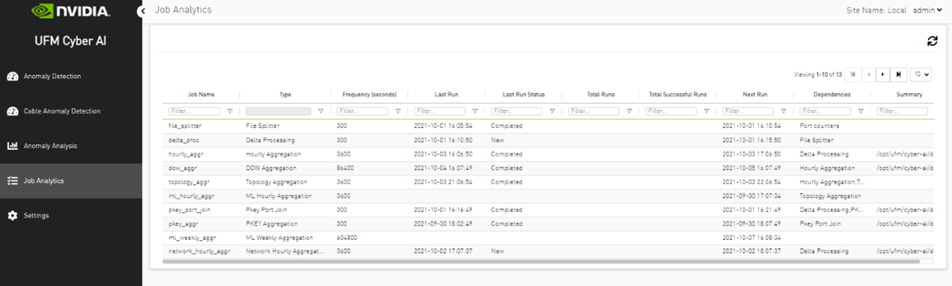
Analytic jobs are critical components in CyberAI. Each analytic job has a specific task to accomplish and runs periodically in a docker container. They process raw data collected from UFM Telemetry and generate informative data that can be displayed to the user in a form of alerts that can be used in making decisions. The process of data includes splitting the data into chunks of 5 mins, calculating the delta (difference between counters values), aggregating data (hourly, day of week, topology, and PKey), and inference the data for any alerts.
Job Types
File Splitter: This job splits the file if it contains more than one timestamp.
Delta Processing: This job calculates the delta from the current sampling and the previous 5 minutes.
Hourly Aggregation: This job aggregates all delta files in the previous hour into one csv file.
Network Hourly Aggregation: Similar to hourly aggregation but, make average over all network nodes.
DOW Aggregation: Collect the CSV files on the same day of the week (DOW), at the same hour, to be aggregated.
Network DOW Aggregation: Similar to DOW aggregation but makes average over all network nodes.
Network Anomaly: Analyzes the network hourly data with the network DOW aggregation and looks for anomalies.
Topology Aggregation: Merges data collected from hourly aggregation, cables, and UFM topology files, and generates a file to be used by ML hourly aggregation.
ML hourly Anomaly: Analyzes the topology merged file using ML model files and looks for link anomalies alert
ML Weekly Aggregation: Updates the ML model used by ML hourly aggregation based on the weekly collected topology.
PKEY Port Join: Merges the delta output files with the PKEY data and generates a file to be input for the PKEY aggregation.
PKEY Aggregation: Analyzes the joined PKEY data and looks for PKEY (tenant) alerts.
Logical Server Join: Merges the delta output files with the logical server data and generates a file to be input for the logical server aggregation.
Logical Servers Aggregation: Analyzes the joint logical servers data and looks for logical servers alerts.
Cable Daily: Analysis of cable counters files and looks for cable threshold and deviation alerts.
Weekly Aggregation: Makes weekly average on hourly data to be displayed to compare the hourly data with the weekly average of this hour.
Output Sample