

Visualization and Plotting with AIPerf
Generate PNG visualizations from AIPerf profiling data with automatic mode detection, NVIDIA brand styling, and support for multi-run comparisons and single-run analysis.
Overview
The aiperf plot command automatically detects whether to generate multi-run comparison plots or single-run time series analysis based on your directory structure, including nested profile_runs/run_000N directories from multi-run profiles. It integrates GPU telemetry and timeslice data when available. Aggregate summary directories may not be directly plottable; point aiperf plot at the run root or concrete per-run directories that contain profile exports.
Key Features:
- Automatic mode detection (multi-run comparison vs single-run analysis)
- GPU telemetry integration (power, utilization, memory, temperature)
- Timeslice support (performance evolution across time windows)
- Configurable plots via
~/.aiperf/plot_config.yaml
Multi-Run Profile Discovery: When --num-profile-runs > 1 produces profile_runs/ subdirectories (e.g., artifacts/my_run/profile_runs/run_0001/ for no-sweep multi-run and trial_0001/ for sweep multi-run), the plot command auto-discovers them across no-sweep, REPEATED, INDEPENDENT, and adaptive Bayesian-optimization layouts. To plot a specific cell directly, you may also pass <base>/profile_runs/ explicitly.
Quick Start
Custom export filenames not supported: The plot command expects default export filenames (profile_export.jsonl, profile_export_aiperf.json). If you ran aiperf profile with --profile-export-file or a custom --profile-export-prefix, the output files will have different names and will not be detected by aiperf plot. To use the plot command, re-run profiling without custom export file options, or rename the files to match the default names.
Analyze a single profiling run:
Sample Output (Successful Run):
Compare multiple runs in a directory:
Sample Output (Successful Run):
Other common invocations:
Launch interactive dashboard for exploration:
Sample Output (Successful Run):
Use dark theme:
Sample Output (Successful Run):
Output directory logic:
- If
--outputspecified: uses that path - Otherwise:
<first_input_path>/plots/ - Default (no paths):
./artifacts/plots/
Customize plots: Edit ~/.aiperf/plot_config.yaml (auto-created on first run) to enable/disable plots or customize visualizations. See Plot Configuration for details.
Visualization Modes
The plot command automatically detects visualization mode based on directory structure:
Multi-Run Comparison Mode
Compares metrics across multiple profiling runs to identify optimal configurations.
Auto-detected when:
- Directory contains multiple run subdirectories, OR
- Multiple paths specified as arguments
Example:
Default plots (4):
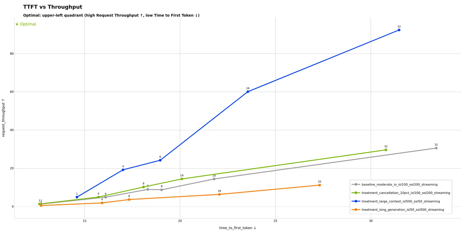
- TTFT vs Throughput - Time to first token vs request throughput
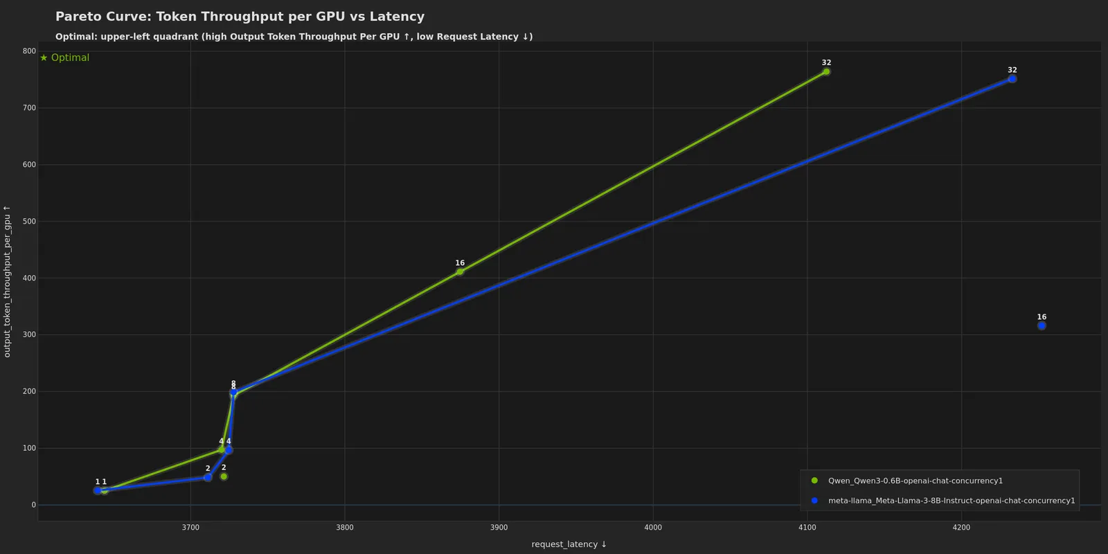
- Token Throughput per GPU vs Latency - GPU efficiency vs latency (requires GPU telemetry)
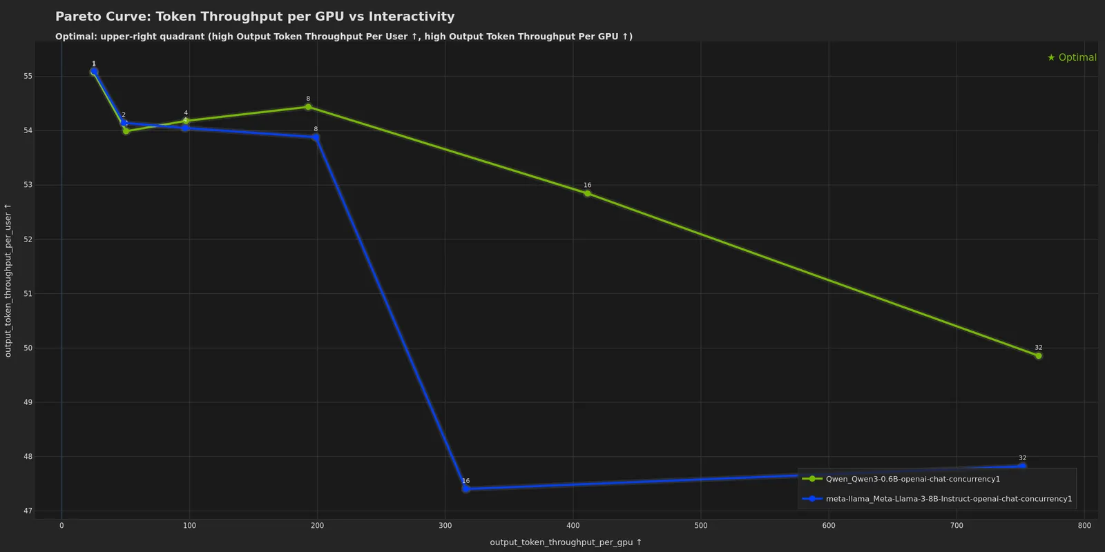
- Token Throughput per GPU vs Interactivity - GPU efficiency vs TTFT (requires GPU telemetry)
- Latency vs Throughput (Joint Uncertainty) - latency vs throughput-per-GPU with 95% confidence ellipses
Use Experiment Classification to assign semantic colors (grey for baselines, green for treatments) for clearer visual distinction.
Example Visualizations
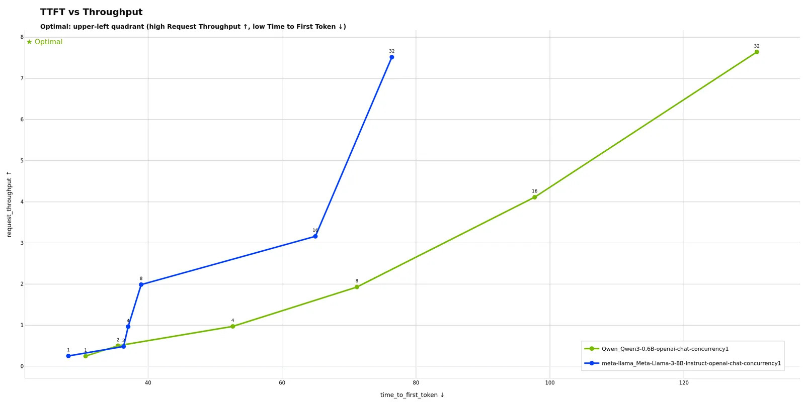
Shows how time to first token varies with request throughput across concurrency levels. Potentially useful for finding the sweet spot between responsiveness and capacity: ideal configurations maintain low TTFT even at high throughput. If TTFT increases sharply at certain throughput levels, this may indicate a prefill bottleneck (batch scheduler contention or compute limitations).
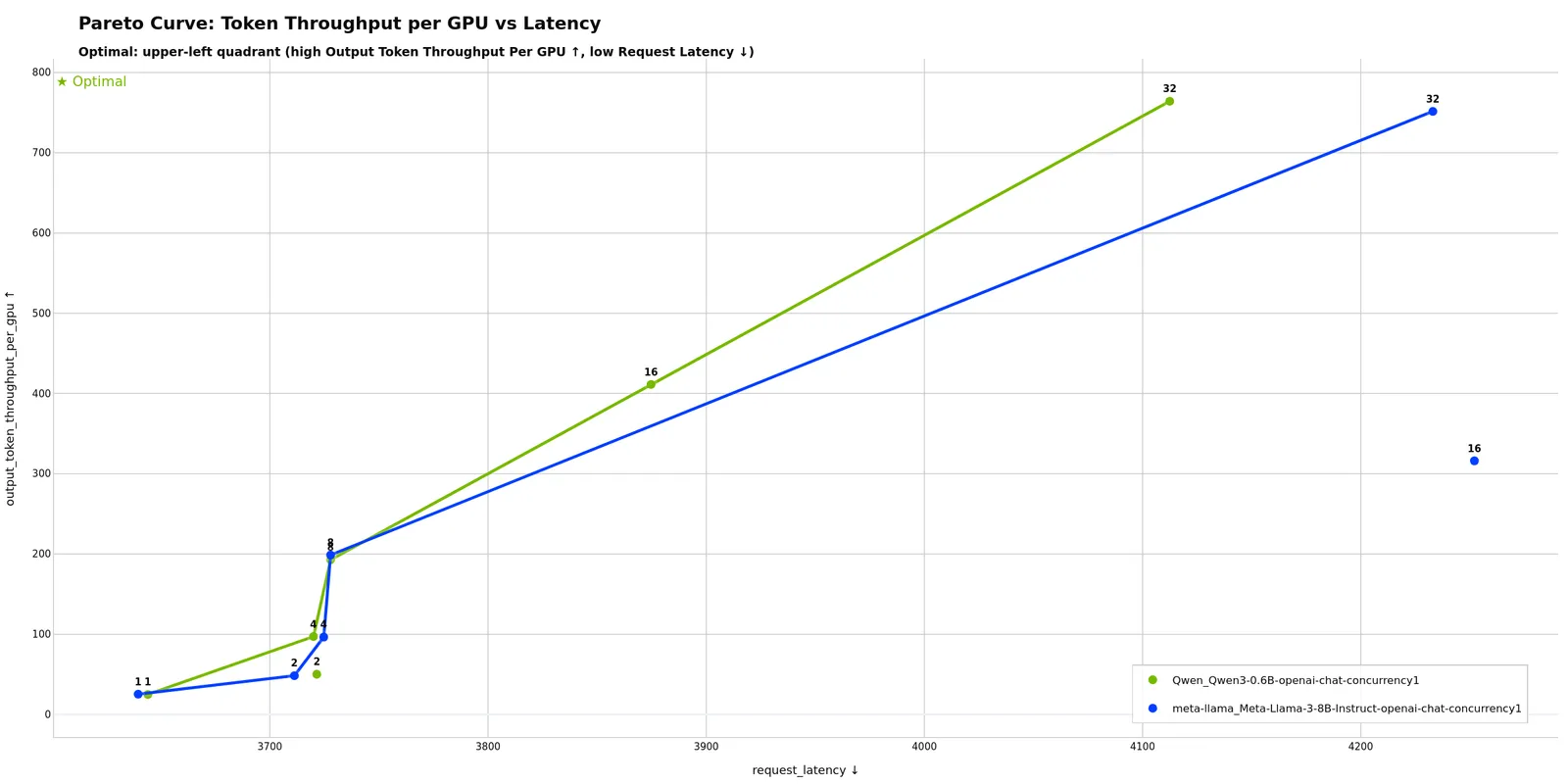
Highlights optimal configurations on the Pareto frontier that maximize GPU efficiency while minimizing latency. Points on the frontier are optimal; points below are suboptimal configurations. Potentially useful for choosing GPU count and batch sizes to maximize hardware ROI. A steep curve may indicate opportunities to improve latency with minimal throughput loss, while a flat curve can suggest you’re near the efficiency limit.
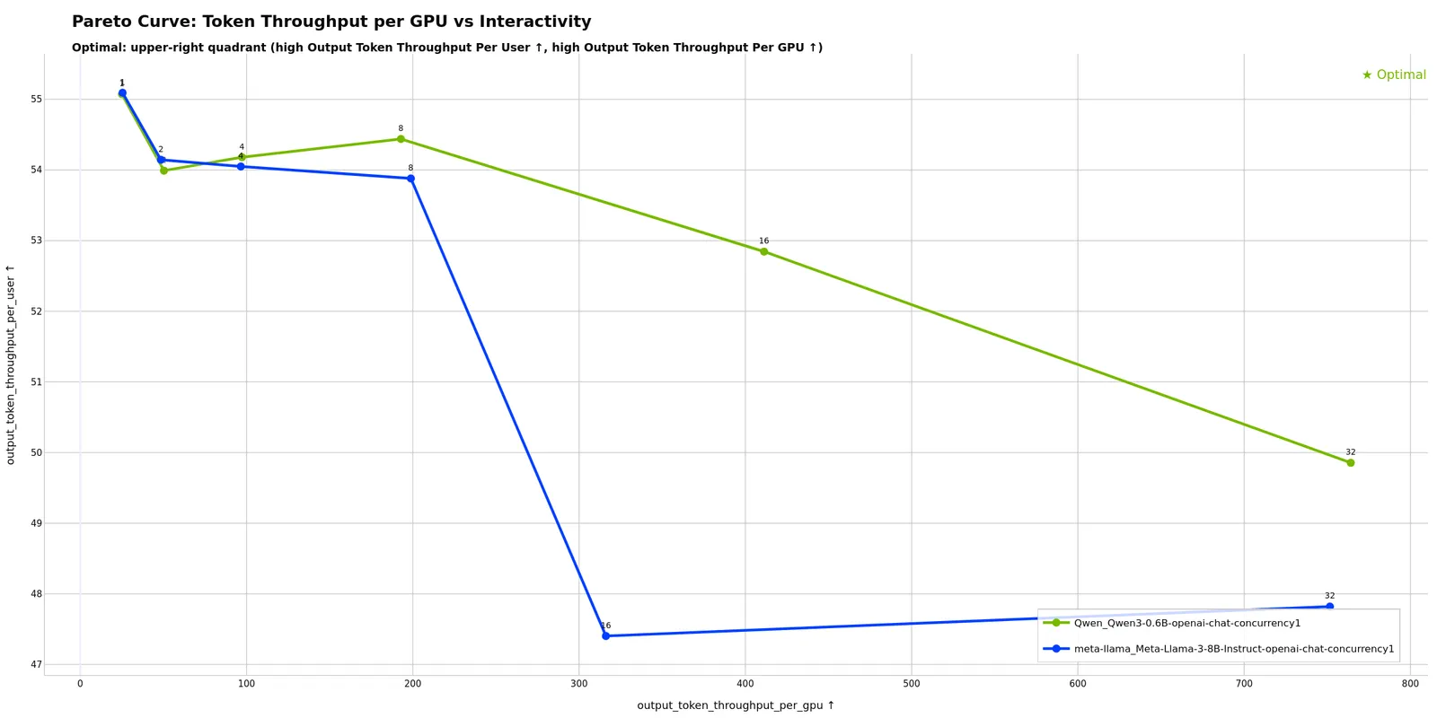
Shows the trade-off between GPU efficiency and interactivity (TTFT). Potentially useful for determining max concurrency before user experience degrades: flat regions show where adding concurrency maintains interactivity, while steep sections may indicate diminishing returns. The “knee” of the curve can help identify where throughput gains start to significantly hurt responsiveness.
Single-Run Analysis Mode
Analyzes performance over time for a single profiling run.
Auto-detected when:
- Directory contains
profile_export.jsonldirectly
Example:
Default plots (5, enabled in shipped single_run_defaults):
- TTFT Over Time (
ttft_over_time) - Time to first token per request - TTFT Timeline (
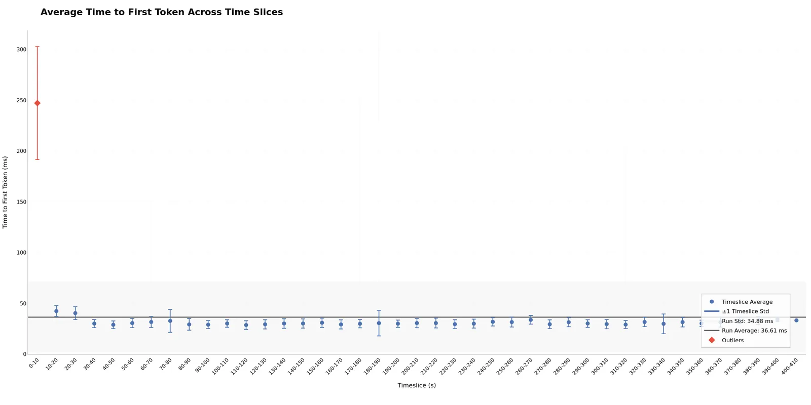
ttft_timeline) - Per-request TTFT plotted against request start time - TTFT Across Timeslices (
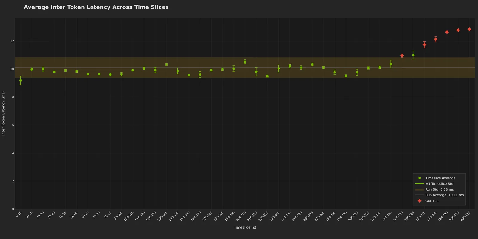
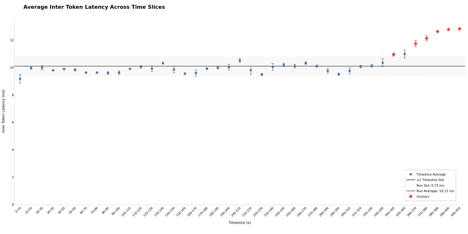
timeslices_ttft) - TTFT statistics per time window - ITL Across Timeslices (
timeslices_itl) - Inter-token latency statistics per time window - GPU Utilization and Throughput Over Time (
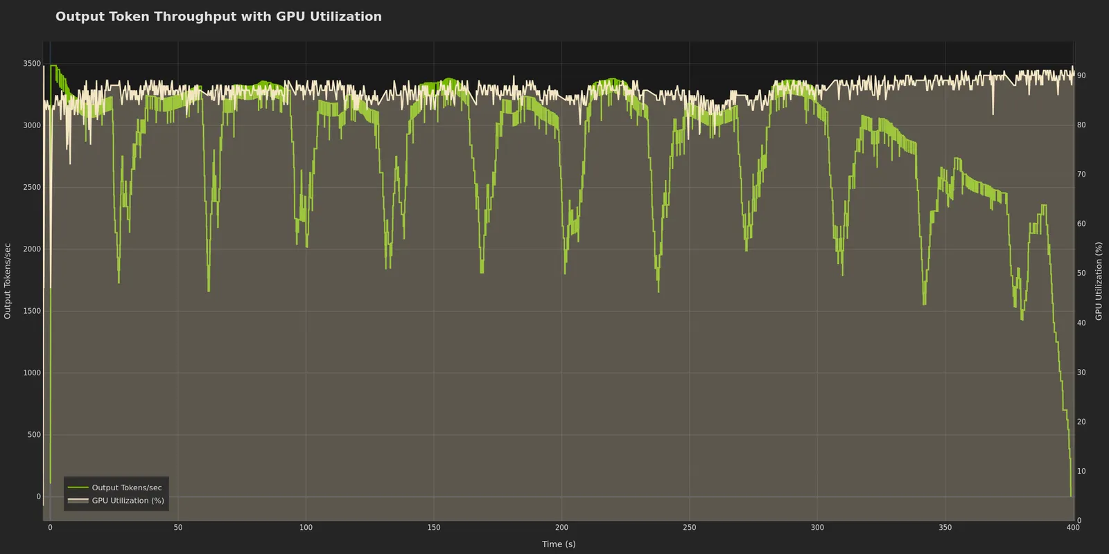
gpu_utilization_and_throughput_over_time) - Correlated GPU usage and token rate (requires GPU telemetry)
Commented-out by default (uncomment in ~/.aiperf/plot_config.yaml to enable):
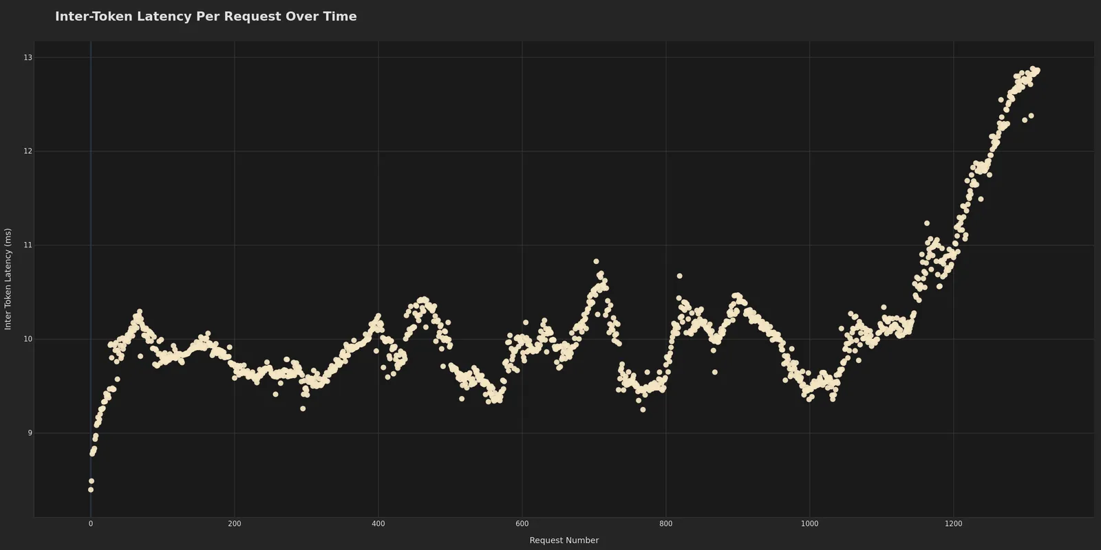
- Inter-Token Latency Over Time (
itl_over_time) - ITL per request - Request Latency Over Time (
latency_over_time) - End-to-end latency progression - Dispersed Throughput Over Time (
dispersed_throughput_over_time) - Continuous token generation rate
Additional plots (when data available):
- Timeslice plots (when
--slice-durationused during profiling) - GPU telemetry plots (when
--gpu-telemetryused during profiling)
Example Visualizations
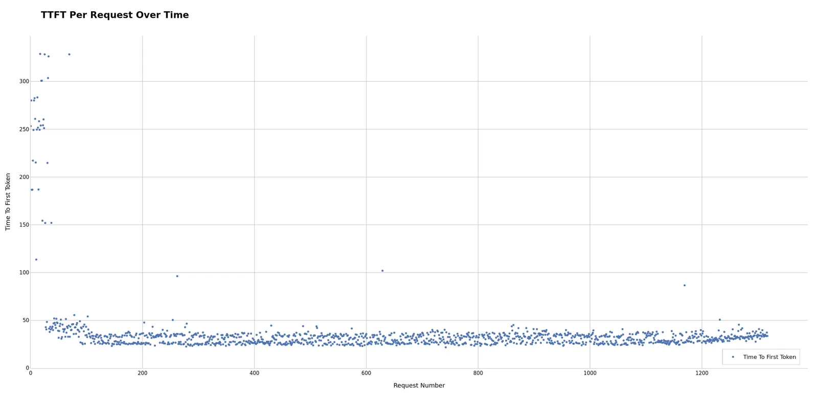
Time to first token for each request, revealing prefill latency patterns and potential warm-up effects. Initial spikes may indicate cold start; stable later values show steady-state performance. Potentially useful for determining necessary warmup period or identifying warmup configuration issues. Unexpected spikes during steady-state can suggest resource contention, garbage collection pauses, or batch scheduler interference.
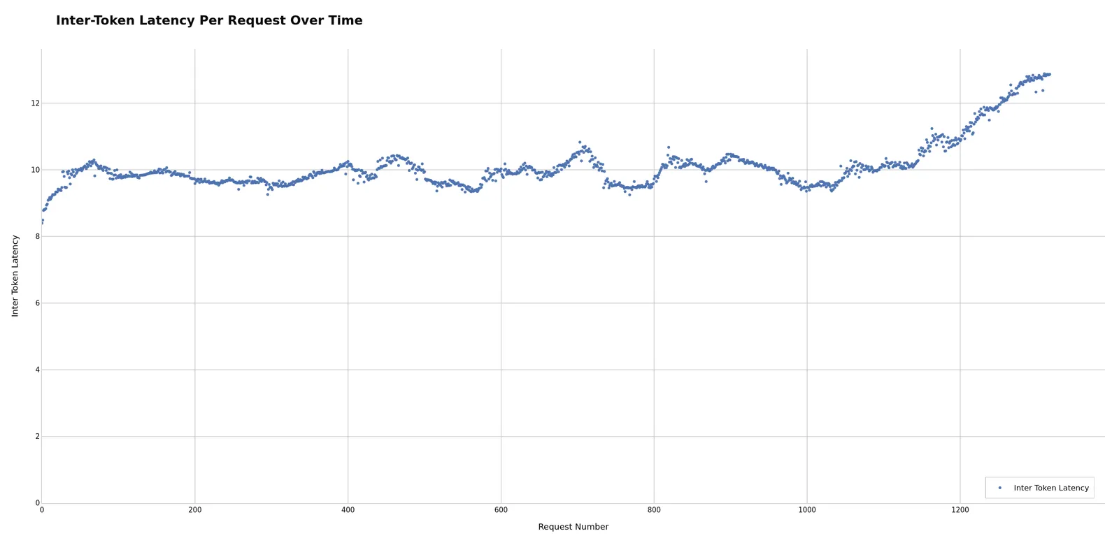
Inter-token latency per request, showing generation performance consistency. Consistent ITL may indicate stable generation; variance can suggest batch scheduling issues. Potentially useful for identifying decode-phase bottlenecks separate from prefill issues. If ITL increases over time, this may indicate KV cache memory pressure or growing batch sizes causing decode slowdown.
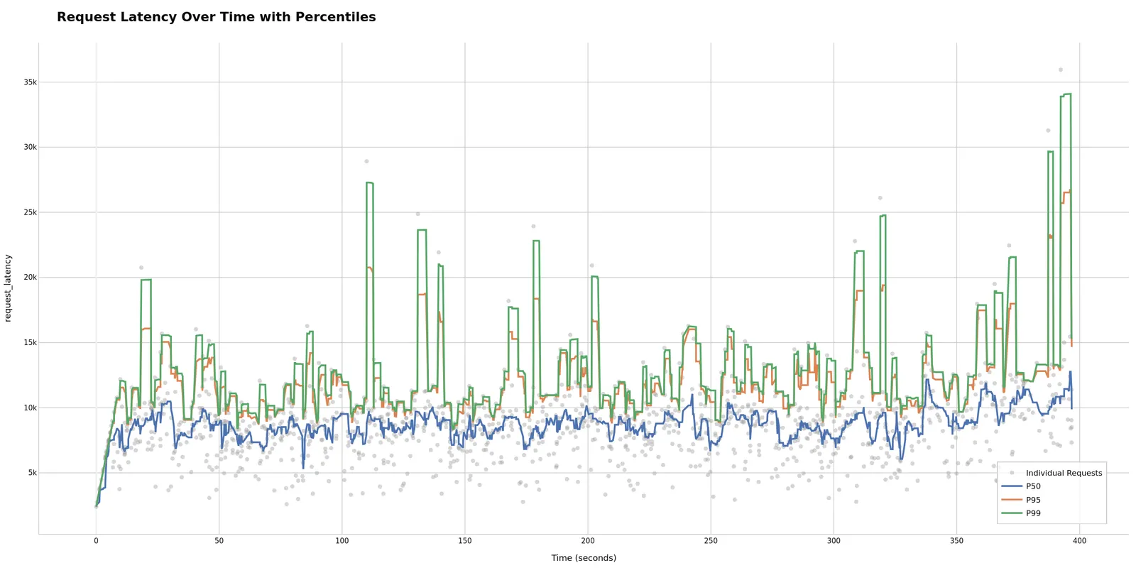
End-to-end latency progression throughout the run. Overall system health check: ramp-up at the start is normal, but sustained increases may indicate performance degradation. Potentially useful for identifying if your system maintains performance or degrades over time. Sudden jumps may correlate with other requests completing or starting, potentially revealing batch scheduling patterns.
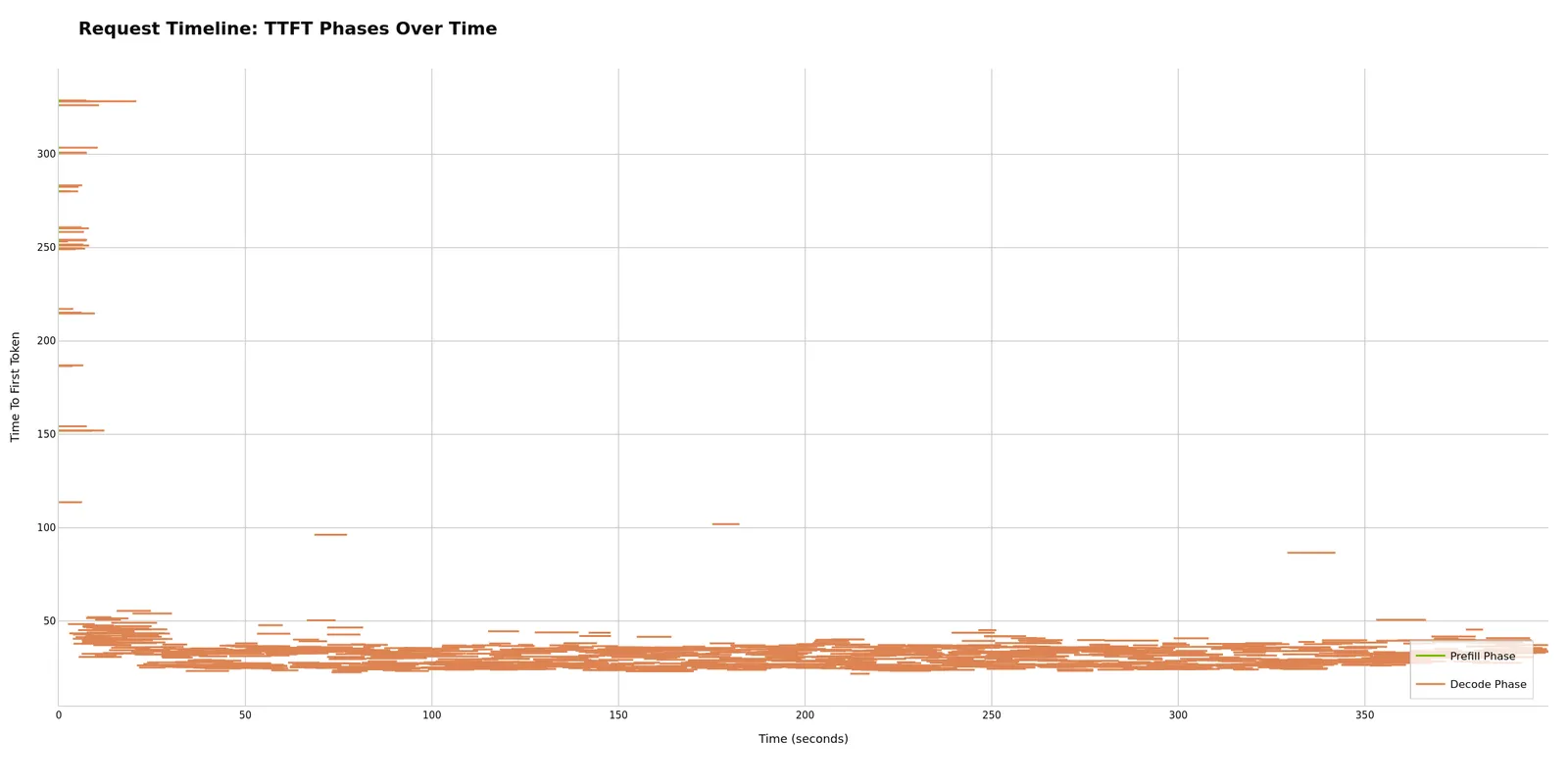
Individual requests plotted as lines spanning their duration from start to end. Visualizes request scheduling and concurrency patterns: overlapping lines show concurrent execution, while gaps may indicate scheduling delays. Dense packing can suggest efficient utilization; sparse patterns may suggest underutilized capacity or rate limiting effects.
Dispersed Throughput
The Dispersed Throughput Over Time plot uses an event-based approach for accurate token generation rate visualization. Unlike binning methods that create artificial spikes, this distributes tokens evenly across their actual generation time:
- Prefill phase (request_start → TTFT): 0 tok/sec
- Generation phase (TTFT → request_end): constant rate = output_tokens / (request_end - TTFT)
This provides smooth, continuous representation that correlates better with server metrics like GPU utilization.
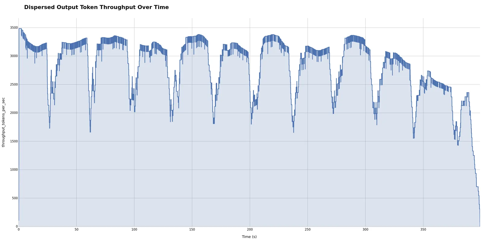
Smooth ramps may show healthy scaling; drops can indicate bottlenecks. Potentially useful for correlating with GPU metrics to identify whether bottlenecks are GPU-bound, memory-bound, or CPU-bound. A plateau may indicate you’ve reached max sustainable throughput for your configuration. Sudden drops can potentially correlate with resource exhaustion or scheduler saturation.
Customization Options
Plot Configuration YAML
Customize which plots are generated and how they appear by editing ~/.aiperf/plot_config.yaml.
Enable/Disable Plots
Multi-run plots:
Single-run plots:
Customize Plot Grouping
Multi-run comparison plots group runs to create colored lines/series. Customize the groups: field in plot presets:
Group by model (useful for comparing different models):
Group by directory (useful for hierarchical experiments):
Group by run name (default - each run is separate):
When experiment classification is enabled, all multi-run plots automatically group by experiment_group to preserve treatment variants with semantic colors.
See the CONFIGURATION GUIDE section in ~/.aiperf/plot_config.yaml for detailed customization options.
Experiment Classification
Classify runs as “baseline” or “treatment” for semantic color assignment in multi-run comparisons.
Configuration (~/.aiperf/plot_config.yaml):
Result:
- Baselines: Grey shades, listed first in legend
- Treatments: NVIDIA green shades, listed after baselines
- Use case: Clear visual distinction for A/B testing
When enabled, all multi-run plots automatically group by experiment_group (directory name) to preserve individual treatment variants with semantic baseline/treatment colors.
Pattern notes: Uses glob syntax (* = wildcard), case-sensitive, first match wins.
Example
Directory structure:
Result: 3 lines in plots (1 baseline + 2 treatments, each with semantic colors)
Advanced: Use group_extraction_pattern to aggregate variants:
src/aiperf/plot/default_plot_config.yaml for all configuration options.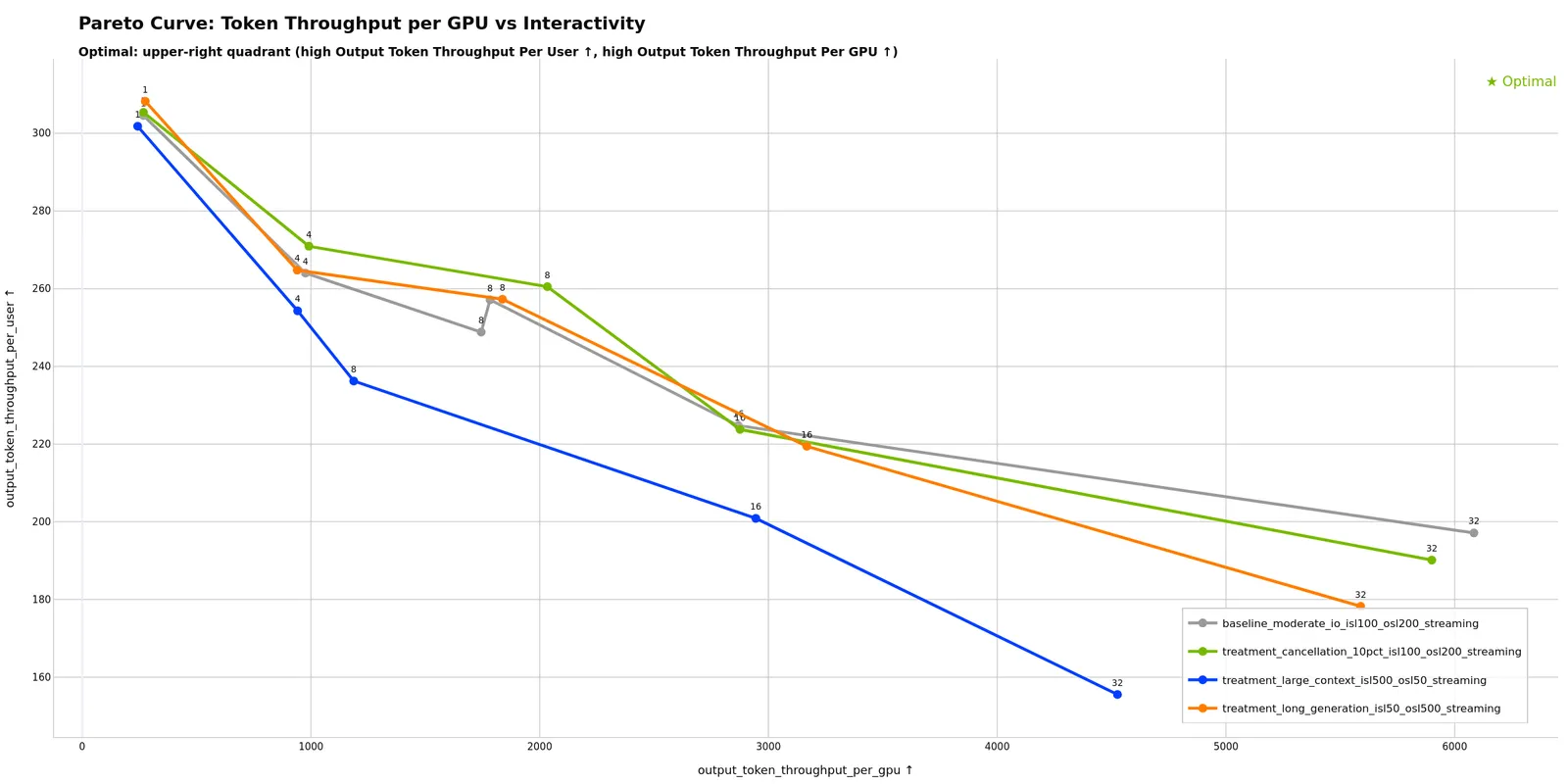
Theme Options
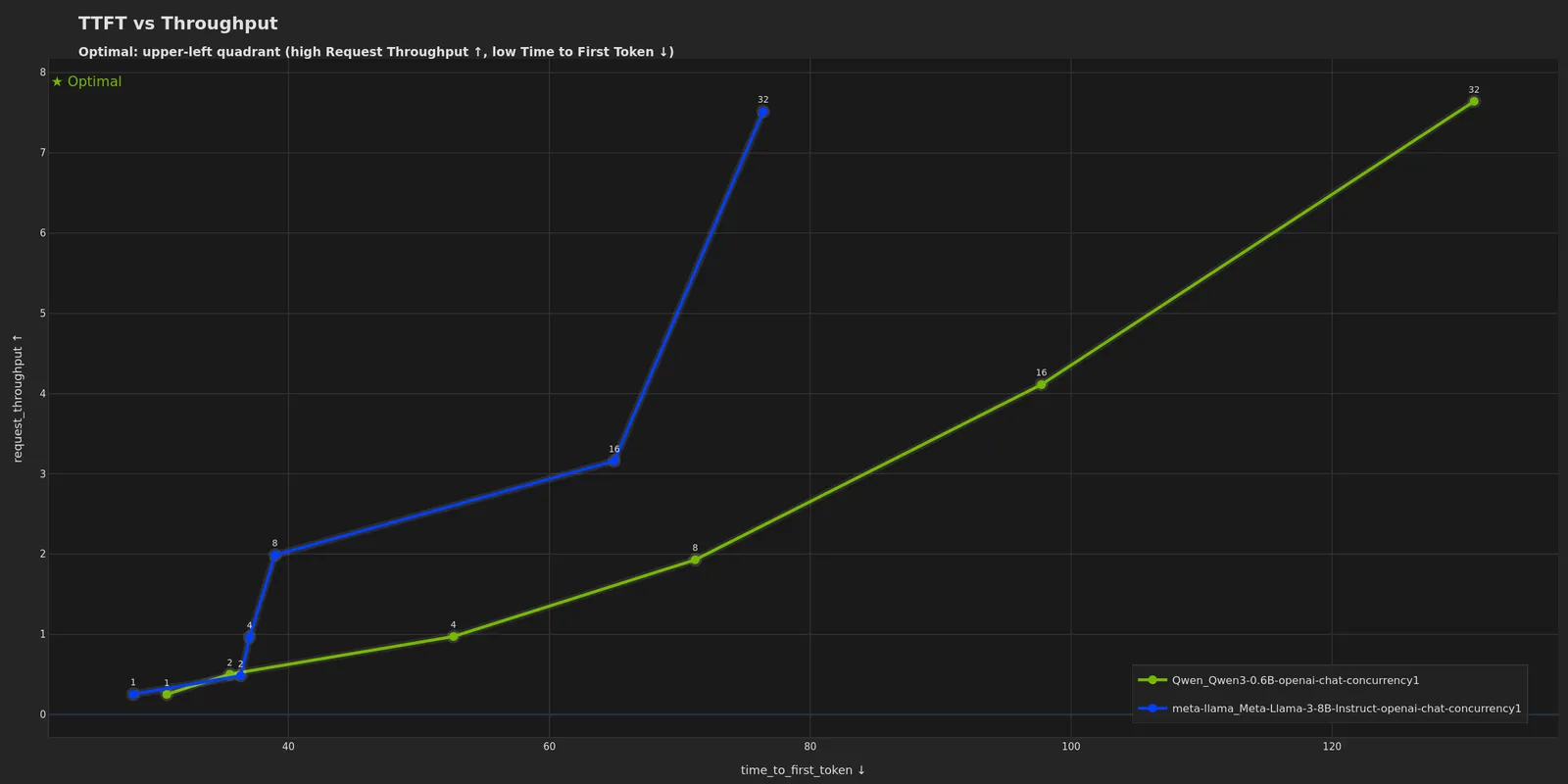
The dark theme uses a dark background optimized for presentations while maintaining NVIDIA brand colors.
Multi-Run Dark Theme
Single-Run Dark Theme
Interactive Dashboard Mode
Launch an interactive localhost-hosted dashboard for real-time exploration of profiling data with dynamic metric selection, filtering, and visualization customization.
Key Features:
- Dynamic metric switching: Toggle between avg, p50, p90, p95, p99 statistics in real-time
- Run filtering: Select which runs to display via checkboxes
- Log scale toggles: Per-plot X/Y axis log scale controls
- Config viewer: Click on data points to view full run configuration
- Custom plots: Add new plots with custom axis selections
- Plot management: Hide/show plots dynamically
- Export: Download visible plots as PNG bundle
The dashboard automatically detects visualization mode (multi-run comparison or single-run analysis) and displays appropriate tabs and controls. Press Ctrl+C in the terminal to stop the server.
The dashboard binds to 127.0.0.1 by default and requires no authentication. For remote access, either bind on all interfaces with aiperf plot --dashboard --host 0.0.0.0 --port 9000 (only on trusted networks) or use SSH port forwarding: ssh -L 8050:localhost:8050 user@remote-host
Dashboard mode and PNG mode are separate. To generate both static PNGs and launch the dashboard, run the commands separately.
Advanced Features
GPU Telemetry Integration
Multi-run plots (when telemetry available):
- Token Throughput per GPU vs Latency
- Token Throughput per GPU vs Interactivity
Single-run plots (time series):
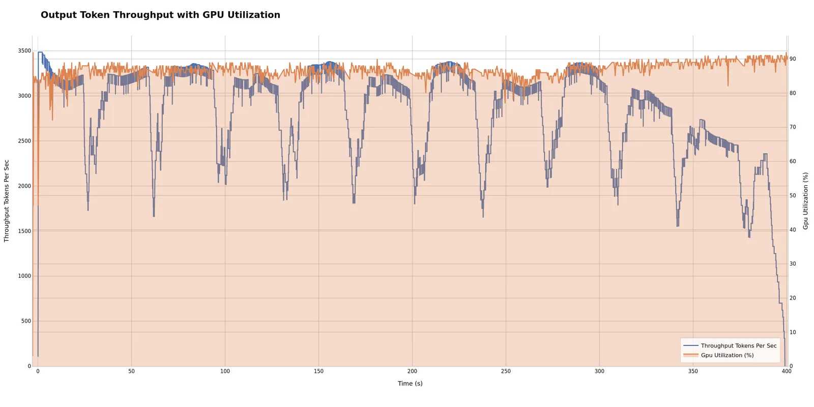
Correlates compute resources with token generation performance. High GPU utilization with low throughput may suggest compute-bound workloads (consider optimizing model/batch size). Low utilization with low throughput can indicate bottlenecks elsewhere (KV cache, memory bandwidth, CPU scheduling). Potentially useful for targeting >80% GPU utilization for efficient hardware usage.
Timeslice Integration
When timeslice data is available (via --slice-duration during profiling), plots show performance evolution across time windows.
Generated timeslice plots:
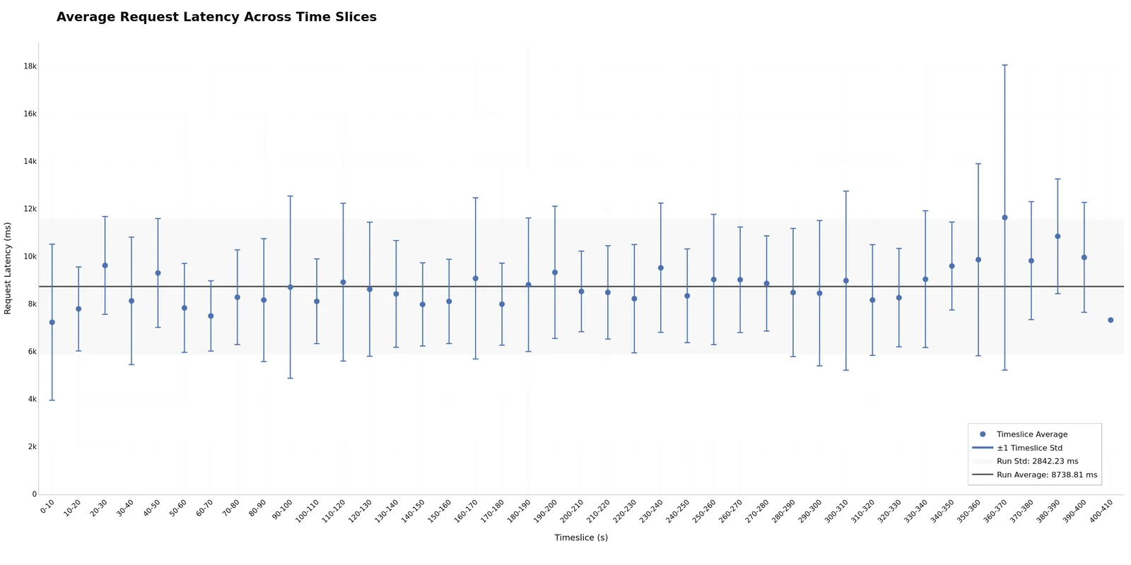
Timeslices enable easy outlier identification and bucketing analysis. Each time window (bucket) shows avg/p50/p95 statistics, making it simple to spot which periods have outlier performance. Slice 0 often shows cold-start overhead, while later slices may reveal degradation. Flat bars across slices may indicate stable performance; increasing trends can suggest resource exhaustion. Potentially useful for quickly isolating performance issues to specific phases (warmup, steady-state, or degradation).
Output Files
Plots are saved as PNG files in the output directory:
Best Practices
Consistent Configurations: When comparing runs, vary only one parameter (e.g., concurrency) while keeping others constant. This isolates the impact of that specific parameter.
Use Experiment Classification: Configure experiment classification to distinguish baselines from treatments with semantic colors.
Include Warmup: Use --warmup-request-count to ensure steady state before measurement, reducing noise in visualizations.
Directory Structure: Ensure consistent naming - runs to compare must be in subdirectories of a common parent.
GPU Metrics: GPU telemetry plots only appear when telemetry data is available. Ensure DCGM is running during profiling. See GPU Telemetry Tutorial.
Troubleshooting
No Plots Generated
Solutions:
- Verify input directory contains valid
profile_export.jsonlfiles - If you used
--profile-export-fileor--profile-export-prefixduring profiling, the output files have non-default names and will not be detected by the plot command. Re-run without custom export file options, or rename files to match the defaults (profile_export.jsonl,profile_export_aiperf.json) - Check output directory is writable
- Review console output for error messages
Missing GPU Plots
Solutions:
- Verify
gpu_telemetry_export.jsonlexists and contains data - Ensure DCGM exporter was running during profiling
- Check telemetry data is present in profile exports
Incorrect Mode Detection
Solutions:
- Check directory structure:
- Multi-run: parent directory with multiple run subdirectories
- Single-run: directory with
profile_export.jsonldirectly inside
- Ensure all run directories contain valid
profile_export.jsonlfiles
Related Documentation
- Working with Profile Exports - Understanding profiling data format
- GPU Telemetry - Collecting GPU metrics
- Timeslices - Time-windowed performance analysis
- Request Rate and Concurrency - Load generation strategies