

Custom Dashboards#
GPU Dashboard#
The GPU Dashboard sources its data from two sources: BCM and NVIDIA DCGM Exporter. BCM provides over-arching health metrics related to GPUs while DCGM metrics provide real-time visibility into the GPU utilization, thermal health and memory usage across a GPU enabled Kubernetes or Slurm cluster. Customers can leverage the GPU Metrics Dashboard to monitor cluster health, identify performance bottlenecks, and troubleshoot issues in production environments. The table below describes each key metric displayed in the dashboard:
Table 1. Overview of visualizations in the GPU Dashboard
Metric Name |
Description |
|---|---|
GPU Health Metrics for All Nodes - BCM Required |
|
GPU Overall Health |
Aggregates GPU health parameters to display a quick visual status: green for healthy, red for issues, enabling efficient cluster-wide GPU monitoring and troubleshooting |
GPU NVLink Health |
Monitors NVLink health for each GPU, showing green for functional links and red for issues |
GPU Power Health |
Monitors GPU power health, showing green for optimal power levels for the chip and red for anomalies |
GPU Memory Health |
Monitors GPU memory health where green indicates normal operation and red for issues |
DCGM GPU Metrics |
|
GPU Temperature |
Monitors thermal health of the device – temperature of each GPU in Celsius |
GPU Average Temperature |
Gauge visualization showing average GPU temperature across all GPUs over the selected time window |
GPU Power Usage |
Time-series plot showing power consumption of each GPU in Watts. Useful for energy efficiency monitoring |
GPU Power Total |
Gauge showing the total power usage across all GPUs in the cluster at a given time |
GPU SM Clocks |
Time-series plot of the Streaming Multiprocessor (SM) clock speeds in Hertz (Hz) indicates GPU core frequency |
GPU Utilization |
Percentage utilization of the GPU cores to measure how busy the GPU is while processing workloads |
GPU Framebuffer Memory Used |
Tracks the amount of GPU framebuffer memory (VRAM) is currently in use. This is important for memory-bound workload monitoring |
Tensor Core Utilization |
Percentage of time the GPU Tensor Cores are actively used. This is useful for monitoring AI/ML workloads leveraging tensor cores |
Note
Since BCM provides overall metrics, the filters at the top of this Dashboard only apply to the DCGM metrics and not to the BCM metrics
The JSON template for this dashboard is available as GPU Dashboard in the Enterprise RA GitHub repository.
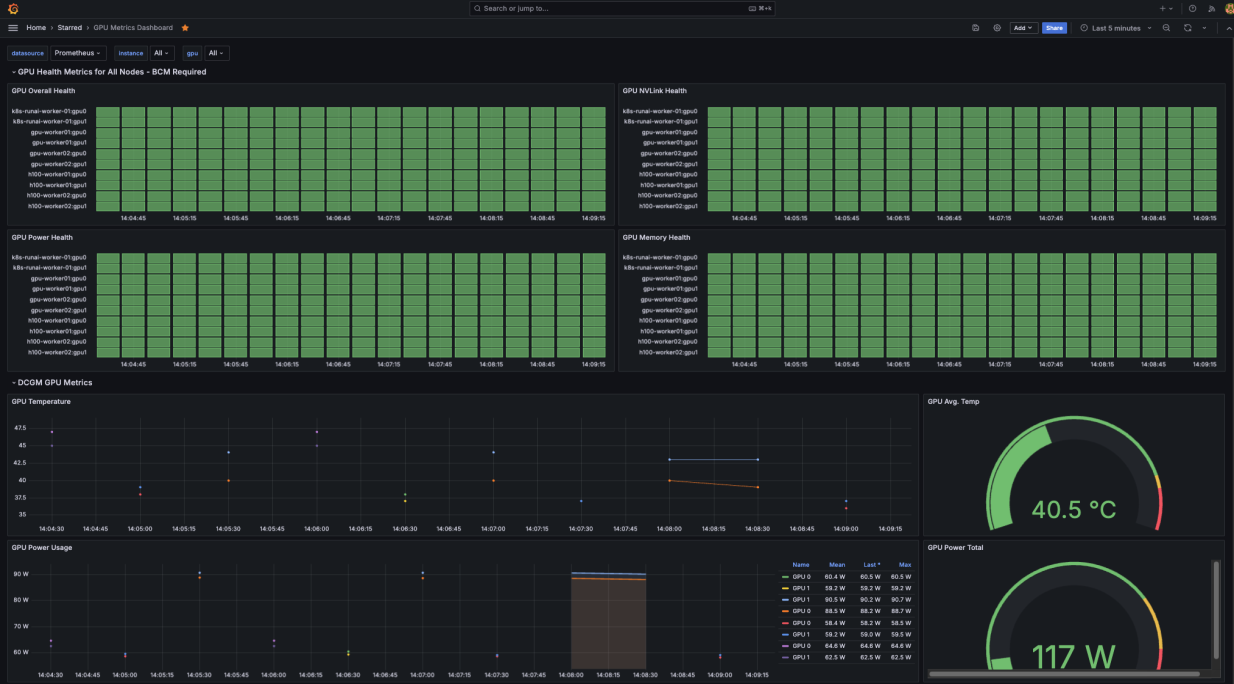
Figure 12 GPU Dashboard showing GPU health metrics from BCM and DCGM telemetry#
NIMs Dashboard#
The NIMs Dashboard offer enterprise customers visibility into the operational behavior of their LLM inference services, allowing them to tune performance and respond to anomalies swiftly. Metrics such as latency and KV Cache Utilization.
Table 2. Overview of visualizations in the NIMs Dashboard
Metric Name |
Description |
|---|---|
Time to First Token (TTFT) p50 |
Median latency between the request submission and the first token being generated – this indicates how quickly the model starts responding |
Inter-Token Latency (ITL) p50 |
Median time delay between consecutive tokens being generated during inference. This helps assess token generation speed |
Throughput |
Measured in tokens/second, this metric highlights the number of tokens generated per second. Higher throughput indicates efficient model serving |
Context versus Generated Tokens |
Pie chart that shows the ratio of prompt (context) tokens versus generated tokens in inference requests. This helps customers understand the load characteristics |
Prompt Tokens |
Time-series chart of the number of prompt token received by the model instance per request |
Generated Tokens |
Time-series chart of the number of tokens generated by the model instance per request |
Time to First Token (TTFT) Heatmap |
Heatmap showing the spread of TTFT latencies across requests over time. This helps in spotting latency spikes in production |
Inter-Token Latency (ITL) Heatmap |
Heatmap showing the spread of ITL latencies across requests over time. Helps identify token generation delays |
KV Cache Utilization |
Percentage of GPU’s Key-Value (KV) Cache usage. KV Cache is an optimization where the LLM ‘remembers’ previous computations in GPU memory. This way for a request prompt or token, the model can generate tokens faster. Higher utilization could indicate memory bottlenecks |
Requests per second |
Rate of incoming inference requests per second which helps in identifying traffic patterns |
Requests Waiting |
Number of requests waiting to be processed. Higher values may indicate overloads or bottlenecks |
Requests Running |
Number of inference requests currently being processed – this helps understand active request concurrency |
The JSON template for this dashboard is available as NIMs Dashboard in the Enterprise RA GitHub repository.
Kubernetes Global Dashboard#
The Kubernetes Global Dashboard provides a comprehensive view of operational health and performance of the Kubernetes cluster. It consolidates key metrics across cluster resources, workloads, and networking to give operators clear visibility into current state. At a glance, you can monitor the health of core components, including pods, namespaces and nodes. Workload level insights show both CPU and memory consumption across deployments, daemonsets and statefulsets, helping pinpoint high resource consuming services or potential scaling concerns.
The filters in this dashboard do not apply to the “Overall Health” tab and only to the “Workload Breakdown”
Table 3. Overview of visualizations in the Kubernetes Global Dashboard
Metric Name |
Description |
|---|---|
Overall Health |
|
Pods Running |
Number of currently active pods across all namespaces |
Pods Pending |
Number of pods in a pending state, awaiting resource allocation or scheduling decisions. High counts may indicate resource bottlenecks |
Namespaces |
Counts distinct Kubernetes namespaces |
Nodes |
Number of worker nodes in the Kubernetes cluster |
Kubernetes Node Status |
Real-time health status of each node. Green signifies nodes are operational and healthy. Red signifies they are not |
Kubernetes Resource Count |
Snapshot of Kubernetes objects -running pods, config maps, PVCs, nodes and ingresses. Helps tracks the overall cluster composition |
CPU Usage by Namespace |
Helps identify which teams, users or applications are consuming the most compute resources, allowing for deeper analysis in the Workload Breakdown section |
Memory Usage by Namespace |
Helps identify which teams, users or applications are consuming the most memory, allowing for deeper analysis in the Workload Breakdown section |
Workload Breakdown |
|
CPU Usage by Workload |
Tracks CPU Utilization by each workload (deployment, daemonset, statefulset) |
CPU Usage by Pod |
Granular view of CPU consumption at the pod level – identifies which specific pods are consuming the most CPU |
Memory Usage by Workload |
Memory consumption by each workload |
Memory Usage by Pod |
Memory usage for individual pods, useful for spotting memory-intensive pods that may need reconfiguration |
The JSON template for this dashboard is available as Kubernetes Global Dashboard in the Enterprise RA GitHub repository.
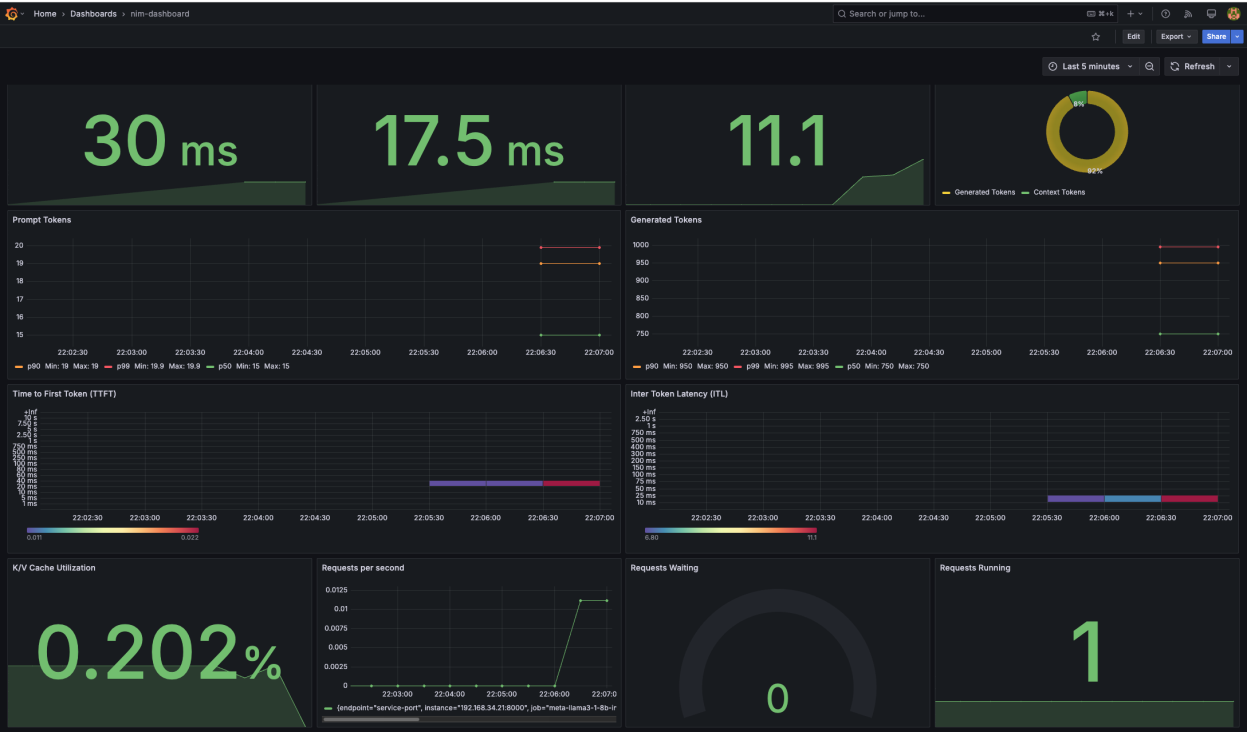
Figure 13 Kubernetes Global Dashboard showing overall cluster health and workload breakdown#
CPU & Node Storage Dashboard#
The CPU & Storage Dashboard provides system-level visibility into CPU performance, memory utilization and storage health of bare-metal nodes. It is designed to give enterprise operators an understanding of CPU and storage related bottlenecks. BCM is leveraged here to provide the overall node health status and hence warrants the BCM Node filter at the top. The CPU metrics and Storage metrics sections rely on the Instance dropdown at the top to filter the graphs.
Table 4. Overview of visualizations in the CPU & Storage Dashboard
Metric Name |
Description |
|---|---|
Node Health – BCM Required |
|
Node Status |
Based on BCM’s device status flag, it gives you the general health of the node |
CPU metrics |
|
Average CPU Utilization |
Displays the average percentage of CPU capacity being used across all monitored nodes |
Average CPU Temperature |
Shows the real-time average temperature of CPU cores across nodes |
Average CPU Idle Time |
Percentage of time the CPU was idle – higher values indicate less workload on the CPU |
Average CPU System Time |
Percentage of CPU time spent on kernel level operations |
Average CPU User Time |
Percentage of CPU time spent on user processes (applications) |
Memory Usage |
Real-time memory consumption across monitored nodes – helps in identifying memory bottlenecks |
Node Storage metrics |
|
Disk Read Time Latency |
Measures the time taken to complete disk read operations for each disk device on the cluster |
Disk Write Time Latency |
Measures the time taken to complete disk write operations for each disk device on the cluster |
Disk I/O Time |
Shows the total time spent on I/O operations for each disk device. High I/O time may indicate disk contention |
Disk Utilization |
Displays the percentage of disk space used across storage devices – helps monitor capacity |
The JSON template for this dashboard is available as CPU & Storage Dashboard in the Enterprise RA GitHub repository.
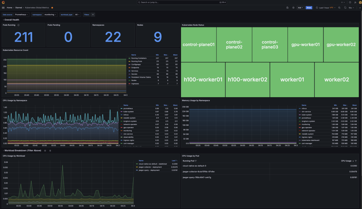
Figure 14 CPU & Node Storage Dashboard showing node health, CPU metrics and storage metrics#
Network Dashboard#
The Network Dashboard provides switch level visibility into link health, traffic patterns, and routing status across the fabric. It is designed to help operators quickly determine whether all spines are exporting telemetry correctly, whether links are up and stable, and whether BGP routing tables are populated as expected. The Inventory section shows which switches are exporting telemetry, their peak port bandwidth, and Cumulus Linux versions. Link Summary panels track link status, link down events, and symbol errors, while Routing panels report BGP peer state and routes per VRF to confirm control plane health.
Metric Name |
Description |
|---|---|
Switch & Stats Health |
|
Reachable & Unreachable Switches |
Shows how many switches are currently reachable and how many are down so you can see overall fabric availability at a glance. |
Stats from Live Switches |
The Live Switches panels provide a quick check that telemetry is flowing from every device: Interface Stats shows how many switches export interface metrics, Routing Stats shows how many export BGP and RIB metrics, and Link Stats shows how many export link health metrics |
Stats from Live Switches - Timeline |
Plots over time how many switches have active Interface, Routing, and Link Stats so you can see gaps in telemetry |
Switch & Interface Performance |
|
CPU Utilization by Switch (%) |
Tracks per-switch CPU usage over time to reveal overload or abnormal spikes |
Memory Utilization by Switch (%) |
Tracks per-switch memory usage over time to catch leaks before it impacts forwarding |
Aggregate Bandwidth (Gbit/s) |
Shows total transmit bandwidth across all monitored ports on each switch to highlight traffic spikes and sustained load |
Aggregate Interface Errors (errors/sec) |
Sums interface error rates per switch so you can quickly see if any box is seeing physical or link-layer problems |
Interfaces Up per Switch |
Shows, per switch, the number of interfaces that are currently up and participating in the network |
Link Down Events |
Charts the number of link down occurrences over time to reveal flapping links or maintenance windows |
Routing Information |
|
BGP (IPv4 + IPv6) Routes Received per Switch |
Shows, per switch, the total number of IPv4, and IPv6 learned from BGP peers that are up |
EVPN Prefixes Received |
Shows, per switch, how many EVPN control-plane routes (MAC/IP/VNI information) are currently learned from peers |
BGP Peer States per Switch |
Summarizes, for each switch, how many BGP peers are in Established, Active, or Idle state so you can spot broken sessions |
Number of Routes BGP per VRF |
Shows how many BGP routes are installed per VRF on each switch to validate routing table population |
BGP Peer Status |
Summarizes each switch’s BGP peers, their current state, and VRF to confirm control‑plane health |
Switch Software |
Lists each switch and its Cumulus Linux version to verify software consistency across the fabric |
The JSON template for this dashboard is available as Network Dashboard in the Enterprise RA GitHub repository.
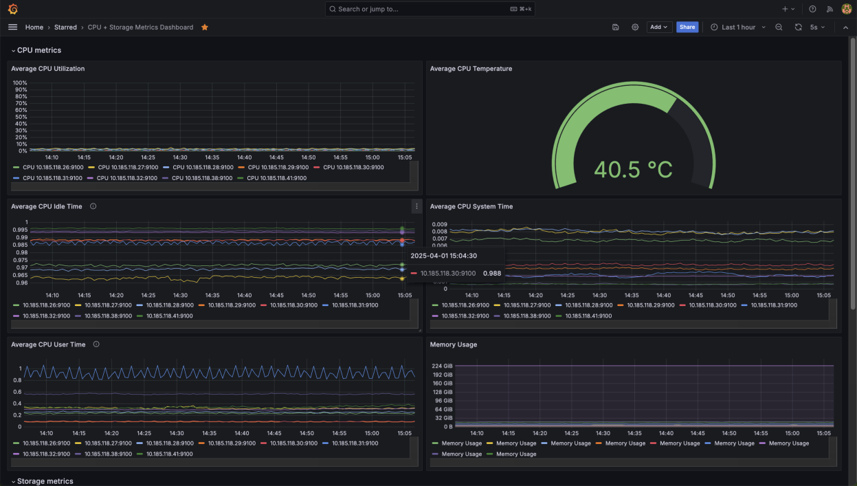
Figure 15 Network Dashboard showing switch health, interface performance and routing information#
In a converged network topology (like the one used in creating the dashboard above), traffic between two switches can be validated using iperf3 to confirm consistent bandwidth and data flow across the fabric. For example, if two servers have IPs 10.183.117.154 and 10.183.117.159, start the receiver with iperf3 -s on .159, then run iperf3 -c 10.184.181.159 -t 600 from .154 to generate a continuous ten‑minute traffic stream between the two endpoints.
During the test, the source console displays transfer rates and bitrates per second, while the Max Port Bandwidth (Gbit/s) panel in Grafana will show corresponding activity spikes, confirming that traffic is being transmitted successfully through and across the switches.
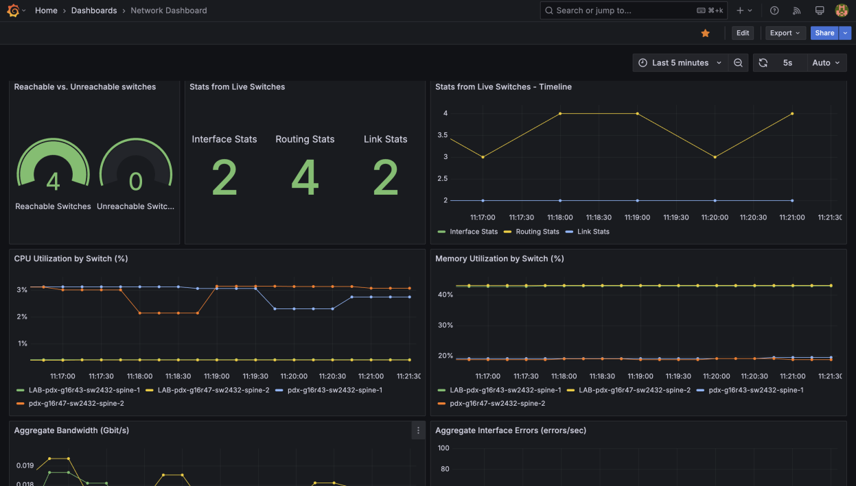
Figure 16 Network Dashboard showing Max Port Bandwidth activity spikes during an iperf3 traffic test#