Composer
The Composer is an GUI application designed to create AI Application pipeline through an easy-to-use graphic interface, reducing the complexity of application development significantly and thus reducing time to market.
The Composer is based on the Omniverse SDK which provides a highly responsive hardware-accelerated GUI.
User Interface
The user interface contains the following windows:
User Interface |
Description |
|---|---|
Graph Editor Window |
Used to edit/create graphs, multiple windows can be created. |
Node Template Window |
Used to create nodes from saved templates. |
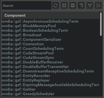
Component List Window |
Displays list of available components from Registry. |
Details Window |
Shows the details on any selected object. |
Console Window |
Display the console output |
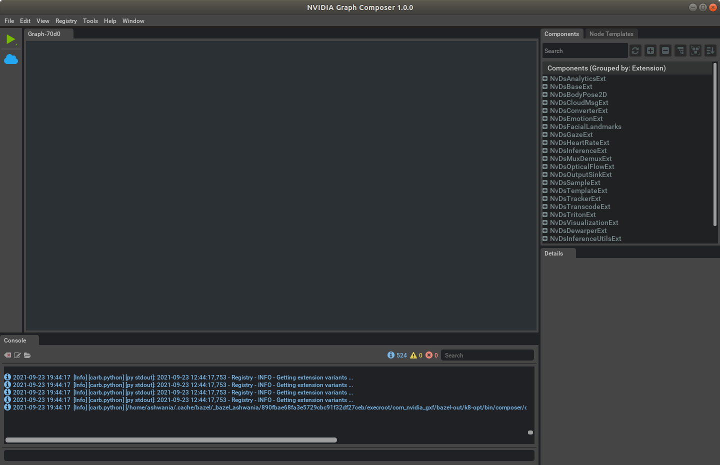
Tool Bar |
Tool buttons for miscellaneous features |
Toolbar
Toolbar on the side of the main window contains current graph related functions.
Menu Items |
Action |
Hot key |
|---|---|---|
Run Graph |
Run current graph on local or remote machine |
|
Stop Graph |
Stops the execution of the currently running graph |
|
Container Builder |
Build container for x86 or aarch64 |
Component List
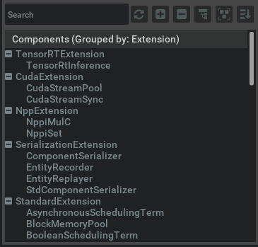
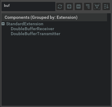
The component list window shows the information of all the available components in various extensions, which are fetched from the remote registry and could be used to build different graphs by the user. By default, the list is showed in a two-level hierarchical view grouped by extensions, and there are several buttons that allow users to switch the view on their purposes. In addition, there is a search bar for users to find their needed components by just typing the component name, the result comes up immediately after filtering the inputs:
Buttons |
Image |
Options |
Action |
|---|---|---|---|
Refresh |

|
N/A |
Refresh the list to synchronize with the remote registry |
Expand All |

|
N/A |
Expand all the groups |
Collapse All |

|
N/A |
Collapse all the groups |
Flat/Tree View Toggle |

|
N/A |
Toggle between the tree view and the Flat view |
Group by |

|
|
Choose how to group the components |
Sort By |

|
|
Choose how to sort the components |
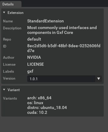
You can choose a component from the Component List by a left click on the mouse to display the detailed information of that component in the Details window. The details include the component type, description, details of the extension which includes the component, and the details of the properties supported by the component. The Component List supports direct Drag and Drop, allowing users to create an instance of a specific component in a graph by simply dragging it from the list and dropping to the canvas or a destination node in the graph. If you drops it to the canvas, a default node will be created automatically to accommodate the instance and its input and output port will be initialized as much as possible.
Create New Application
Navigate to the File menu from the main window menu bar and choose New Graph.
An empty graph window is created and displayed in the graph editor workspace.
You may create multiple graph editor windows to work on different graphs simultaneously.
Open and Save Application Graphs
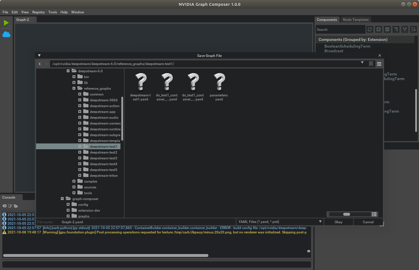
To save the current graph, use the ‘File’ menu and choose Save the Graph (Ctrl + S) or Save the Graph as (Shift + Ctrl +S), if the graph has never been saved before or you want to save it to a different file.
A file browser dialog pops up prompting you to pick a path in the file system.
Compose an Application Graph
Finding the right component
Components are grouped by extensions. Information of a specific component and the extension can be found in the details window if you click on the corresponding item showed in the Component List, including its type, the purpose, and supported properties. With the search bar on the top of the Component List window, you can also filter out the candidate components.
By choosing the versions from the Version list, the extension with a specific version will be loaded.
From Composer perspective, a Component falls into one of the 3 categories below based on the role it plays in the graph:
Component Type |
Description |
Example |
|---|---|---|
Primary Component |
Compute Components which are executed by scheduler. |
Decoder |
Secondary Component |
Used by primary components for data exchange, config, scheduling rules. |
SinkPad |
Connection Component |
Responsible to connect input and output components |
Connection |
Subgraph Component |
Used to load a subgraph |
Subgraph |
Before creating an AI Application graph, a user should always figure out what kind of primary components are needed. Only after all the primary components have been properly picked, a user could consider initializing them and then setting up connections.
The component within an entity has two parts:
The header - Displays the name of the component, which is its type by default. Double-click on the header to change its name.
One or more handles - They are displayed under the header part if the component can link to the other components. Number of supported handles, the type and names of those handles are all predefined by the component type.
Creating a Component Instance
Steps to create component instances:
Using Drag and Drop
To add a new component instance to a graph, find the type of the component from Component window and drag and drop it to the graph editor window.
If the component is dropped to the vacant area an entity will be added automatically to contain the component
If the component is dropped to an existing entity it is going to be added to that entity.
Using New empty node
You can also choose to first create an empty node by right-clicking on the canvas and choosing New Empty Node, then drag and drop a component to the node. You must manually initialize all the handles of the instance if it is a primary component.
Using Context Menu
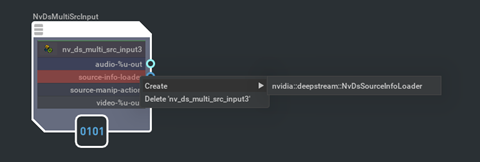
Select Create from the context menu of a handle, which only works for secondary components. Since the compatible components have already been filtered for the specific handle, the list becomes much shorter and it is always recommended to create secondary components including Input and output components in this way.
Understanding the Component Handles
A component can have handles which allows it to interact with other components. Essentially a handle is a special property supported by the component, which is associated with a specific component type. To make a handle functional, you’ll need to initialize it first, based on its type.
There are some special handles called Input and Output handles who manage the data exchange of a component, and to enable data exchange of a component a user needs to initialize them with appropriate Input and Output components.
Linking and Unlinking components
There are two options for a user to initialize a Handle: one is through its context menu, which is mentioned above; the other one is using Link. The Link operation can be done by dragging and dropping a curve from the handle to its required component, which means the required component must be created at first. As a reverse operation, Unlink operation turns a handle back to uninitialized state, which can be invoked through the context menu of the handle.
Note
One handle can only be initialized with (or linked to) one component instance at the same time
Steps to link or unlink the components:
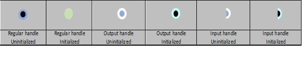
To link two components, left-click with your cursor on an output port (the full circle) in one component and drag a curve to the input port (the half circle) of another component.
Links can only be set up among compatible components, which means the type of the link source must be the same type or the base type of a link target.
To see the port type, hover the mouse cursor on the port.
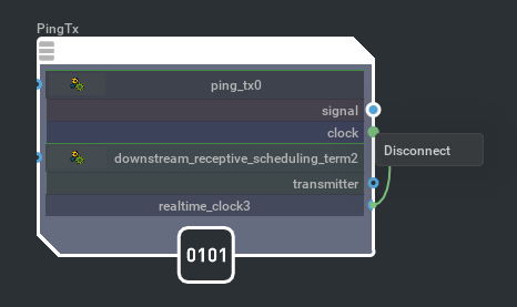
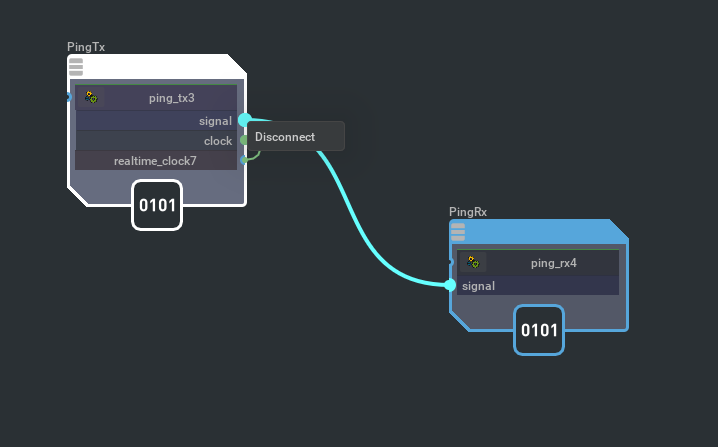
To remove the link, right-click on either end of the link and choose Disconnect.
Node
A node is the container of a set of components who work together to get certain tasks done. Usually there is one primary and several secondary components required by the primary one, including the input, output, and others. An empty node can be created through context menu triggered by a right click on the canvas, and an existing node can be deleted from File Menu, the Context Menu of the node or the corresponding hot key.
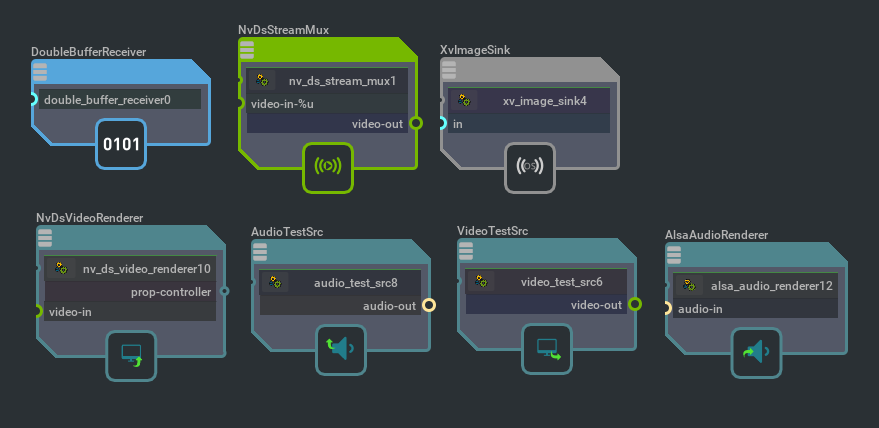
Nodes can be categories based on the roles and types of the components contained inside, different category of nodes will be showed in different style:
Node Category |
Description |
Example |
|---|---|---|
Standard |
Standard components |
DoubleBufferReceiver |
Deepstream |
Provided by Deepstream SDK |
NvDsStreammux |
Opensource |
Provided by the opensource community such as Gstreamer |
XvImageSink |
Video Input |
Serving as a video source |
VideoTestSrc |
Audio Input |
Serving as an audio source |
AudioTestSrc |
Video Output |
Serving as a video sink |
NvDsVideoRenderer |
Audio Output |
Serving as an audio sink |
AlsaAudioRenderer |
Setting up a Connection from an Input to an Output
A connection represents the data flow from an input component to an output one, and it can be created when a user drags a curve from an output and drop it to a compatible input. It is important to understand that the input and the output of a connection must be compatible, that is to say, the type of data from the output to the input must be exchangeable. Connections can only be set up between two different nodes. Multiple connections are allowed on a single input or output. To remove connections on an Input or Output, users can use the “Disconnect” from the context menu by right clicking on the Input or Output.
Changing the Component Properties
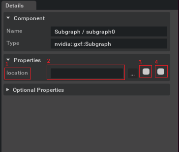
To select a component, left or right-click on a component or its handles in the graph editor. This displays the component information including its properties in the detail window accordingly, where you can make changes on any writable property. It displays the property name [1], the text field [2] to edit the property, the check box [3] to export a file property to a resource file and another check box [4] to export the property to a different yaml file.
Editor Features
Zoom and Pan the Canvas
The scroll wheel of the mouse enables zoom in and zoom out. Left click on the mouse is used to pan the canvas.
Copy, Cut and Paste
Before doing a Copy or Cut, first select a instance from a graph editor, then trigger the operation through Edit menu or corresponding hot key. Copy and Cut is supported for both component instances and node instances in the graph editors. Either operation creates a copy of the instance. When the copy of a node is created, all the components inside the node will be created accordingly preserving their relationship. There is a global clipboard in the Composer where a copied instance (a component or a node) is kept temporarily. When a Paste command is triggered the instance in the clipboard will be added back to the graph. To paste a component instance, the user needs to choose the destination node first, otherwise the Paste fails.
Undo and Redo
Undo and Redo are supported for following commands:
New Node
New Component
Link a Handle
Unlink a Handle
Set up a Connection
Disconnect an Input/Output
Delete a Node
Delete a Component
Rename a Node
Rename a Component
Debug View
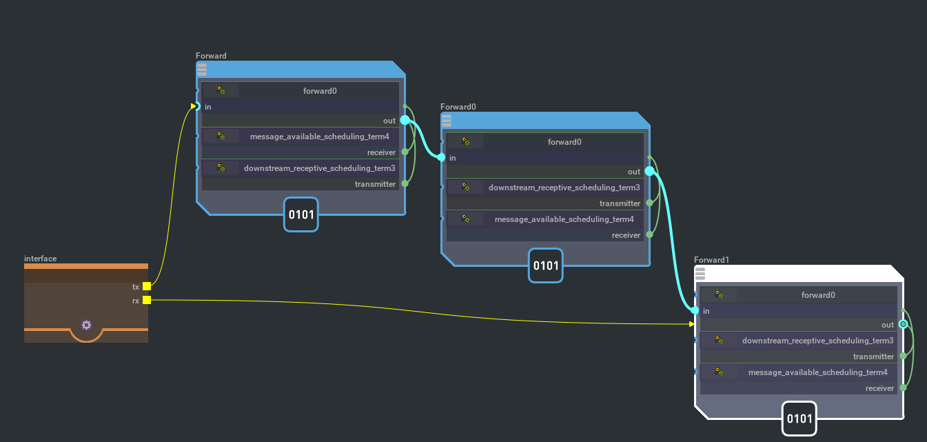
The composer provides an option for users to turn on the debug view on the graph, which represents the graph in the exact same topology its implementation architecture. In the debug view all the abstractions used for visualization simplification have been restored to their raw structures:
Connections be expanded to a standalone node with a connection component inside, whose handles be linked to an input component and an output component.
Connections cannot be set up from an Output to an Input directly, even after both of them have been linked to some Input and Output components
Debug view is useful in inspecting your graph if you notice anything abnormal.
Subgraph
Introduction of the Subgraph concept increases the modularity and reusability of Component based programming significantly. Subgraph is nothing different from a regular graph except that it has exported interfaces which allow it to be re-used in other graphs, and a subgraph itself can also use other subgraphs.
When a subgraph is used in other graphs, it will be abstracted as a “Subgraph” type component inside a subgraph node, only the exported interfaces are showed in the same node with all the other details being concealed. Components in the parent graph can interact with the subgraph through those interfaces.
Creating a Subgraph
There is not too much difference between creating a regular graph and a subgraph. After creating a regular graph the user can export interfaces so that the graph can be used as a subgraph in other graphs. To export interfaces, the user need to add an interface node from the context menu by right clicking on the canvas. Then if the user right click an the newly created interface he or she can add interfaces from the context menu of that interface node. After adding interfaces the user can point them to the actual component which is to be exported by dragging a connection from the interface to the target component. To make the exported interfaces effective the graph file needs to be saved.
Using a Subgraph
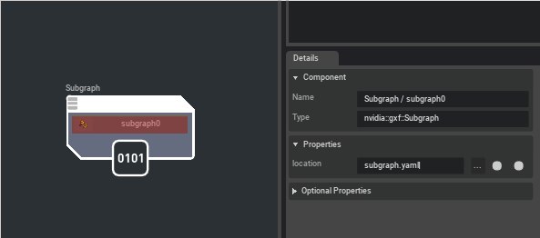
In order to use a subgraph in the current graph, the user needs to create a empty node and put a ‘Subgraph’ Component into it (He/She can also drag and drop a ‘Subgraph’ component to the canvas directly and the container node will be created automatically). By default the subgraph is empty without the ‘location’ parameter being set. The user can change the ‘location’ from the detail window of the subgraph component. Once the ‘location’ is updated the corresponding subgraph file will be loaded and exported interfaces will appear in the subgraph node that allow other component to use them.
Viewing a Subgraph
A double-click on the subgraph component will trigger a switch of the current graph view to the subgraph view, where the internal details of the subgraph is displayed. A navigation bar will show up on the top of the graph window once a subgraph view is activated so that the user can switch the view between subgraphs and their parent graph.
Run Graph
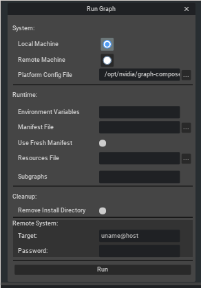
A Graph can be run through Composer using the Play button on the toolbar. Output of the running graph can be seen on the console window. A running graph can be stopped using the Stop button on the toolbar.
Options
System Options
Options |
Description |
Range |
|---|---|---|
Local Machine |
Run Graph on Local Machine |
|
Remote Machine |
Run Graph on Remote Machine |
|
Platform Config File |
Select a platform config file. For x86_64, Default value
is |
Required |
Runtime Options
Options |
Description |
Range |
|---|---|---|
Environment Variables |
Separated List of environment variables to be set before running the graph |
Optional |
Manifest File |
Use an existing manifest file |
Optional |
Use Fresh Manifest |
Re-install graph and generate a manifest file |
Optional |
Resources File |
Use a existing resources file. If not specified, tool will generate a temp resources file in /tmp/ |
Optional |
Remove Install Directory |
Remove graph install directory during exit |
Optional |
Subgraphs |
Comma separated list of paths to subgraphs used by the graph. Paths can be absolute or relative to the main graph. |
Optional |
Remote Machine Options
Options |
Description |
Range |
|---|---|---|
Target |
Address of the remote machine uname@host |
Required when Remote Machine is selected |
Password |
Password of the remote machine |
Required when Remote Machine is selected |
Note
To run graph on the remote machine, install the following packages:
openssh-client
sshfs
Also generate a ssh key pair using ssh-keygen.
Build Container Image
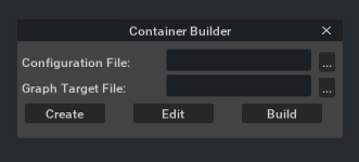
A container image can be build through the Composer using the Docker button on the toolbar.
Options
Runtime Options
Options |
Description |
Range |
|---|---|---|
Configuration File |
Select a Container Builder configuration file |
Required |
Platform Config File |
Select a platform config file |
Required |
Buttons
Options |
Description |
|---|---|
Create |
Create a new Container Builder Config File using a template |
Edit |
Edit an existing Container Builder Config File |
Build |
Build the Container |
Generate Gstreamer Extension
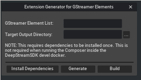
Note
If the Deepstream reference graph package is not installed, Generate Extension button will be disabled.
Options
Options |
Description |
Range |
|---|---|---|
GStreamer Elements List |
Comma Separated Elements List |
Required |
Target Output Directory |
Directory where the extension will be generated |
Required |
Buttons |
Description |
|---|---|
Install Dependencies |
Install extension development dependencies |
Generate |
Generates the extension |
Build |
Builds the extension using Bazel |
Restrictions
The Composer is well supported only on NVIDIA GPU setup