Customization#
Overview#
This guide will walk you through how to create your own custom UI design with Tokkio. By the end of this guide, you will be able to understand the different customization options available, and implement a customized UI for your use case.
Customization Options#
There are several ways to create a custom UI depending on the level of customization required:
Show custom multimodal content sent by the ACE Controller
Create a custom layout in the Tokkio reference UI
Create a new UI from scratch
Embed the Tokkio UI in another website as an iframe
For the first option, see the Adding Custom Multimodal Content section.
For the second option, refer to the Creating a Custom Layout section.
For the third option, visit the Creating a Custom UI From Scratch section.
For the fourth option, refer to the Embedding the UI Into Another Website section at the bottom of this page.
Adding Custom Multimodal Content#
Overview#
This section will show you how to add custom multimodal content to the Tokkio UI. This is useful if you want to show custom content in the UI such as a custom image, video, or text based on the response from a RAG, Agent, or other AI service used in the Tokkio application.
Prerequisites#
This will require a custom implementation of the ACE Controller. If you haven’t already done so, see the Local Developer Workflow Method section for information on how to set up a local ACE Controller for development. This section will also require a basic understanding of Pipecat, which is the framework used to construct the ACE Controller pipeline.
What is Available#
The Tokkio UI can show custom multimodal content sent by the ACE Controller without changing the UI code. The UI is capable of showing the following types of multimodal content in any order as modular components stacked on top of one another:
Header
Image
Image With Text
Hint Carousel
Paragraph
Table
Text Input
List of Selectable Options
Buttons
These components are referred to as Blocks in the documentation and code.
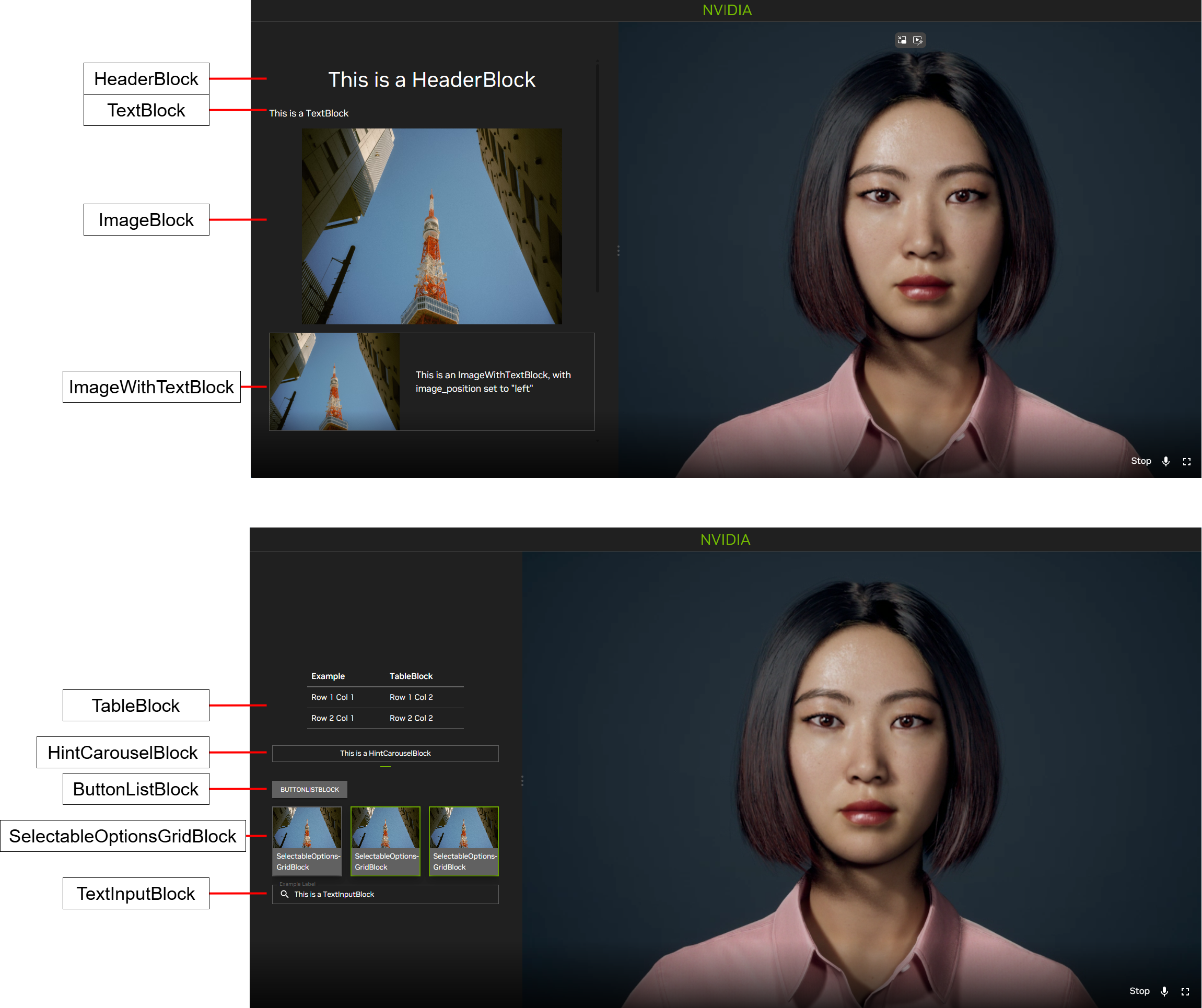
Tokkio UI Custom View#
Setting Up the Multimodal Content#
Note
Check out the documentation embedded in the ACE Controller code for detailed information on what multimodal content can be sent by the ACE Controller and how to set up the Custom View blocks. The Tokkio implementation of the ACE Controller contains a CustomViewProcessor in the pipeline which gives a reference example of how the multimodal view can be set up.
The setup for this is as follows:
In a custom frame processor in the ACE Controller, import the custom view frames and blocks from the
frames/custom_view.pyfile in the ACE Pipecat library. Take the time to read and understand the documentation for the Custom View frames and blocks embedded in the code from the imported file.Create a
StartCustomViewFrame, and add the multimodal content you want to show in the UI by adding the modularBlockobjects to theblocksarray in the frame. Here is an example code snippet for a Frame that will show an image based on a URL in the UI:# Import the relevant custom view frames and blocks. from nvidia_pipecat.frames.custom_view import StartCustomViewFrame, HeaderBlock, ImageBlock, Image # Inside your frame processor, create a StartCustomViewFrame and add a title and an image to the blocks array. frame = StartCustomViewFrame( action_id="test-action-id", blocks=[ HeaderBlock(id="test-header", header="Example Title", level=1), ImageBlock(id="test-image", image=Image(url="https://example.com/image.jpg")), ], ) # Send the StartCustomViewFrame down the pipeline. await self.push_frame(frame, direction)
Send the
StartCustomViewFramedown the pipeline.When it is time to hide the multimodal content, send a
StopCustomViewFrame. Here is an example code snippet for a Frame that will hide the multimodal content:# Import the relevant custom view frames and blocks. from nvidia_pipecat.frames.custom_view import StopCustomViewFrame # Inside your frame processor, create a ``StopCustomViewFrame``. frame = StopCustomViewFrame(action_id="test-action-id") # Send the ``StopCustomViewFrame`` down the pipeline. await self.push_frame(frame, direction)
If your example is based on the Tokkio implementation of the ACE Controller, then you are all set! Here is what will happen next:
The frames will be received by the
TokkioUIWebSocketSerializer, which will convert the frames into WebSocket messages to be sent to the UI.The UI will receive the messages and display the multimodal content.
If you are creating a custom implementation of the ACE Controller or UI, you must ensure that the above steps are present in your implementation.
Creating a Custom Layout#
Overview#
This section will show you how to create a custom layout for the Tokkio UI. This is useful if you want to change the overall look and feel of the UI, or add new features to the UI.
Prerequisites#
Before going through this section, ensure you have done the following:
Deployed your Tokkio application.
Downloaded the UI code and run it once to make sure that everything is working end to end. You should be able to see and hear the avatar. Ensure that you are able to have a conversation with the avatar before starting. Docs for setting up the UI from source for the first time documented in the UI Source Code Deployment.
Familiarized yourself with the UI codebase. It is recommended to read this section in its entirety and familiarize yourself with the relevant parts of the UI code before beginning customization.
Ensure that you are using the version of the UI that matches the version of this document. This document assumes you are using the 5.0.0-beta version of Tokkio.
The Tokkio UI uses several technologies which would be useful to read up on before beginning development. These are:
JavaScript
React
React Redux
Material UI
Node Package Manager
This guide assumes that you have met the prerequisites and have a basic understanding of the listed technologies, especially React.
UI Code Structure#
The UI source code is contained in the src/ directory from the downloaded NGC artifact. It will have the following structure:
├── App.jsx
├── config
│   └── config.js
├── connection
│   ├── axios-interceptors
│   │   ├── interceptAndAppendHeaders.js
│   │   └── interceptAndRetry.js
│   └── websocket
│       ├── websocket.js
│       ├── websocketMessage.js
│       └── websocketSlice.jsx
├── features
│   ├── avatar-window
│   │   ├── AvatarWindow.jsx
│   │   ├── ControlsOverlay.jsx
│   │   └── pipModeSlice.js
│   ├── backdrops
│   │   ├── circular-loading
│   │   │   └── CircularLoading.jsx
│   │   ├── error-backdrop
│   │   │   └── ErrorBackdrop.jsx
│   │   └── loading-backdrop
│   │       └── LoadingBackdrop.jsx
│   ├── conversation-control
│   │   └── ConversationControl.jsx
│   ├── conversation-state
│   │   ├── BotState.jsx
│   │   ├── conversationSlice.jsx
│   │   └── UserAttentionState.jsx
│   ├── countdown
│   │   └── Countdown.jsx
│   ├── custom-view
│   │   ├── CustomView.jsx
│   │   ├── customViewSlice.jsx
│   │   └── item-custom
│   │       ├── ASCarousel.jsx
│   │       ├── BlankNode.jsx
│   │       ├── custom-button
│   │       │   ├── button-list
│   │       │   │   └── ButtonListBlock.jsx
│   │       │   ├── GenericButton.jsx
│   │       │   ├── selectable-options-grid
│   │       │   │   ├── ImageAndTextButton.jsx
│   │       │   │   └── SelectableGridBlock.jsx
│   │       │   └── ToggleableButton.jsx
│   │       ├── HeaderBlock.jsx
│   │       ├── ImageBlock.jsx
│   │       ├── ParagraphBlock.jsx
│   │       ├── ParagraphWithImageBlock.jsx
│   │       ├── TableBlock.jsx
│   │       └── TextInputBlock.jsx
│   ├── error
│   │   └── ErrorMessage.jsx
│   ├── feedback
│   │   └── Feedback.jsx
│   ├── fullscreen-toggle
│   │   └── FullscreenToggle.jsx
│   ├── mic-button
│   │   ├── MicButton.jsx
│   │   └── micButtonSlice.jsx
│   ├── top-bar
│   │   └── CustomTopBar.jsx
│   └── transcripts
│       ├── transcriptSlice.jsx
│       └── TranscriptsStack.jsx
├── hooks
│   ├── useResizer.jsx
│   └── useWindowSize.js
├── index.css
├── index.jsx
├── pages
│   ├── AvatarPage.jsx
│   └── StartPage.jsx
├── serviceWorker.js
├── session
│   ├── AuthorizationCodeWrapper
│   │   └── AuthorizationCodeWrapper.jsx
│   └── sessionSlice.jsx
├── store
│   └── store.jsx
├── styles
│   ├── nvPlayer.css
│   └── scrollbarStyle.js
├── theme
│   ├── themeSlice.jsx
│   └── TokkioThemeProvider.jsx
└── utils
    ├── knowledgeBaseToggle.js
    ├── useInterval.js
    └── utils.js
The below table lists the different code files and directories, and explains what the code in them is responsible for:
Code Section |
Description |
|---|---|
|
|
|
This file initializes the different pages used in the application. Depending on the configuration, it will either initialize Avatar Page or the Start Page. |
|
The code in the |
|
This contains the theme used by the rest of the application. The default theme uses the NVIDIA color scheme. Updating the theme is not a use-case that is tested to work out of the box, but would be a good start for updating the theme for the app. |
|
This contains features that are used by the UI application, such as the feature to show TTS and ASR transcripts, or the start button. |
|
Initializes the Redux store, used to manage the Redux state tree of the entire application. |
|
Used to process incoming WebSocket messages from the ACE Controller. |
|
Contains pages that are used by the app. This includes the start page and the avatar page. |
|
Sets up the default configuration for the app, and processes any configuration that is passed from an ENV variable via |
|
Contains various utilities used by the UI. |
|
Contains custom hooks used by the UI. |
|
Contains some custom styles used by the UI. |
Creating a Custom Page#
To create a customized UI, it is recommended to create a third page in the pages directory in addition to the two that are already there. Here are the basic steps to get started:
In the
pagesdirectory, create a file namedMyCustomPage.jsx(you can call this file whatever you want).In this file, add a React component that returns
<p>Hello World!</p>. This will eventually contain the custom code for your application. For now, this can be a very basic component.In
App.jsx, replace the code forStartPageandAvatarPagewith the custom component you made in the previous step.Once you do these steps, you can run the UI using the steps from the UI Source Code Deployment and see
Hello World!appear in your browser when it starts up.
Adding Features to the Custom Layout#
Now that you have set up the custom page, it is time to start adding features to it! The Tokkio reference UI contains code for available features in the features directory. The available features are visualized in the image below.
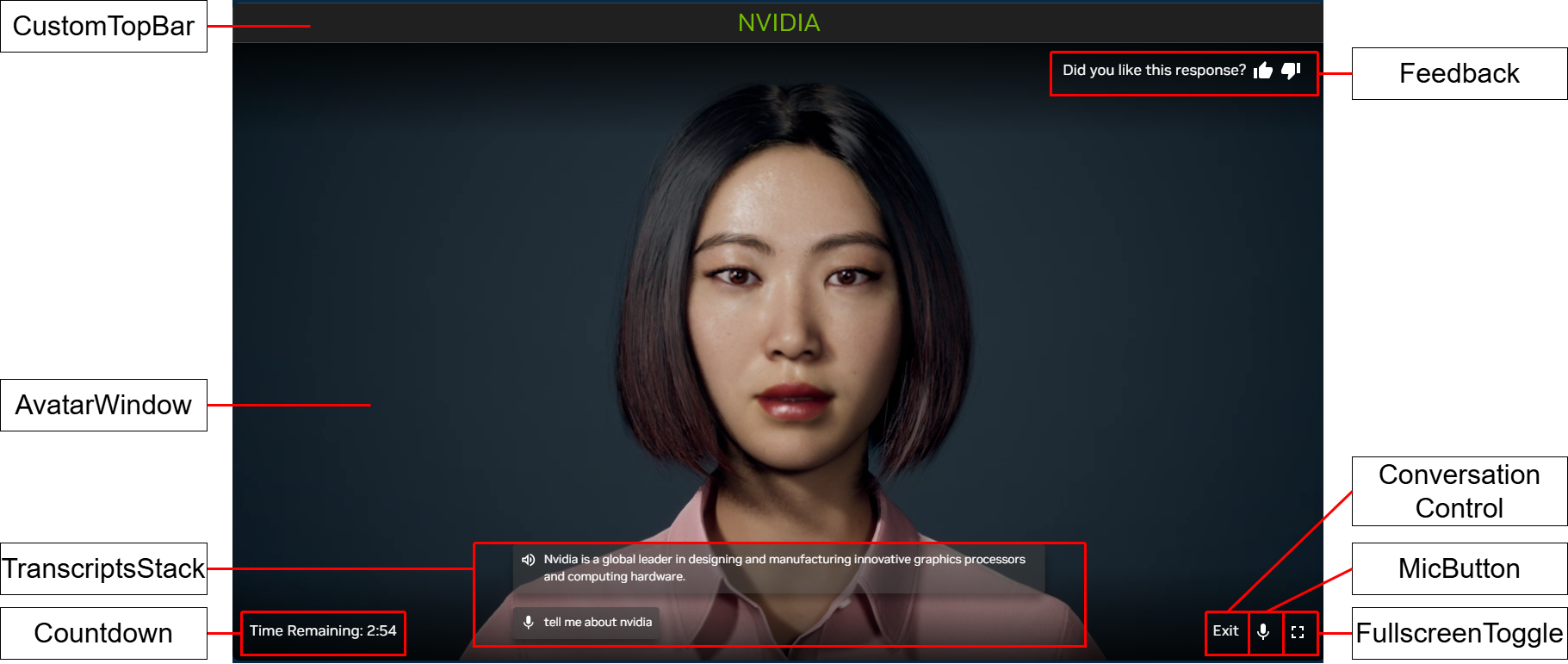
Tokkio UI Features#
The table below contains the locations of the features in code, and a description of what each feature does.
Component Name |
Location in |
Description of Feature |
|---|---|---|
|
|
Shows transcriptions of the user’s and avatar’s speech |
|
|
Initializes the WebRTC connection, and shows a video with the avatar |
|
|
A button that allows the user to toggle their microphone on and off. |
|
|
A button that allows the user to start and stop a conversation with the avatar. |
|
|
A button that allows the user to toggle the UI in and out of fullscreen mode. |
|
|
A top bar that shows the title of the application. |
|
|
A component that allows the user to give feedback (thumbs up or thumbs down) during their session. |
|
|
A component that shows an error message to the user, along with an error code. |
|
|
A component that shows a countdown timer, and stops the conversation with the avatar after the timer reaches 0. |
|
|
A component that allows one to show multimodal content, such as images, videos, and text in the UI next to the avatar (not pictured). |
By default, the available features match the overall style requirements of the reference UI. However, the appearance of these components can be easily updated by changing the CSS styles present in the code. If you are unsure about how a feature should work, you can search the code for the component name to see how it is used in the existing reference application.
At this point, you should be able to put together your custom layout by combining the existing components for the available features with your own React code.
Useful Tools for Development#
The Redux DevTools Chrome Extension can be used to view the redux state tree of the application as the UI is running.
Creating a Custom UI From Scratch#
Overview#
This guide will help get you started with creating your own UI from scratch to replace the Tokkio reference UI.
Warning#
This approach is not recommended at this time for the following reasons:
The interface between the UI and the rest of the app is subject to change without warning for most releases. A UI built from scratch requires one to keep up with these interface changes when you update your version of Tokkio. Building from a custom layout within the reference UI will shield you from these interface changes.
A UI built from scratch will not be able to take advantage of pre-built features available in the reference UI out of the box. Each of these features will need to be re-implemented in the new UI.
You may run into unexpected bugs related to an incorrect use of the interfaces with Ingress, the Tokkio UI Server, or VST.
In short, the reference UI gives you a quick way to set up a custom design and maintain it across releases. When creating a UI from scratch, additional effort will be required to both create and maintain the UI.
Prerequisites#
Before going through this section, ensure that you have done the following:
Deployed your Tokkio application.
Deployed the reference UI to make sure that everything is working end to end. You should be able to see and hear the avatar. Ensure that you are able to have a conversation with the avatar before starting.
Familiarized yourself with the reference UI codebase. Even if you will not use this code, some of it will likely be duplicated in your custom UI. Read the Creating a Custom Layout before following these steps.
This section is for advanced users only. To follow this section, you must be familiar with the VST, Ingress, and ACE Controller microservices, and have a working understanding of their interfaces. You must also be an experienced web developer.
Minimal Components for a UI to Work#
For a UI to connect to Tokkio and access all the features, it must implement the following:
Recurring call to Ingress to fetch session cookie
Create an instance of the VST Streaming Library for the avatar video connection
Connect to the ACE Controller over WebSocket for bi-directional communication with the ACE Controller pipeline (used to get all of the UI features, not required to see avatar video)
To get the session cookie from Ingress, make the following API call: GET http(s)://<ingress endpoint>/token. This API will return a response that looks like this: {"token_ttl":"30","token":"77234b6a-89e0-4b37-8bb7-c33e0d2a7183"}. Take the token and add it as a cookie to all subsequent requests to the Tokkio deployment. The cookie should be of the following format: Session=77234b6a-89e0-4b37-8bb7-c33e0d2a7183. To keep your session alive, call this endpoint every 15 seconds, and ensure that the session cookie is present in these subsequent API calls.
Once you have your session cookie, initialize the VST connection via the VST Streaming Library. See the code in the reference UI (src/features/avatar-window directory) for an example of how this is done. The vstWebsocketEndpoint parameter should be set to ws(s)://<ingress endpoint>/vms/ws.
Next, make a WebSocket connection to the ACE Controller through Ingress. The connection endpoint is ws(s)://<ingress endpoint>/ace/ws.
Now that you have made the necessary connections, you should be able to see the avatar video and communicate with the ACE Controller. For any additional features, please refer to the reference UI for how these should work.
Embedding the UI Into Another Website#
Once the UI is deployed, it can be embedded into another website as an iframe. The same UI deployment can either be run standalone or as an iframe.
This is done by adding the following code snippet to the HTML of your website:
<iframe src="<Tokkio UI deployment URL>" title="Tokkio UI">
When adding the iframe to your website, ensure that the aspect ratio between the height and width provided to the iframe roughly matches the dimensions of the avatar video to prevent parts of the avatar’s face from being cropped.
More information on iframes can be found here.