Customize the Tokkio Reference UI#
Overview#
This section will show you how to add customizations to the Tokkio UI. This is useful if you want to change the overall look and feel of the UI, or add new features to the UI.
Prerequisites#
Before going through this section, ensure you have done the following:
Deployed your Tokkio application.
Downloaded the UI code and run it once to make sure that everything is working end to end. You should be able to see and hear the avatar. Ensure that you are able to have a conversation with the avatar before starting. Docs for setting up the UI from source for the first time documented in the UI Source Code Deployment.
Familiarized yourself with the UI codebase. It is recommended to read this section in its entirety and familiarize yourself with the relevant parts of the UI code before beginning customization.
Ensure that you are using the version of the UI that matches the version of this document. This document assumes you are using the 5.0.0-GA version of Tokkio.
The Tokkio UI uses several technologies which would be useful to read up on before beginning development. These are:
JavaScript
React
React Redux
Material UI
Node Package Manager
This guide assumes that you have met the prerequisites and have a basic understanding of the listed technologies, especially React.
UI Code Structure#
The UI source code is contained in the src/ directory from the downloaded NGC artifact. It will have the following structure:
├── App.jsx
├── config
│   └── config.js
├── connection
│   ├── axios-interceptors
│   │   ├── interceptAndAppendHeaders.js
│   │   └── interceptAndRetry.js
│   └── websocket
│       ├── websocket.js
│       ├── websocketMessage.js
│       └── websocketSlice.jsx
├── features
│   ├── avatar-window
│   │   ├── AvatarWindow.jsx
│   │   ├── ControlsOverlay.jsx
│   │   └── pipModeSlice.js
│   ├── backdrops
│   │   ├── circular-loading
│   │   │   └── CircularLoading.jsx
│   │   ├── error-backdrop
│   │   │   └── ErrorBackdrop.jsx
│   │   └── loading-backdrop
│   │       └── LoadingBackdrop.jsx
│   ├── conversation-control
│   │   └── ConversationControl.jsx
│   ├── conversation-state
│   │   ├── BotState.jsx
│   │   ├── conversationSlice.jsx
│   │   └── UserAttentionState.jsx
│   ├── countdown
│   │   └── Countdown.jsx
│   ├── custom-view
│   │   ├── CustomView.jsx
│   │   ├── customViewSlice.jsx
│   │   └── item-custom
│   │       ├── ASCarousel.jsx
│   │       ├── BlankNode.jsx
│   │       ├── custom-button
│   │       │   ├── button-list
│   │       │   │   └── ButtonListBlock.jsx
│   │       │   ├── GenericButton.jsx
│   │       │   ├── selectable-options-grid
│   │       │   │   ├── ImageAndTextButton.jsx
│   │       │   │   └── SelectableGridBlock.jsx
│   │       │   └── ToggleableButton.jsx
│   │       ├── HeaderBlock.jsx
│   │       ├── ImageBlock.jsx
│   │       ├── ParagraphBlock.jsx
│   │       ├── ParagraphWithImageBlock.jsx
│   │       ├── TableBlock.jsx
│   │       └── TextInputBlock.jsx
│   ├── error
│   │   └── ErrorMessage.jsx
│   ├── feedback
│   │   └── Feedback.jsx
│   ├── fullscreen-toggle
│   │   └── FullscreenToggle.jsx
│   ├── mic-button
│   │   ├── MicButton.jsx
│   │   └── micButtonSlice.jsx
│   ├── top-bar
│   │   └── CustomTopBar.jsx
│   └── transcripts
│       ├── transcriptSlice.jsx
│       └── TranscriptsStack.jsx
├── hooks
│   ├── useResizer.jsx
│   └── useWindowSize.js
├── index.css
├── index.jsx
├── pages
│   ├── AvatarPage.jsx
│   └── StartPage.jsx
├── serviceWorker.js
├── session
│   ├── AuthorizationCodeWrapper
│   │   └── AuthorizationCodeWrapper.jsx
│   └── sessionSlice.jsx
├── store
│   └── store.jsx
├── styles
│   ├── nvPlayer.css
│   └── scrollbarStyle.js
├── theme
│   ├── themeSlice.jsx
│   └── TokkioThemeProvider.jsx
└── utils
    ├── knowledgeBaseToggle.js
    ├── useInterval.js
    └── utils.js
The below table lists the different code files and directories, and explains what the code in them is responsible for:
Code Section |
Description |
|---|---|
|
|
|
This file initializes the different pages used in the application. Depending on the configuration, it will either initialize Avatar Page or the Start Page. |
|
The code in the |
|
This contains the theme used by the rest of the application. The default theme uses the NVIDIA color scheme. Updating the theme is not a use-case that is tested to work out of the box, but would be a good start for updating the theme for the app. |
|
This contains features that are used by the UI application, such as the feature to show TTS and ASR transcripts, or the start button. |
|
Initializes the Redux store, used to manage the Redux state tree of the entire application. |
|
Used to process incoming WebSocket messages from the ACE Controller. |
|
Contains pages that are used by the app. This includes the start page and the avatar page. |
|
Sets up the default configuration for the app, and processes any configuration that is passed from an ENV variable via |
|
Contains various utilities used by the UI. |
|
Contains custom hooks used by the UI. |
|
Contains some custom styles used by the UI. |
Creating a Custom Page#
To create a customized UI, it is recommended to create a third page in the pages directory in addition to the two that are already there. Here are the basic steps to get started:
In the
pagesdirectory, create a file namedMyCustomPage.jsx(you can call this file whatever you want).In this file, add a React component that returns
<p>Hello World!</p>. This will eventually contain the custom code for your application. For now, this can be a very basic component.In
App.jsx, replace the code forStartPageandAvatarPagewith the custom component you made in the previous step.Once you do these steps, you can run the UI using the steps from the UI Source Code Deployment and see
Hello World!appear in your browser when it starts up.
Adding Features to the Custom Layout#
Now that you have set up the custom page, it is time to start adding features to it! The Tokkio reference UI contains code for available features in the features directory. The available features are visualized in the image below.
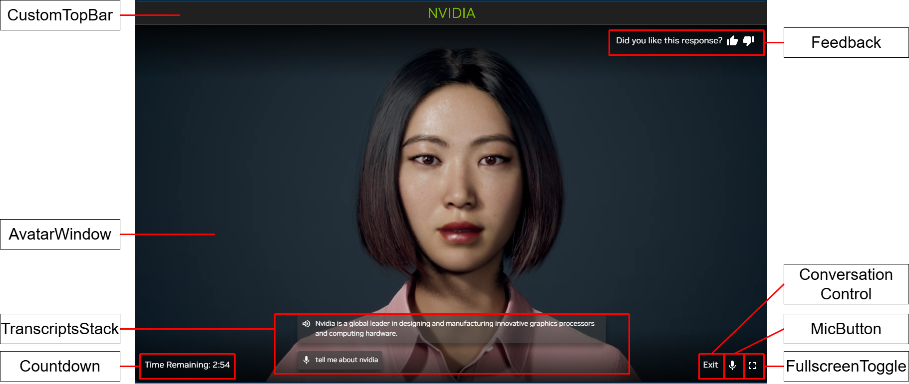
Tokkio UI Features#
The table below contains the locations of the features in code, and a description of what each feature does.
Component Name |
Location in |
Description of Feature |
|---|---|---|
|
|
Shows transcriptions of the user’s and avatar’s speech |
|
|
Initializes the WebRTC connection, and shows a video with the avatar |
|
|
A button that allows the user to toggle their microphone on and off. |
|
|
A button that allows the user to start and stop a conversation with the avatar. |
|
|
A button that allows the user to toggle the UI in and out of fullscreen mode. |
|
|
A top bar that shows the title of the application. |
|
|
A component that allows the user to give feedback (thumbs up or thumbs down) during their session. |
|
|
A component that shows an error message to the user, along with an error code. |
|
|
A component that shows a countdown timer, and stops the conversation with the avatar after the timer reaches 0. |
|
|
A component that allows one to show multimodal content, such as images, videos, and text in the UI next to the avatar (not pictured). |
By default, the available features match the overall style requirements of the reference UI. However, the appearance of these components can be easily updated by changing the CSS styles present in the code. If you are unsure about how a feature should work, you can search the code for the component name to see how it is used in the existing reference application.
At this point, you should be able to put together your custom layout by combining the existing components for the available features with your own React code.
Useful Tools for Development#
The Redux DevTools Chrome Extension can be used to view the redux state tree of the application as the UI is running.