Fabric Dashboard
The dashboard window summarizes the fabric’s status, including events, alarms, errors, traffic and statistics.
Fabric Dashboard View
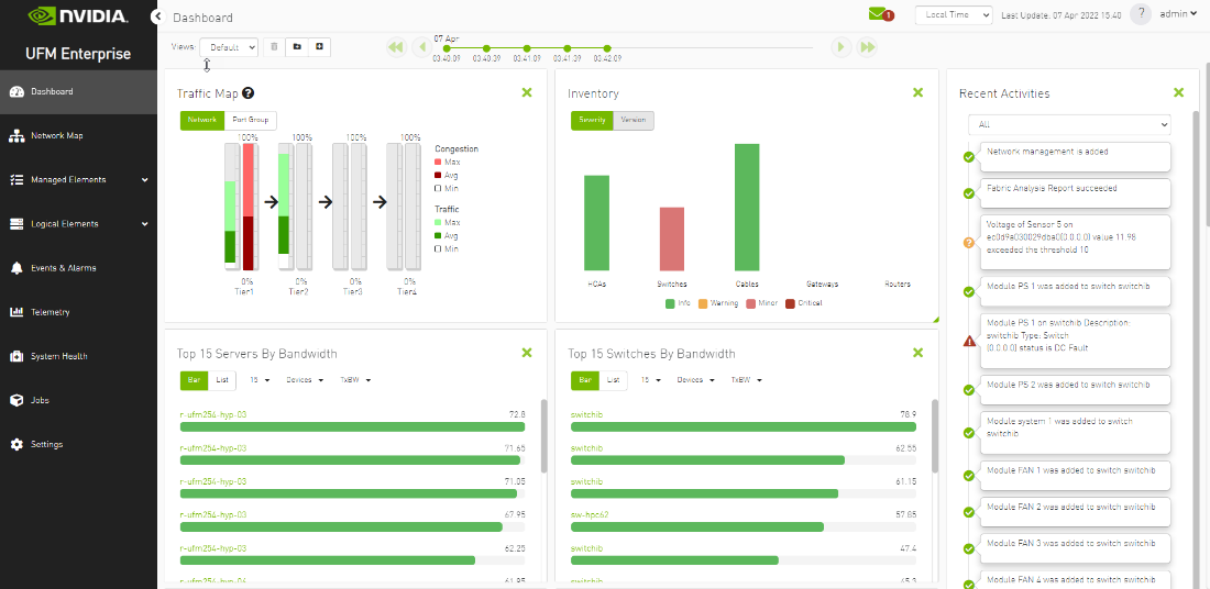
The Fabric Dashboard view consists of the following six dashboards, which provide real-time information about the fabric.
UFM is installed with a default view of the most important panels. These panels are resizable and draggable. Users can customize their default view or create new views altogether
The dashboard views and panels are managed by a set of action buttons appearing at the top of the main dashboard screen:
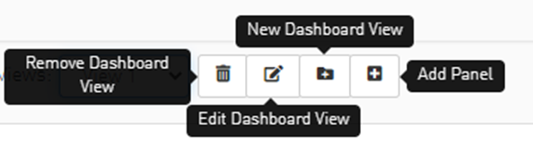
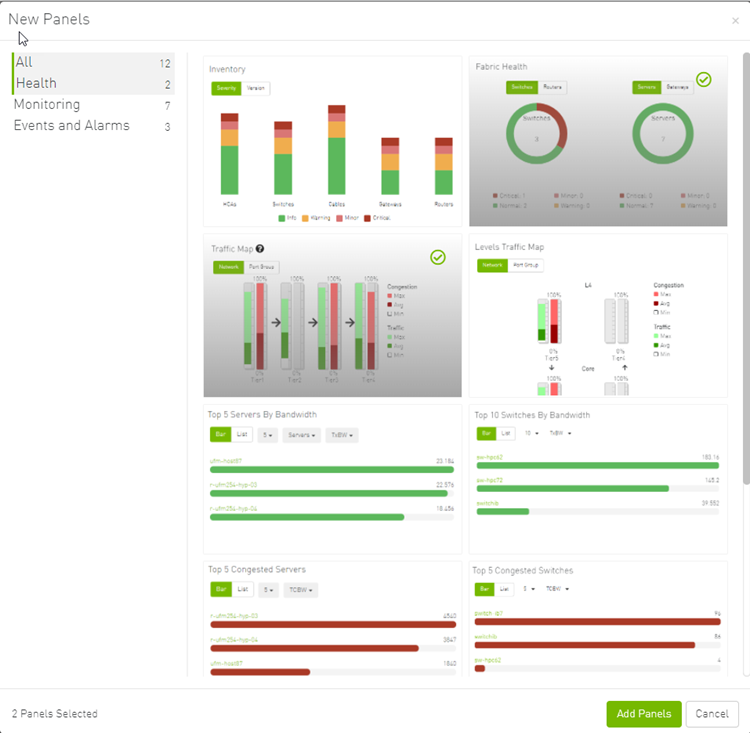
Clicking on the Add Panel button will show a model to select which panels you wish to add to the current dashboard view.
Once the user is logged into the UFM Enterprise, the UFM will start recording snapshots of the dashboard panel data every 30 seconds.
The user is able to navigate between these snapshots and load the dashboard data of a specific data snapshot.

The Fabric Dashboard view consists of the following 12 panels, which are categorized into 3 main categories and provide real-time information about the fabric.
Health:
Inventory
Fabric Health
Monitoring:
Traffic Map
Levels Traffic Map
Top X Servers by bandwidth
Top X Switches by bandwidth
Top X congested servers
Top X congested switches
Top X utilized Pkeys
Events and Alarms:
Recent Activities
Top X alarmed servers
Top X alarmed switches
Events History
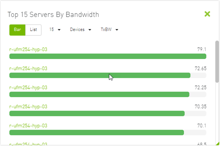
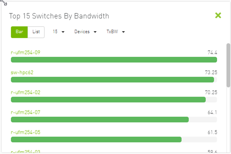
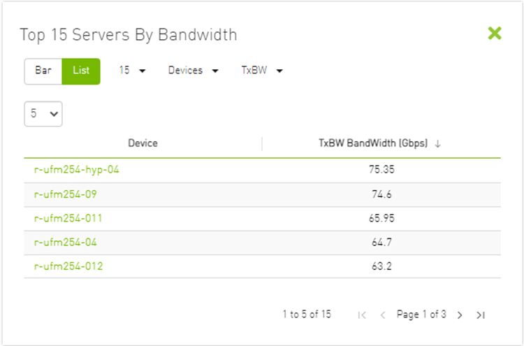
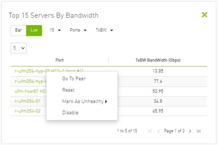
The Top N servers/switches by Rx or Tx Bandwidth component shows the top elements that are transmitting or receiving the most bandwidth per second. These elements are classified top-down according the defined Transmit (Tx) or Receive (Rx) bandwidth (MB/sec Rate).
Bandwidth is measured as a rate in bytes/sec.
Transmitted (Tx) bandwidth is measured by N server/switch ports in MB/sec
Received (Rx) bandwidth is measured by N server/switch ports in MB/sec
N can be 5, 10, 15, or 20.
The following table lists the icons of this component:
|
Options |
Description |
|
List view 
|
Shows the top N elements as a list Each element is shown in a row with the name of the element and the bandwidth rate |
|
Bar view 
|
Shows the top N nodes as a bar graph
|
|
Drop-down menu 
|
Selects the number of items to display Default: 10 nodes |
|
Monitoring attributes 
|
Selects the attribute for monitoring:
|
|
View by port/element 
|
Switches view to t op 5 elements by bandwidth or top 5 ports by bandwidth. Nodes view is presented by default.
|
|
Filter toggle 
|
Toggles the filter textbox |
Top Servers/Switches by Bandwidth—Bar View
Top Servers/Switches by Bandwidth—List View
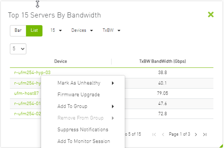
Right-clicking a device displays a list of the actions that can be performed. These actions (shown in the following screenshot) are the same actions available in the devices table (see Devices Actions table under Devices Window).
Right-clicking a port displays a list of the actions that can be performed. These actions (shown in the following screenshot) are the same actions available in the Ports table (see Ports Window for more information).
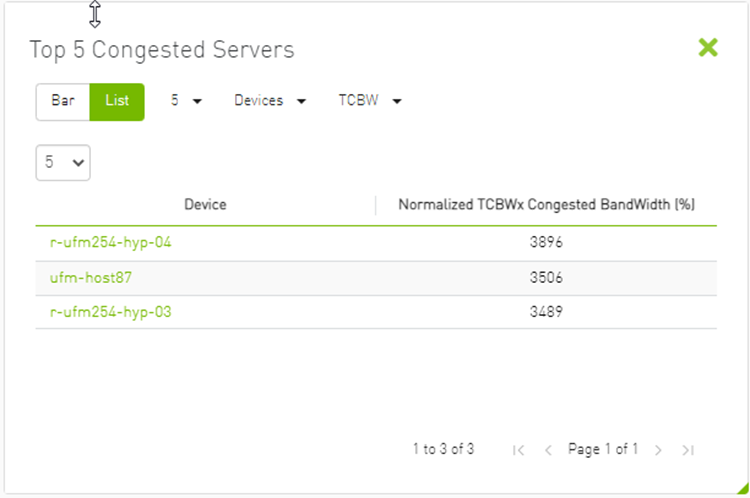
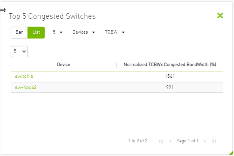
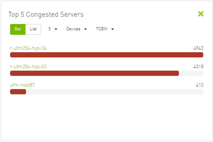
The Top N Congested devices by Rx or Tx Bandwidth component shows the top congested devices, classified top-down according to the defined Transmit (Tx) or Receive (Rx) bandwidth.
Bandwidth is measured as congestion bandwidth rate (CBW) by percentage.
For Tx, congestion is measured by N HCA ports.
For Rx, congestion is measured by N switch ports connected to HCAs.
N can be 5, 10, 15, or 20.
Top N Congested Servers by Bandwidth—List View
Top N Congested Servers/Switches by Bandwidth—Bar View
The following table describes the options available in this component.
Top N Congested Devices by Rx/Tx Bandwidth
|
Options |
Description |
|
Bar view 
|
Shows the top N congested devices as a bar graph
|
|
List view 
|
Shows the top N congested nodes as a list Each congested node is shown in a row with the name of the node and its picture. It also shows the bandwidth rate |
|
Drop-down menu 
|
Enables selecting the number of top N congested nodes Default: 10 nodes |
|
View by port/element 
|
Switches view to Top 5 elements By Bandwidth or Top 5 Ports By Bandwidth. Devices view is presented by default.
|
|
Monitoring attributes 
|
|
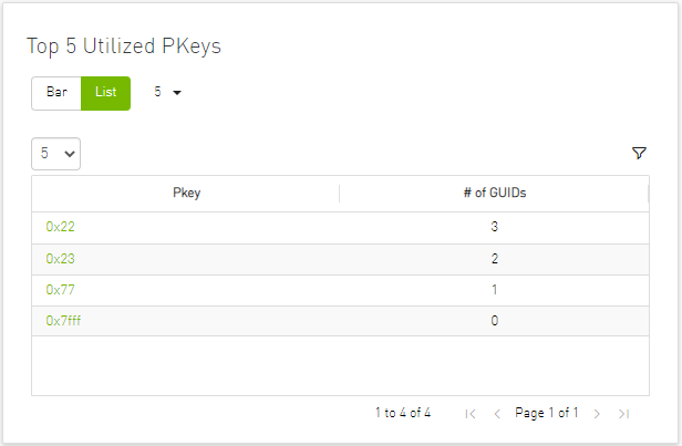
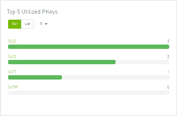
Top N Utilized PKeys displays the top utilized PKeys based on the number of the PKey members.
N can be 5, 10, 15, or 20.
Top N Utilized PKeys—List View
Top N Utilized PKeys—Bar View
The following table describes the options available in this component.
Top N Utilized PKeys
|
Options |
Description |
|
Bar view
|
Shows the top N Utilized Pkeys as a bar graph
|
|
List view
|
Shows the top N Utilized PKeys as a list Each PKey is shown in a row with the name of the PKey and the number of its members |
|
Drop-down menu
|
Enables selecting the number of top N Utilized PKeys Default: 10 Utilized PKeys |
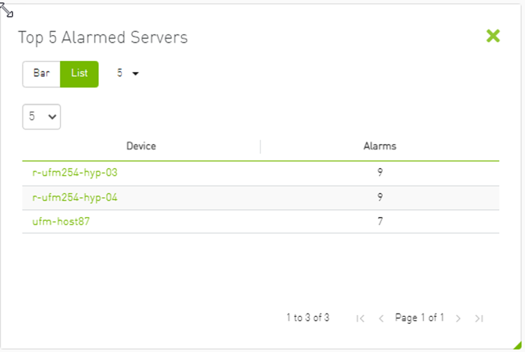
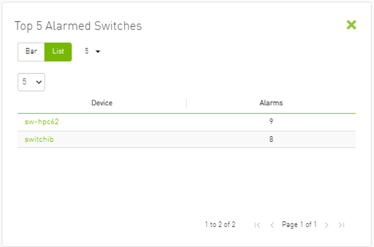
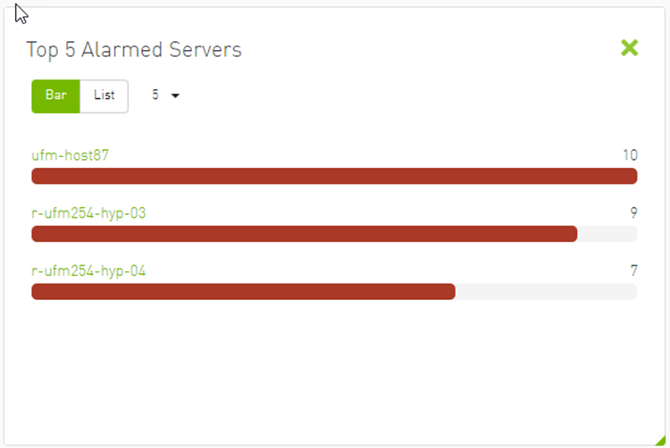
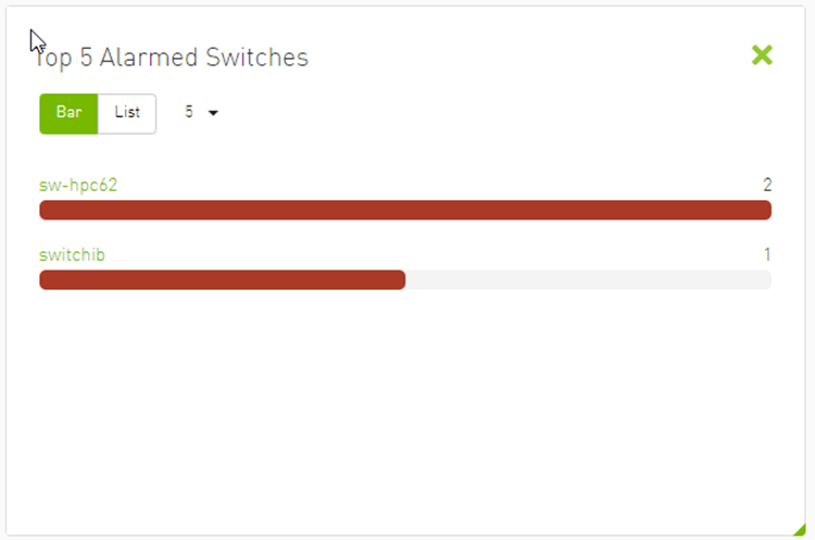
The Top N Alarmed Servers/Switches component shows the top nodes with alarms classified in a descending order. Alarmed nodes are measured according to the following:
Severity – only the top nodes, in order of severity:
Critical
Minor
Warning
Normal
Alarm – numbers (N can be 5, 10, 15, or 20)
The following table lists the components.
Top N Alarmed Servers/Switches
|
Options |
Description |
|
List view 
|
Shows the top N alarmed servers/switches as a list. Each alarmed device is shown in a row with the name of the node and the number of alarms. |
|
Bar view 
|
Shows the top N alarmed devices as a bar graph.
|
|
Drop down menu 
|
Enables selecting the number of top N alarmed nodes. Selects the number of items to display. Default: 10 alarmed nodes |
|
Filter toggle 
|
Toggles the Filter textbox |
Top Alarmed Servers/Switches—List View
Top N Alarmed Servers/Switches—Bar View
The Fabric Inventory Summary component shows a summary of your fabric inventory (HCAs, Switches, Gateways, Routers and Cables) categorized by the element’s severity or firmware version.
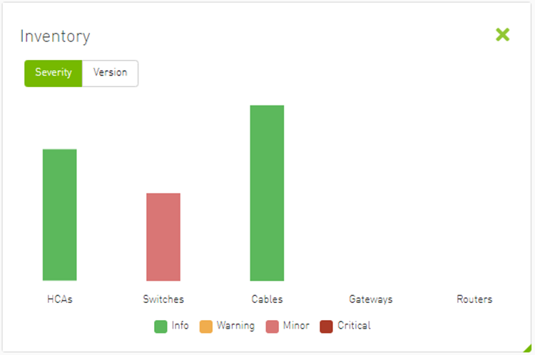
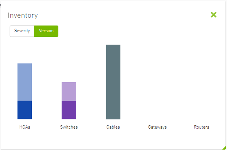
Clicking on one bar element with specific severity/firmware version will redirect you to the clicked element’s table.
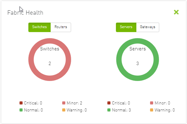
The Fabric Utilization component shows the number of alarmed objects, categorized by the alarm’s severity. They are as follows:
Warning
Minor
Normal
Critical
If Server X has 2 minor alarms, 1 warning alarm and 2 critical alarms, and Server Y has 0 minor alarms, 2 warning alarms and 1 critical alarm, the Fabric Resource Utilization pie chart will show 2 servers in the critical slice, 2 servers in the warning slice and 1 server in the minor slice.
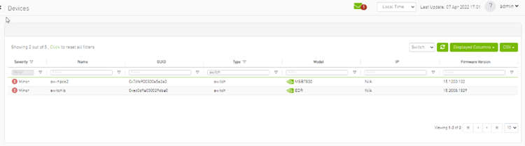
You can filter for both switches and nodes of a specific severity level by clicking the specific pie slice indicating the severity.
In the example below, the Devices table lists all the switches of severity level "Minor" after clicking the red (Minor) slice from the Switches pie chart.
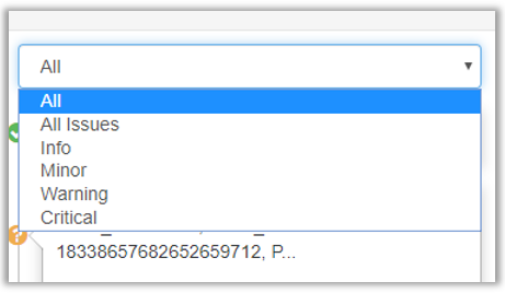
The Recent Activities component lists the recent events detected by the UFM system.
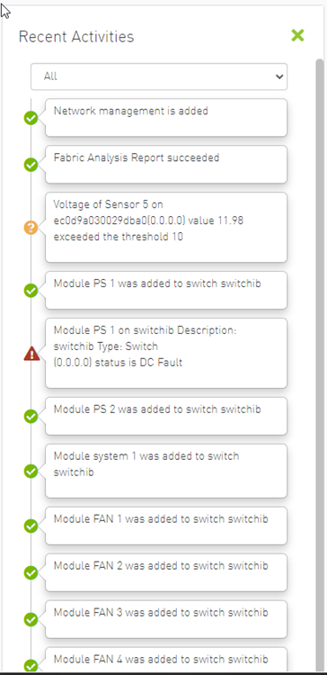
You can filter for the events you would like to see in one list using the drop-down menu that provides the following options:
All – shows all recent activities
All issues – shows all non-Info activities
Info – shows all activities with Info severity or higher
Minor – shows you all activities with Minor severity or higher
Warning – shows you all activities with Warning severity or higher
Critical – shows you all activities with Critical severity
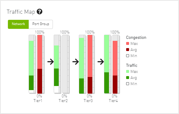
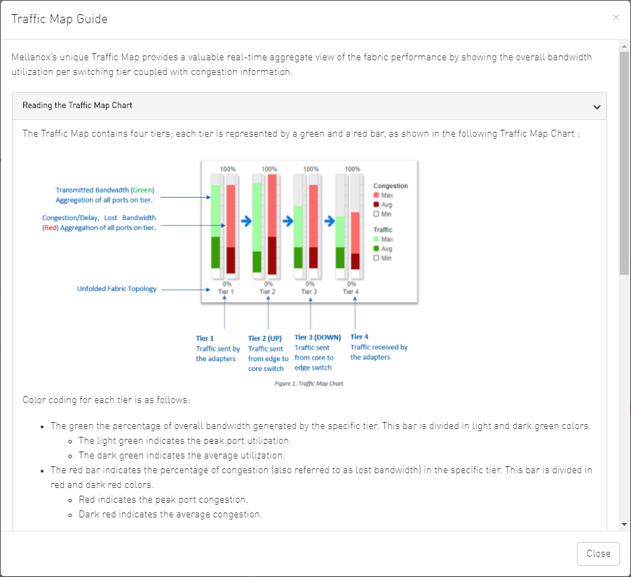
The Traffic Map dashboard shows the normal traffic versus congested traffic distributed on switch tiers and on port groups. This view, together with the Top N Congestion dashboard, gives a full status of the traffic congestion of the fabric.
Network Traffic Map
Four double bars represent the transmitted bandwidth (normalized transmit data) and normalized congested bandwidth (CBW), both measured in bytes/sec with minimum, average, and maximum bandwidth values.
An explanatory window on traffic map opens once clicked on the

icon.
The percentage of total theoretical bandwidth (TBW) is calculated based on the underlying InfiniBand technology (SDR, DDR, QDR, FDR or EDR). The speed can be viewed when checking the ports.
The vertical axis shows the following:
Bandwidth (BW) is represented by a green bar and is measured in percentages
Congested Bandwidth (CBW) is represented by a red bar and is measured in percentages
Minimum, average, and maximum bandwidth are represented in each bar by a subset color
The horizontal axis represents the tiers.
The bottom of the dashboard represents the tier-related transmitted traffic, which is divided into four segments by measurement ports:
Tier 1 – represents the traffic injected by all adapters
Tier 2 – represents the traffic sent from the edge switches to the core of the fabric (in case of a single Director switch, this tier indicates traffic utilization inside the Director between the line and fabric boards)
Tier 3 – represents the traffic sent from the core to the edge switches
Tier 4 – represents the traffic sent from the edge switch to the adapters
The illustrations at the bottom of the tiers show a four-tier topology:
Server [tier 1] Switch [tier 2] Director Switch [tier 3] Switch [tier 4] Server.
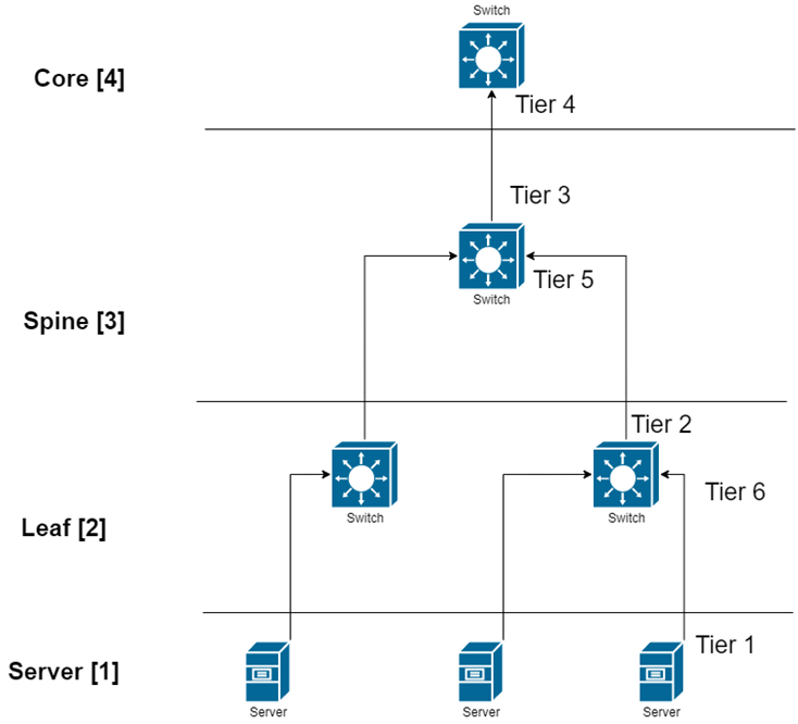
Levels Network Traffic Map
Different representation of the fabric traffic map that based on the devices/ports levels.

The level of the device/port is the distance between the device and the nearest server/gateway.
Levels Calculations:
The levels calculations are configurable from the gv.cfg file under TopologyLevels section enable item and it is disabled by default.
The levels names are configurable from the gv.cfg file under TopologyLevels section levels item and by default we are defining up to 4 levels levels equals server, leaf, spine, core
Server: hosts and gateways.
Leaf: switches and routers that are directly connected to the server
Spine: switches and routers that are directly connected to the leaf
Core: switches and routers that are directly connected to the spine
If the fabric has more than 4 levels, the level value will be L + distance e.g., L4, L5, L(N), and if levels was empty, the levels will start from L0, L1, L2, etc.
The levels calculations are done at either the discovery stage or once the topology changes.
Ports Tiers calculations based on the levels:
If the levels calculations is enabled, the port’s tier will be calculated as the following steps:
Get the level for both port's parent device and port's peer parent device
Decide whether the port’s data flow is the up or down direction, by checking the order of the parent and peer parent level:
If the parent's level order is less than or equals the parent peer level, then the port's flow is up and tier is the parent level order
If the port's flow is down and the tier is the distance between the host to the root device and the distance between the root to the parent device
Example:
If the level calculations are disabled, the tier calculations will be done as mentioned in this section.
Port Group Traffic Map
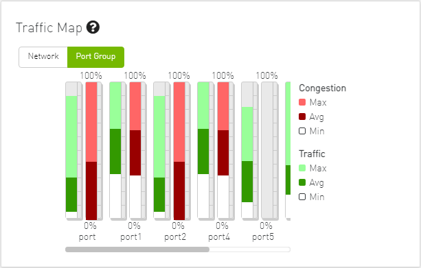
Traffic Map Bar Chart
Bandwidth Bars
The bandwidth graph shows how traffic is traversing the fabric and how traffic is being transmitted between the servers. For example, the following considerations could be evaluated:
The size of the difference between max bandwidth and min bandwidth.
The traffic that is flowing in the middle tiers and whether it would be more efficient to move the traffic to the edges to save the uplinks.
Bandwidth levels are measured in percentages, as shown below:

Congestion Bars
The Congestion graph shows where congestion starts. For example, the following considerations could be evaluated:
If congestion is in the first or second tier, there is probably a routing problem
If there is no red bar, it means that there is no congestion or no routing problems
Congestion levels are measured in percentages, as shown:

To view the Event History panel in the dashboard, the System Monitoring feature must be enabled. Otherwise, the panel will be hidden. Users can enable System Monitoring by setting the system_monitoring_metrics flag under the SystemMonitoring section in the gv.cfg file to true.
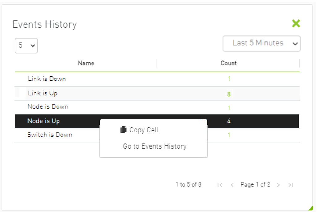
The Events History panel presents the topology change events in a table along with their respective counts.
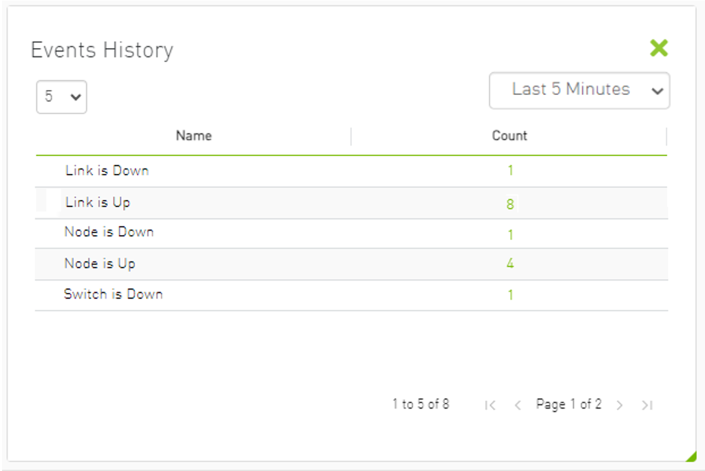
The user can filter the event count by selecting the desired time interval.
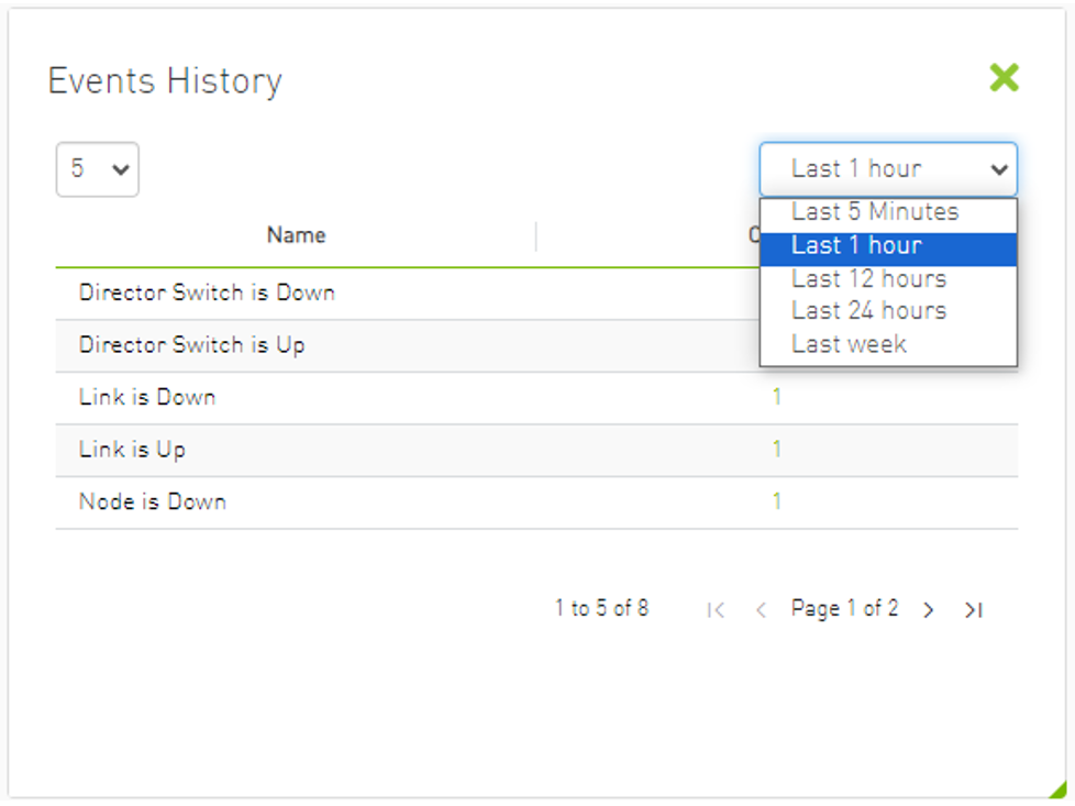
Users can navigate to the ‘Device/Link Status Events’ tabs by either clicking on the counter value or by right-clicking and selecting 'Go to Events History'.