Composer#
The Composer is an GUI application designed to create AI Application pipeline through an easy-to-use graphic interface, reducing the complexity of application development significantly and thus reducing time to market.
The Composer is based on the Omniverse SDK which provides a highly responsive hardware-accelerated GUI.
User Interface#

Ref# |
Option |
Description |
|---|---|---|
1 |
File Menu |
Opens the File Menu |
2 |
Edit Menu |
Opens the Edit Menu |
3 |
Graph Menu |
Opens the Graph Menu |
4 |
Registry Menu |
Opens the Registry Menu |
5 |
Tools Menu |
Opens the Tools Menu |
6 |
Window Menu |
Opens the Window Menu |
7 |
Help Menu |
Opens the Help Menu |
8 |
Toolbar/Shelf |
Tool buttons for the most frequently used features |
9 |
Graph Canvas |
A canvas window to create and manipulate a graph |
10 |
Property Window |
Shows the details on any selected object |
11 |
Extension Grouping |
Extensions/Components can be grouped by different ways |
12 |
Extension Search Bar |
A search bar for searching the extensions/components |
13 |
Component |
Object which can be drag and drop on the graph canvas |
14 |
Node |
A node on the graph canvas |
15 |
Console |
Display the console output |
Context Menu#
Context menu is invoked while a user right-clicks on the canvas with a mouse, which provides the entries to commands bound to the current graph.
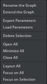
Menu Items |
Action |
|---|---|
Rename the Graph |
Rename the current graph |
Export Parameters |
Export the flagged parameters in the current graph to a file |
Load Parameters |
Load the value of parameters from a parameter file |
Delete Selection |
Delete the currently selected node |
Open All |
Expand all the nodes in the graph with all the details |
Minimize All |
Minimize all the nodes in the graph by showing connected ports only |
Close All |
Close all the nodes in the graph by hiding all the ports |
Layout All |
Automatically layout all the nodes |
Focus on All |
Automatically zoom and pan the canvas to fit the entire graph |
Focus on Selection |
Automatically zoom and pan the canvas to focus on the current selection |
Toolbar#

Toolbar on the top of the main window provides shortcuts of available functions of the current graph
Toolbar Items |
Action |
|---|---|
New Graph |
Open an empty Graph Editor Window |
Open Graph |
Open an existing graph file in an new Graph Editor Window |
Save Graph |
Save the current graph |
Close Graph |
Close the current graph |
Run Graph |
Run current graph on local or remote machine |
Stop Graph |
Stops the execution of the currently running graph |
Container Builder |
Build container for x86 or aarch64 |
Export Parameters |
Export the flagged parameters in the current graph to a file |
Load Parameters |
Load the value of parameters from a parameter file |
Delete |
Delete the current selection |
Copy |
Copy the current selection |
Paste |
Paste the current selection |
Expand Nodes |
Expand all the nodes in the graph with all the details |
Minimize Nodes |
Minimize all the nodes in the graph by showing connected ports only |
Close Nodes |
Close all the nodes in the graph by hiding all the ports |
Focus Selection |
Automatically zoom and pan the canvas to focus on the current selection |
Focus All |
Automatically zoom and pan the canvas to fit the entire graph |
Layout All |
Automatically layout all the nodes |
Component List#
The component list window shows the information of all the available components in various extensions, which are fetched from the remote registry and could be used to build different graphs by the user. It can be grouped in two ways:
By default, the list is showed in a two-level hierarchical view grouped by extensions.
By Workflows, the list is showed in a two-level hierarchical view grouped by extension categories.
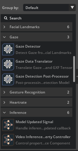
You can choose a component from the Component List by a left click on the mouse to display the detailed information of that component in the Property window. The details include the component type, description, details of the extension which includes the component, and the details of the properties supported by the component. The Component List supports direct Drag and Drop, allowing users to create an instance of a specific component in a graph by simply dragging it from the list and dropping to the canvas or a destination node in the graph. If you drops it to the canvas, a default node will be created automatically to accommodate the instance and its input and output port will be initialized as much as possible.
Create New Application#
Navigate to the File menu from the main window menu bar and choose New Graph, or click the Create Graph` icon from the landing page.
An empty graph is created and displayed in the graph canvas.
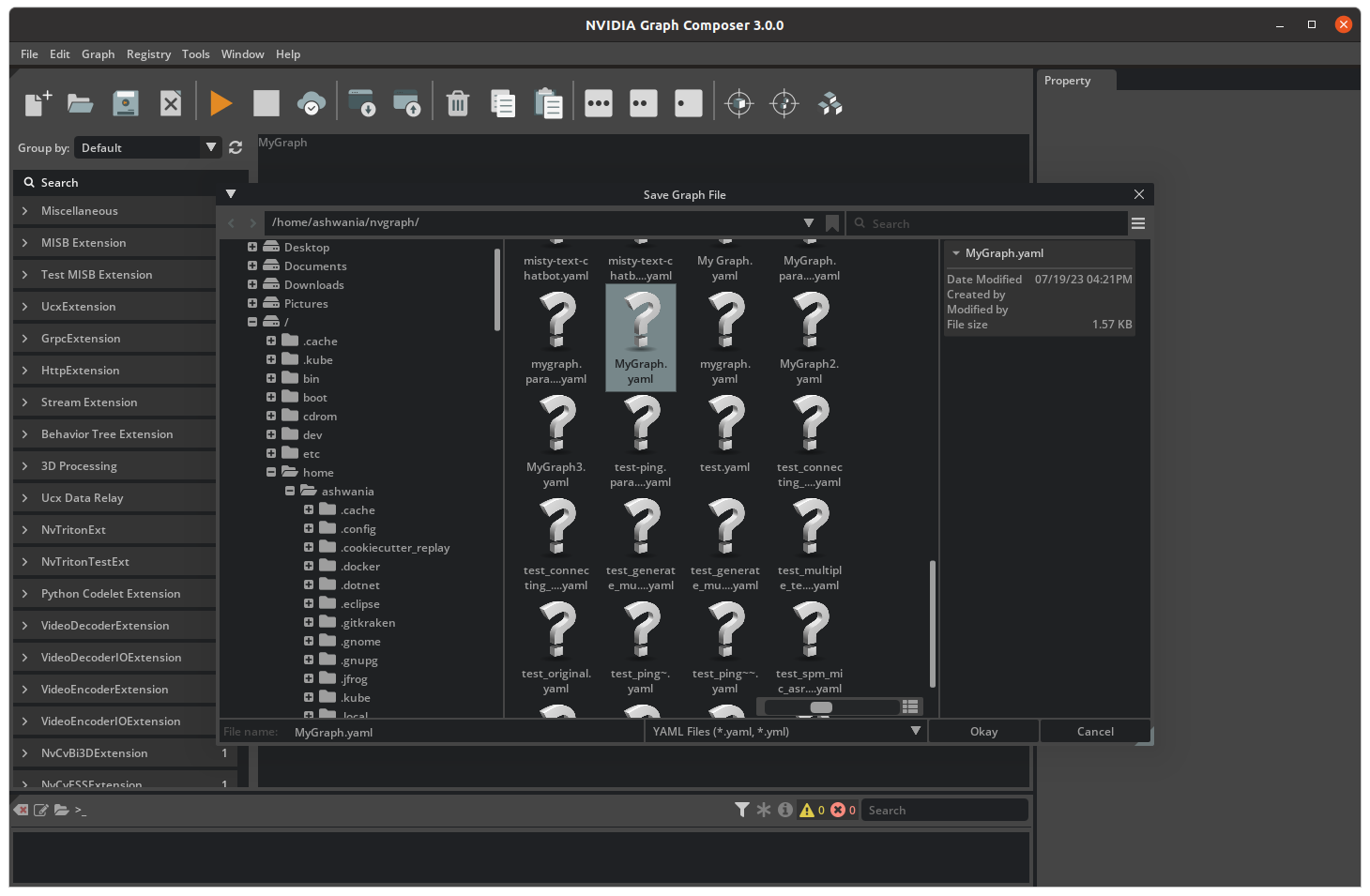
Open and Save Application Graphs#
Note
Be sure the component list is not empty before opening any graph, trying opening a graph file with an empty component list will generate a corrupted graph.
Note
To access component information, the Composer must connect to the gxf server either locally or remotely. Users can set the server address through the Edit/Preferences menu. By default, the server is set to run locally with an IP address of 127.0.0.1. If the server is not running, the component list will be empty and a connection error will be displayed in the log.
To save the current graph, use the ‘File’ menu and choose Save the Graph (Ctrl + S) or Save the Graph as (Shift + Ctrl +S), if the graph has never been saved before or you want to save it to a different file.
A file browser dialog pops up prompting you to pick a path in the file system.
Compose an Application Graph#
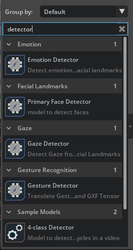
Finding the right component#
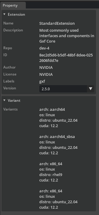
Components are grouped by extensions. Information of a specific component and the extension can be found in the details window if you click on the corresponding item showed in the Component List, including its type, the purpose, and supported properties. With the search bar on the top of the Component List window, you can also filter out the candidate components.
By choosing the versions from the Version list, the extension with a specific version will be loaded.
From Composer perspective, a Component falls into one of the 3 groups below based on the role it plays in the graph:
Component Type |
Description |
Example |
|---|---|---|
Primary Component |
Compute Components which are executed by scheduler. |
Decoder |
Secondary Component |
Helper components being used by primary ones for data exchange, config, scheduling rules. |
SinkPad |
Connection |
Responsible to connect input and output components |
Connection |
Subgraph Component |
Used to load a subgraph |
Subgraph |
Before creating an Application graph, users should always firstly figure out what kind of primary components are needed. Only after all the primary components have been properly picked, they could consider initializing them and then setting up the connections.
The component inside an entity node contains:
The Component name: can be changed with a double click
Handles under the component: displayed under the component if the component could use the other components. Not all the components have handles and the number of handles, their type and names are all predefined by the type of the component itself.
Creating a Component Instance#
Steps to create component instances:
Using Drag and Drop
To add a new component instance to a graph, find the type of the component from Component List and drag&drop it to the graph canvas.
If the component is dropped to the vacant area an entity node will be created automatically to hold the component
If the component is dropped to an existing entity node it is going to be added to that entity.
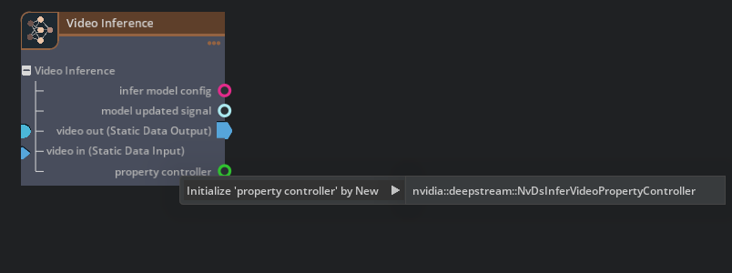
Initialize a Handle by Creating a New Component Using Context Menu
Through the context menu of a handle, users can choose to Create a new component instance and use it to initialize a handle. Since the compatible components have already been filtered for the specific handle, the list becomes much shorter and it is always recommended to create secondary components including Input and Output through this way.
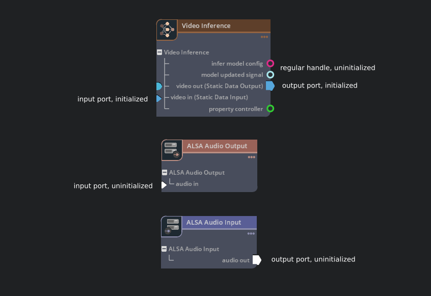
Understanding the Component Handles#
A component can have handles through which it interact with other components. A handle is essentially a special property supported by the component, and it must be initialized with a component instance of the required type to become functional. There are some special handles called Input and Output who manage the data exchange of a component, and to enable data exchange of a component a user needs to initialize them with appropriate Input and Output components.
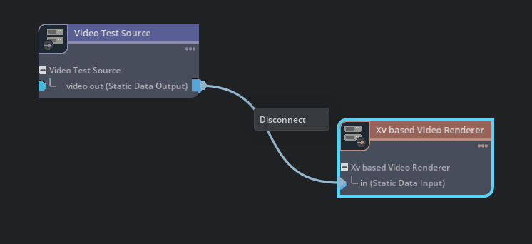
Linking and Unlinking components#
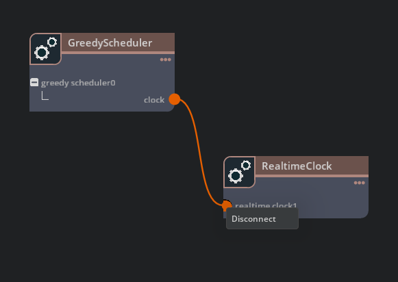
There are two options for a user to initialize a Handle: one is through its context menu, having been mentioned above; the other one is using Link. The Link operation can be done by dragging and dropping a curve from the handle to its required component, meaning the required component must be created at first.
As a reverse operation, Users can use Disconnect from the context menu of the target component to break up from its owner, or use Release option from the context menu of a handle to de-initialize it and release the target component.
Note
One handle can only be initialized with (or linked to) one component instance at the same time
Steps to link or unlink the components:
To link two components, left-click with your cursor on an output port (the full circle) in one component and drag a curve to the input port (the half circle) of another component.
Links can only be set up among compatible components, which means the type of the link source must be the same type or the base type of a link target.
To see the port type, hover the mouse cursor on the port.
To remove the link, right click on the input port (the half circle), then choose Disconnect from the context menu.
Entity Node#
An entity node is the container of a group of components who work together to get certain tasks done. Usually there is one primary and several secondary components required by the primary one, including the input, output, and others. An existing node can be deleted from File Menu, the Context Menu of the node or the corresponding hot key.
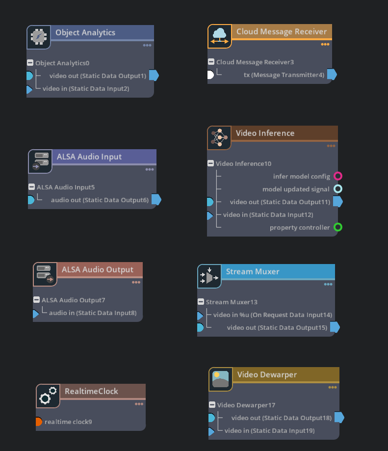
Nodes can be categories based on the roles and types of the components contained inside, different category of nodes will be showed in different style:
Node Category |
Description |
Example |
|---|---|---|
compute |
General Computing Components |
Object Analytics |
cloud |
Cloud Components |
Cloud Message Receiver |
input |
Input Components |
Alsa Audio Input |
neural networks |
Inference Components with Neural Networks |
Video Inference |
output |
Output Components |
Alsa Audio Output |
muxer |
Muxing/Demuxing Components |
Stream Muxer |
utility |
Utilities |
RealTimeClock |
image processing |
Image Processing Components |
Video Dewarper |
Setting up a Connection from an Input to an Output#
A connection represents the data flow from an input component to an output one, and it can be created when a user drags a curve from an output and drop it to a compatible input. It is important to understand that the input and the output of a connection must be compatible, that is to say, the type of data from the output to the input must be exchangeable. Connections can only be set up between two different nodes. Multiple connections are allowed on a single input or output. To remove connections on an Input or Output, users can use the “Disconnect” from the context menu by right clicking on the connection.
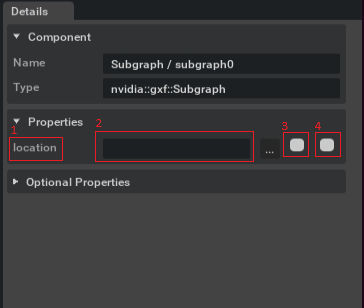
Changing the Component Properties#
To select a component, left or right-click on a component or its handles in the graph editor. This displays the component information including its properties in the detail window accordingly, where you can make changes on any writable property. It displays the property name [1], the text field [2] to edit the property, the check box [3] to export a file property to a resource file and another check box [4] to export the property to a different yaml file.
Editor Features#
Zoom and Pan the Canvas
The scroll wheel of the mouse enables zoom in and zoom out, and using ‘ALT’ and left click of the mouse allows users to pan the canvas.
Copy and Paste
Before doing a Copy, first select a instance from a graph editor, then trigger the operation through Edit menu or corresponding hot key. Copy operation creates a copy of the node instance. When the copy of a node is created, all the components inside the node will be duplicated accordingly, preserving their relationship. There is a global clipboard in the Composer where a copied node is kept temporarily. When a Paste command is triggered, the instance in the clipboard will be added back to the graph.
Undo and Redo are supported for following commands:
New Node
New Component
Link a Handle
Unlink a Handle
Set up a Connection
Disconnect an Input/Output
Delete a Node
Delete a Component
Rename a Node
Rename a Component
Debug View
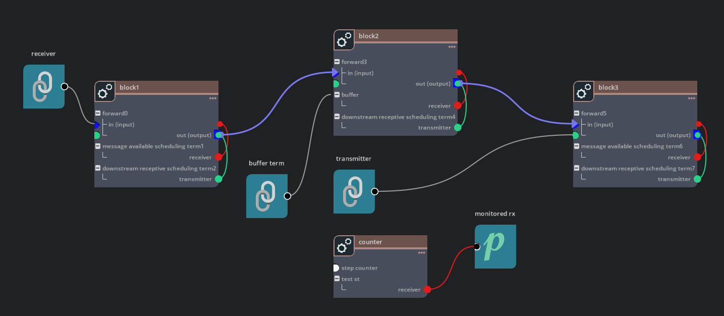
The composer provides an option for users to turn on the debug view on the graph, which represents the graph in the exact same topology its implementation architecture. In the debug view all the abstractions used for visualization simplification have been restored to their raw structures:
Connections be expanded to a standalone node with a connection component inside, whose handles be linked to an input component and an output component.
Connections cannot be set up from an Output to an Input directly, even after both of them have been linked to some Input and Output components
Debug view is useful in inspecting your graph if you notice anything abnormal.
Subgraph#
Introduction of the Subgraph concept increases the modularity and reusability of Component based programming significantly. Subgraph is nothing different from a regular graph except that it has exported interfaces which allow it to be re-used in other graphs, and a subgraph itself can also use other subgraphs.
When a subgraph is used in other graphs, it will be abstracted as a “Subgraph” type component inside a subgraph node, only the exported interfaces are showed in the same node with all the other details being concealed. Components in the parent graph can interact with the subgraph through those interfaces.
Creating a Subgraph
Creating a subgraph is similar to creating a regular graph. Once the user has created a regular graph, they can export interfaces so that the graph can be used as a subgraph in other graphs. Additionally, the user can add placeholders to the subgraph, which can be materialized by the parent graph.
To export interfaces, users need to right click on the component that is going to be exported as an interface and choose “Export … as an interface”, before the interface is created users are given a chance to name the interface. Users can also create an interface node through Drag&Drop first, then link it to the component that is going to be exported.
To use placeholders, users can drag and drop a Placeholder node to the graph canvas, which holds a prerequisite component and can be used in the graph as a general component.
To make the interfaces and placeholders to be effective users must save the graph file.
Using a Subgraph
In order to use a subgraph in the current graph, the user needs to Drag and Drop a “Subgraph” node from “Miscellaneous” group in the catalog to the canvas, then update the “location” property to load the subgraph from the filesystem.
The location must be a valid file path which could be either absolute or relative to the subgraph search path.
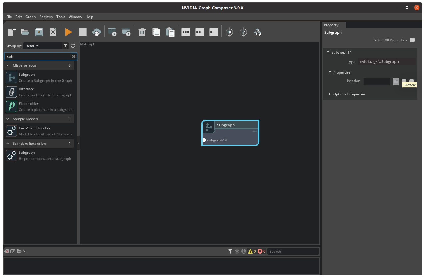
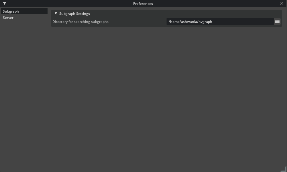
In order to make the relative path work correctly with subgraphs user must go to Edit/Preferences menu and set the subgraph search path properly.
Users can set multiple file paths as the location for a subgraph by separating them with commas. This is useful when appending multiple graph files to a single subgraph.
Viewing a Subgraph
A double-click on the subgraph component will trigger a switch of the current graph view to the subgraph view, where the internal details of the subgraph is displayed. A navigation bar will show up on the top of the graph window once a subgraph view is activated so that the user can switch the view between subgraphs and their parent graph.
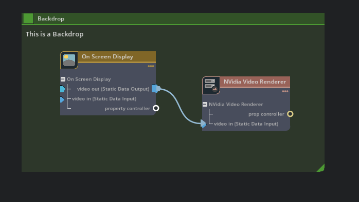
Backdrop#
Backdrop is a tool used to group the nodes in the current graph, which can be created through Drag&Drop from “Miscellaneous” group in the catalog. After a Backdrop rectangle is created, it can be moved and resized to include a number of nodes, so to group them together. Once a Backdrop is created, the nodes inside will be moved altogether while the Backdrop itself is moved.
User can rename a Backdrop by double-clicking on its name or change its color through the color picker.
Extend a Graph#
Users can extend an open graph by appending a new graph file to it, which is supported in the context menu triggered by a right-click on the graph canvas.
While a graph is being extended, new components and nodes in the second graph will be added to the current graph and existing ones will be overridden with new definitions.
Run Graph#
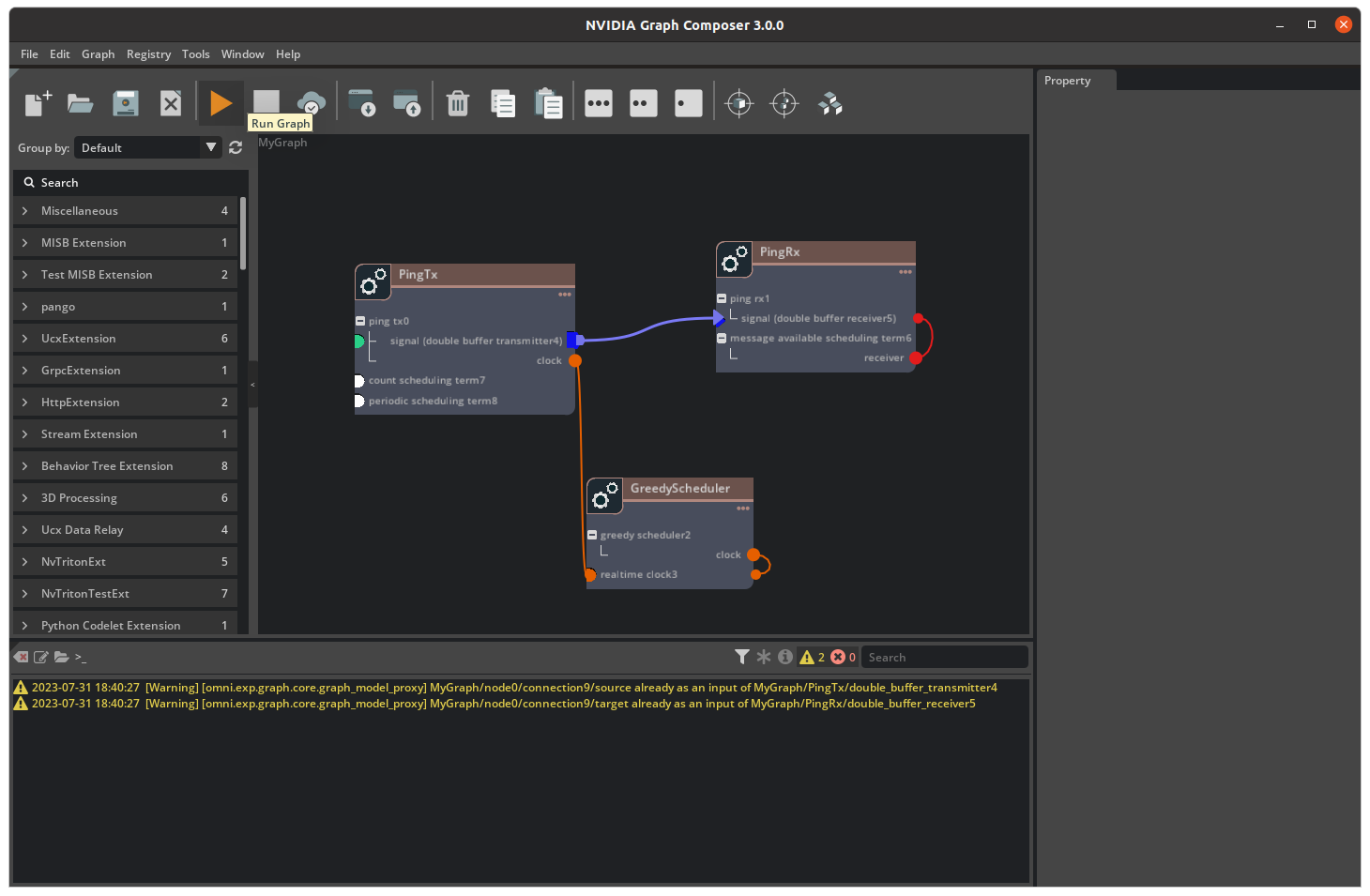
A Graph can be run through Composer using the Play button on the toolbar. Output of the running graph can be seen on the console window. A running graph can be stopped using the Stop button on the toolbar.
Options#
Options |
Description |
Range |
|---|---|---|
Platform Config File |
Select a platform config file. For x86_64, Default value is /opt/nvidia/graph-composer/config/target_x86_64.yaml. For ARM 64, Default value is /opt/nvidia/graph-composer/ config/target_aarch64.yaml |
Required |
Comparison of Different Work Flows
Work Flow |
Description |
Host Requirement |
Target Requirement |
Remote Requirement |
DS Installation |
|---|---|---|---|---|---|
Local Execution |
both the Composer and graphs run on the host machine |
Ubuntu 24.04 with Nvidia GPU |
N/A |
N/A |
DS 8.0 required on the host |
Remote Execution |
the Composer runs on the host machine and graphs on the target machine |
Ubuntu 24.04 with Nvidia GPU |
Ubuntu 24.04 on Jetson Xavier/Orin |
N/A |
DS 8.0 require on the target |
Remote Access |
the Composer runs on the host machine and user access the UI from a remote machine |
Ubuntu 24.04 with Nvidia GPU |
Ubuntu 24.04 on Jetson Xavier/Orin |
Linux/Windows with Browser Support |
DS 8.0 required on host or target |
Build Container Image#
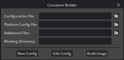
A container image can be build through the Composer using the Docker button on the toolbar.
Options#
Runtime Options
Options |
Description |
Range |
|---|---|---|
Configuration File |
Select a Container Builder configuration file |
Required |
Target Config Keys(s) |
Select a target config key: |
Required |
Additional files |
Path to additional files/directories, separated by comma |
Optional |
Working Directory |
Path to the working directory; on server machine or if running gRPC server locally. |
Optional |
Buttons
Options |
Description |
|---|---|
Create |
Create a new Container Builder Config File using a template |
Edit |
Edit an existing Container Builder Config File |
Build |
Build the Container |
Generate Gstreamer Extension#
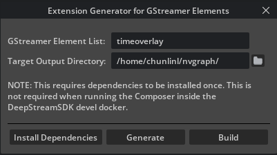
Note
If the Deepstream SDK package is not installed, Generate Extension button will be disabled.
Options#
Options |
Description |
Range |
|---|---|---|
GStreamer Elements List |
Comma Separated Elements List |
Required |
Target Output Directory |
Directory where the extension will be generated |
Required |
Buttons |
Description |
|---|---|
Install Dependencies |
Install extension development dependencies |
Generate |
Generates the extension |
Build |
Builds the extension using Bazel |
Remote Access#
Composer supports remote access through only one streaming option. 1) Omniverse Streaming Client 2) WebRTC
Comparison of available options#
Technology |
Devices |
Benefits |
|---|---|---|
Omniverse Streaming Client |
Windows and Linux |
Native desktop application. Supports streaming up to 4K at 60 frames per second. |
WebRTC |
Web browsers (all devices) |
Simple to distribute. Strong support across devices and platforms. |
Omniverse Streaming Client#
Omniverse Streaming Client is a lightweight application allowing Users to connect to Omniverse applications deployed on the network or over the Internet.
The application makes it possible to access a broad range of Omniverse applications, even from devices that would otherwise not meet the minimum requirements. Some of these workflows include:
Accessing Omniverse applications from low-powered devices or ultrabooks.
Facilitating the sharing resources over the network or the Internet, allowing Users to connect to Omniverse applications provisioned by IT resources.
Installation and Usage#
To install the Omniverse Streaming Client on user machines:
From the Omniverse Launcher, select Exchange from the top-level menu bar.
From there, click Omniverse Streaming Client from the left-hand Apps sidebar.
In the detail page of Omniverse Streaming Client, click the Install button.
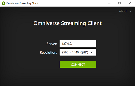
Once the download completes, and Omniverse Streaming Client is installed, click the Launch button to start the client.
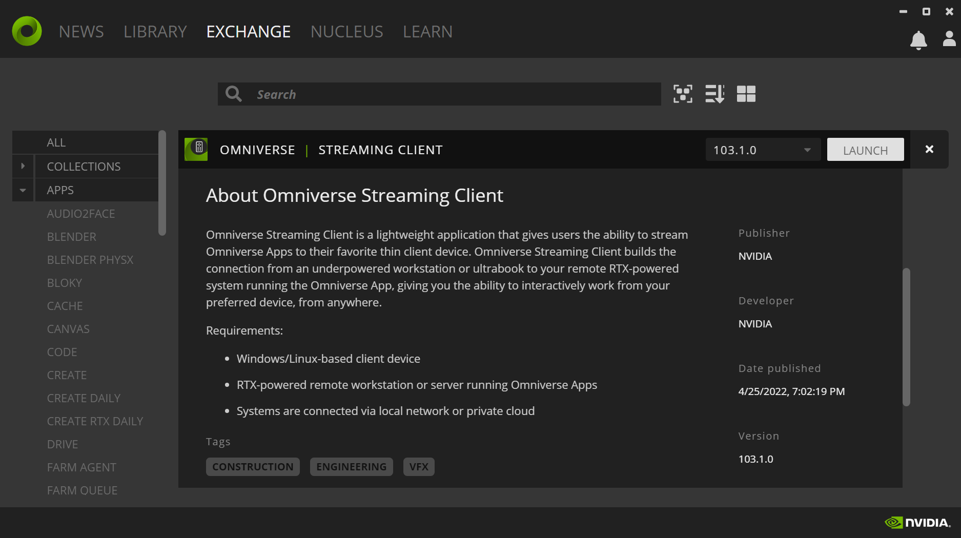
When prompted, enter the IP address or URL of the remote machine which is broadcasting to interact with the remote session:
Configuration#
Server#
To launch Composer with Omniverse Streaming Client, run the following command:
composer --enable-streaming ov-streaming
Should the host be located on the infrastructure of a third-party Cloud provider, it may additionally be required that the following ports be opened, and that firewall rules allow traffic inbound and outbound traffic:
TCP:
47995to48012TCP:
49000to49007TCP:
49100UDP:
47995to48012UDP:
49000to49007
Client#
On Linux, the following packages may be required on machines where the client is installed: libavcodec, libavformat, libavutil. These packages can be installed using the following command:
sudo apt-get install libavcodec57 libavformat57 libavutil55
Windows environments do not require any additional dependencies or configuration, other than ensuring firewall rules do not restrict access to the ports listed above.
WebRTC streaming#
By leveraging the new WebRTC live-streaming, it is now possible to stream Graph Composer to web browsers.
Using the WebRTC live-stream is a straightforward process:
In a command prompt or terminal, run the command:
composer --enable-streaming webrtcFind the IP address of the machine hosting the Graph Composer application on your local network
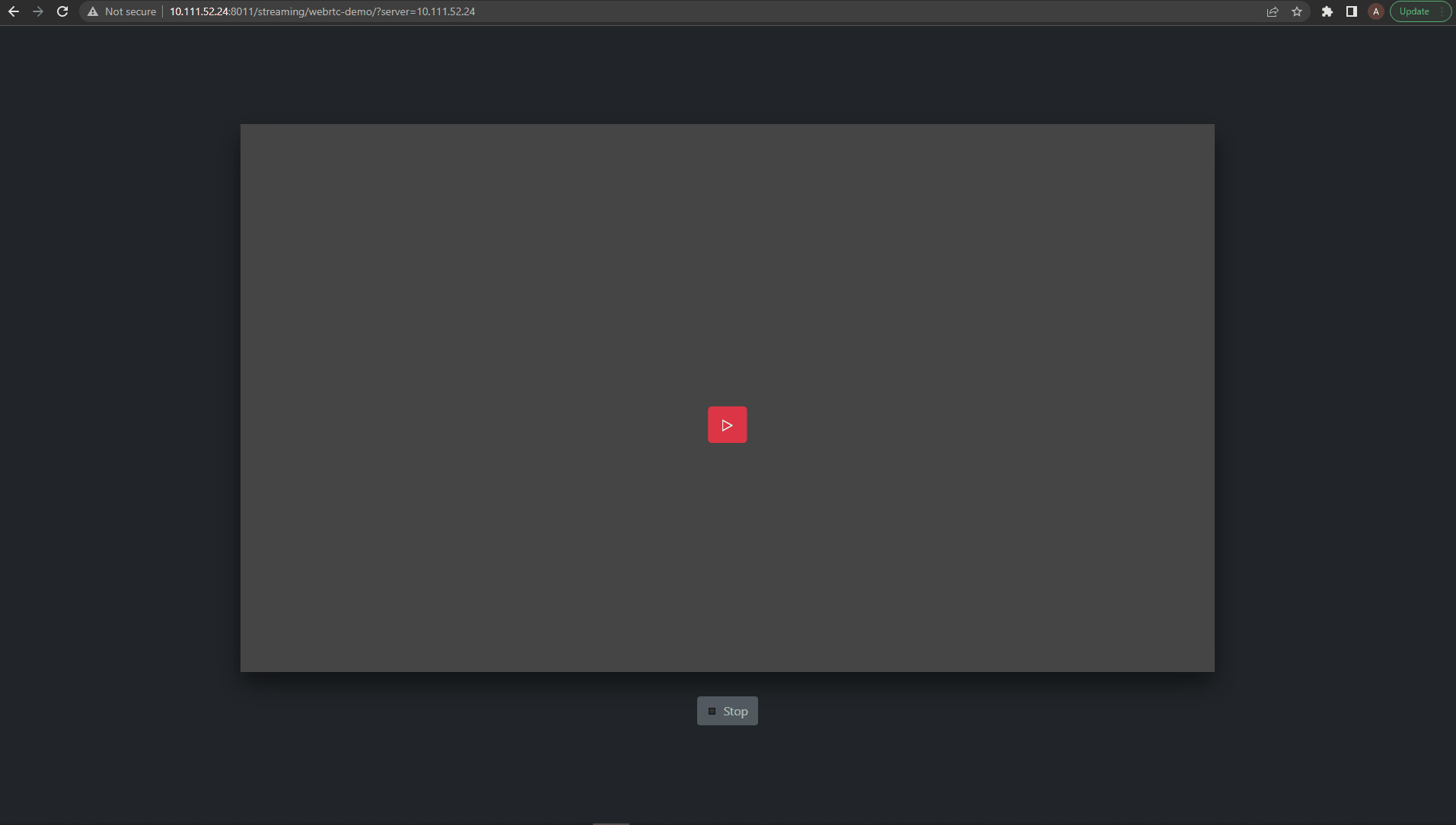
Navigate to the stream page in your favorite web browser:
http://<server IP address>:8011/streaming/webrtc-clientClick the “play” button to start streaming your application
Note
Sometimes the above URL is not accessible because the port 8011 might have been occupied, in the case we need to replace 8011 with the right HTTP port number displayed in the console.
For example, in the following log, the server started on port 8010 instead of 8011
[omni.services.transport.server.http.server] http server was meant to start on 8011 but port is taken, starting on port 8010 instead.
Note
Currently there is no feature for security, we assume it is deployed in secure environment
Current Limitations:#
For a best user experience, it is recommended that only a single User at a time be provided with mouse or keyboard control while others remain in spectator mode.
WebRTC Streaming is supported only on RTX GPUs.
Copy/paste support is not yet available.
The stability of WebRTC streaming is not good enough and Omniverse streaming client is always preferred.
Restrictions#
Currently the Composer is well supported only on NVIDIA GPU setup.
Trouble Shooting#
Instructions for resolving issues when running the Graph Composer.
Component Type not found
In some cases users will see such messages as “Component type invalid” while opening a graph, which means some component types are not available in the current component list thus the loaded graph become incomplete. There are 2 major reasons for the issue: 1. The component list is empty or standalone 2. The graph is not compatible with the latest component list It is recommended for users to close the graph without saving it and perform “repo sync” through the registry menu and try again with the updated list. If the issue still occurs, users should review the graph to figure out which component is missing and replace it with the proper one from the latest component list.
Failure During the Repo Sync
Sometimes the “repo sync” process takes too long or gets stuck in the middle due to network issues and users can’t close the “repo sync” progress bar, in this case it is recommended to close the Graph Composer app and restart it again.
GStreamer Extension not found after building
After generating a GStreamer extension, Composer does not show the generated Component name and brief. Currently, Composer shows it as <DISPLAY_NAME>. This is a known issue. However, using the Component is not a problem.