Monitoring
NVIDIA® NEO® features monitoring dashboards which provide central views that enable users to oversee and analyze the network state. The available dashboards are:
Fabric dashboard – for overall network status
What Just Happened® – for information about packet drops in the fabric
RoCE dashboard – for RoCE related network status
Network Health – for a graphic display for each device in the system representing its status and the severity of events reported
The general fabric dashboard displays several sub-panels, as shown in the following figure.

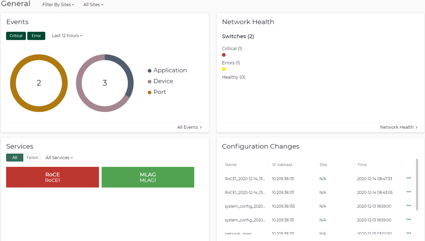
Events
The Events panel displays statistics pertaining to critical and error events that occurred over a specific period. A pie chart is available to visualize each event type. You may show critical and/or error events by clicking the Critical and/or Error buttons respectively. If only one severity is selected, you will see one big pie chart instead of two smaller ones.
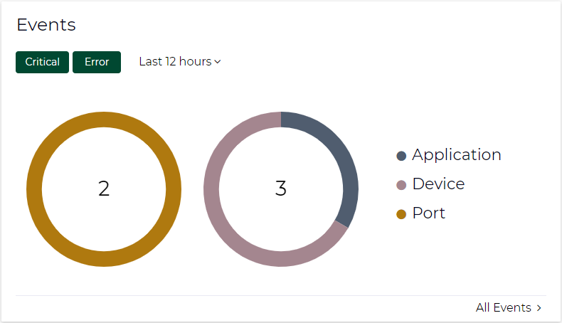
The events are distributed over 4 categories: Application, Device, Port, and Priority.
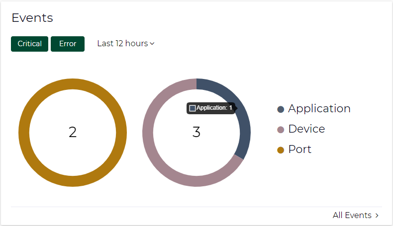
Inside each one of the pie charts, you will have the total number of events. Hovering over a specific slice, shows the category and number of events belonging to that category.
You may utilize a time filter to view events for a specific time period (from last 5 minutes to last 1 year).
The charts are updated according to the time filter settings and the settings of the general filters in the dashboard (Sites, Groups, Devices).
Clicking the "All Events" link at the bottom redirects to the Events dashboard.
Clicking on a specific category will open a preview model displaying the subcategory distribution for that category.
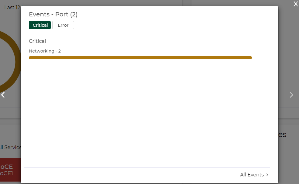
If both Critical and Error severities are selected, the area on the left displays "Critical" subcategories and the one on the right displays "Error" subcategories.
If more than 5 subcategories exist, the top 5 appear first, and the rest are collapsed under a bar called "Other" which can be expanded to reveal the statistics for the subcategories inside.
Clicking "Full Report" on the bottom right corner navigates to the Events page.
The pagination function allows us to navigate between categories—clicking the right arrow (>) to the right of the preview model takes you to the subcategory distribution of the next category.
Network Health
Network Health displays switches and servers as circular nodes in different colors according to the severity of their health state; it will show the switches in the left panel and the servers in the right panel.
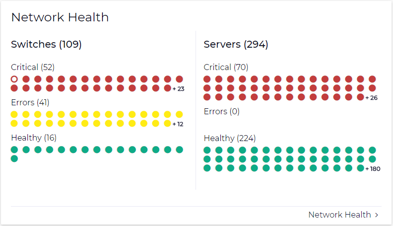
The colors of circles will indicate the status of the device as follows:
Green – OK
Yellow – Error
Red – Critical
Empty red circle – Lost communication
For each device type (Servers, Switches) we will have the title (Switches or Servers) and next to it the number of devices under this type; and for each severity we will have the title (Critical, Errors, Healthy) and next to it we will have in brackets the number of devices under that severity.
Once a certain device is clicked, a preview model is displayed showing more information about the device (hostname, IP, site, system type, MAC address).
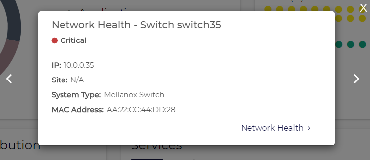
In the preview model, pagination is enabled and clicking on the "<" or ">" arrows navigates to other nodes of the same device type.
Clicking "Network Health" in the model or in the Network Health panel redirects to the "Network Health" dashboard.
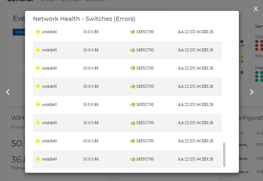
If there are too many devices to show on the small panel, a + sign with a number appear indicating the number of remaining devices (e.g. +34). If clicked, a preview model appears showing all devices in same severity.
WJH Category Distribution
WJH Categories Distribution provides information regarding packet drops throughout the fabric and statistical data of the drop reasons. It consists of four main parts:
A drop-down menu time filter to view statistics for a specific time period
The total number of events in the selected time period
Distribution of events per category displaying the number of drops per category and the name of that category under the number
The "WJH Dashboard >" button which navigates to the What Just Happened dashboard

If more than three categories exist, then pagination is activated making it possible to navigate to the other categories.
Clicking any of the categories opens a preview model showing drop reasons that fall under that category.

Per drop reason distribution, you see:
Reason name
Number of drops associated with it
Bar illustrating the proportion of drops belonging to it
If there are more than 5 reasons, the distribution for the top 5 is shown and a reason group called "Other" is displayed which combines all other reasons. If Other is expanded, distribution for all the remaining reasons is displayed.
Clicking < or > navigates to next/previous category. Clicking "WJH Dashboard" navigates to the What Just Happened dashboard.
Services
The Services panel provides a view of all services created in the system. In addition to global filters in the dashboard, this panel has two filters which affect what is displayed:
All/Failed filter: "All" shows all the services created. Failed shows for showing the failed services only.
Custom filter that displays specific services. by default, "All services" is selected.
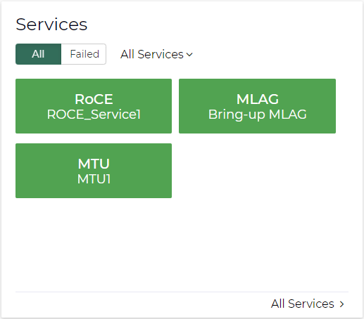
Clicking on a specific service opens a service preview model displaying the following information for each member:
Validation Status
Configuration Status
System Name
IP
Site
The validation and configuration status will be displays with a circle as follows:
Red – completed with errors
Green – completed
Gray – unknown
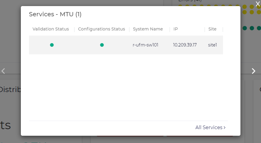
The title of the model will contain the name of the service and the number of members in that service in parentheses.
Hovering over specific status indicators shows a tooltip of the status (e.g. Completed).
You're able to navigate to the status of other services by clicking the "<" and ">" arrows.
Clicking "All Services" redirects to the "Services" page.
Configuration Changes
The Configuration Changes panel provides the user with some information about the latest configuration changes applied to devices. This panel contains the following information:
Device hostname
Device IP address
Site to which the device is assigned
Time of last change on the device
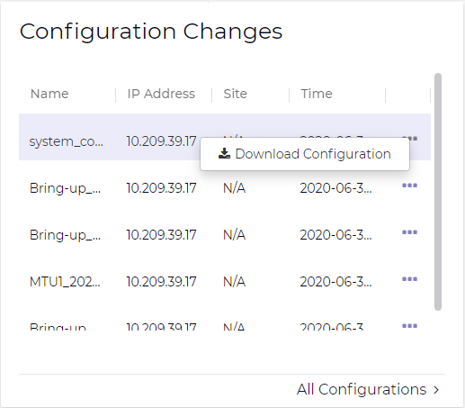
If desired, the three dots can be clicked in order to download configuration for a specific device.
Clicking "All Configurations" redirects to the "Configurations" page.
NEO gives the user an out-of-box, built-in WJH dashboard to view current and historical WJH data from managed NVIDIA® Spectrum® switches. In order to do so, NEO relies on InfluxDB and switch Telemetry Agents on the switches as part of the solution. Please see "NEO Telemetry Agent" for the Telemetry Agent installation procedure.
The telemetry data can be visualized and queried by using either NEO or any visualization software available. To get the telemetry data into the database of choice, a switch Telemetry Agent is used to pull, parse, and apply logic and stream out of the Spectrum switch.
To enable WJH using NEO, the Telemetry Agent must be installed in a docker container on the switch.
WJH is only supported through CLI with Web UI or using NEO, but not in parallel.
The upper main section of the page, contains the title, the number of dropped packets, and the filters button.Once installed and enabled, The WJH dashboard can be accessed to visualize WJH categories, events, and other details. For a list of possible packet drop reasons, please refer to What Just Happened® Reasons.
WJH Filtering
Under the title, users can find the WJH presets, where they are able to add/edit filters which affect the data presented in the WJH dashboard.
On the top-right of this area, users can save filters to the current preset, create a new preset, or reset the filters to the default preset. More about presets in the Manage Presets and History section.
Filter Editing Area
Users may access this area by clicking the filters icon on the top-right of the dashboard, or clicking the edit icon next to each item in the filters area, or clicking "+ Add Filters".
This screen allows users to modify currently selected filters, add new filters, or manage presets.
Time Filtering
In the Active Filters section, users are able to sort through WJH results by setting a time filter. Clicking the dropdown menu allows users to select from several preset time options. Alternatively, users may also select a custom time frame by clicking the Custom option.
This opens up a calendar from which users may select start and end time.
Severity Filtering
Users may select which severity (i.e. Error, Warning, Notice) they want to include (at least one should be selected) in their WJH results.
Add Filters
This area provides the ability to add new filters to your presets.
The search box enables users to search for specific attributes and filter with them (e.g. search for specific drop reasons)
The Metadata section provides the ability to filter for metadata (e.g. reason, switch, port, etc.)
The Flow Details section features the following submenus for filters (L2, L3, L4, VXLAN) If expanded, users can filter attributes for these categories (e.g. filter specific MAC under L2, or filter for a specific L3 protocol).
Every category has the option to either include or exclude.
Categories Distribution
This panel provides statistics about the reported drops per category. Per category, this section shows the reason distribution in pie chart format.
Above each pie chart, users can see the name of the category it represents, and in the middle of each pie chart, users can see the total number of drops belonging to this category. Each slice in the pie represents the portion for specific reason drops.
Filtering for Specific Drop Category
Hovering in the middle of one pie chart (on the number), opens a tooltip showing the name of the category and the option to add it to filter by clicking "Add to Filters".
After filtering on a specific category is applied, it will affect the entire dashboard. All results for drops would belong to that category only. The name of this area is also changed from "Categories Distribution" to "Reasons Distribution". The filter is then added to the filters area (e.g. category is Forwarding).
The reason distributions will appear beside the pie chart in bars graphs. The first two bars will show the proportion of drops with the highest rate of occurrence. The remainder of the drops are lumped under an expandable "Other" bar.
The filter may be removed by clicking the Edit button at the top of the dashboard and removing it in the Edit Filters module.
Filtering for Specific Drop Reason
Clicking on a specific slice under Categories Distribution shows a tooltip containing the name of the drop reason, the number of drops belongs to that reason, and the option to add that reason to your filters by clicking "+ Add to Filters".
Once the filter is added, both category and reason are added to the filters, and only drops for the filtered reason will appear now.
Reordering Categories
By default, the categories are presented in descending order according to the number of drops, but the pie charts can be rearranged by clicking and dragging the 4 dots below each category.
Once the order is changed, a button appears to reset the order to default (descending).
Events Distribution Per Switch
This view displays the distribution of events per switch and features two options. One is to show all switches, and another to show the Top 3. If Top 3 is selected, then only 3 pie charts (if any) are visible. If All is selected, then we can see more than 3 pie charts (3 per screen).
By default, the pie charts are shown in descending order according to the number of drops. It is possible to reorder them by dragging and dropping them using the 4 dots below each switch.
In the following screen All is enabled. This enables pagination so more than 3 switches are visible. The order of the switch is changed so the button that reorders them (Order by Descending) is enabled.
Event Distribution Per Port – Multiple Mode (One Switch Filtered)
Hovering in the middle of the pie chart reveals a tooltip that contains the name of the switch and the option to add the switch to the filters.
If the switch is added to the filters, then the whole dashboard is affected as all panels will return data for that switch only.
The name of this panel will change from "Events Distribution Per Switch" to "Events Distribution Per port" as now it presents the distribution of events per port for the selected switch.
Event Distribution Per Port – Single Mode (One Port Filtered)
Hovering in the middle of the ports pie chart reveals a tooltip that shows the name of the port and the option to add it to the filters.
If the port is added to the filters, then the whole dashboard is affected as only drops for this port are displayed.
Events Distribution Per Port – Filtering for Specific Category
Hovering on a slice of the pie chart reveals a tooltip presenting the category name and the option to add it to the filters.
Once added, only drops for that port and that category are displayed.
Time-based Categories
This panel displays the WJH events received during in a specified period. This panel is affected with the filters applied to the dashboard.
Hovering over any point on the graph reveals a tooltip containing the name of the category, the date and time, and the number of drops that had occurred. It also has the option to add that category to the filters.
Detailed Flow Distribution
This panel allows users to select multiple properties and aggregate the events to display the combined number of WJH events.
Hovering over a specific bar displays the names of the properties selected, their value, and the combined number of WJH events for the selected properties.
The "i" icon indicates that L1 drops are not included in this distribution.
Detailed WJH Events
This table presents detailed information about each drop.
There is a collapse button at the top of each column in the table. Clicking it opens a filter module allowing users to narrow down the results they see in the table by deselecting certain values and clicking the apply button.
There are three vertical dots at the end of each WJH event (row). Clicking them opens up a context menu showing the two options:
Details & Recommended Actions
Streaming Settings
Details & Recommended Actions
Clicking "Details & Recommended Actions" opens a module showing the name of the switch, time of the WJH event, reason, and recommended actions to be taken.
Streaming Settings
Clicking "Steaming Settings" opens a module showing the streaming settings of the WJH event.
This model provides the ability to define some filters on the agent-side level. For example, to prevent the agent from streaming buffer drops, then they can be disabled using this module.
The RoCE Dashboard contains a snapshot of the RoCE related network state, including information on service state, traffic and events. RoCE services can also be added and managed from this dashboard.
The RoCE related counters and events can be taken from the Telemetry Agent or retrieved by JSON API requests. This can be configured by the controller.cfg configuration file, in the Telemetry section. When using a Telemetry Agent, you must enable the NEO Counter Events session in the Telemetry streaming definitions page in order to get traffic events (see "Enable/Disable Session").
This feature is only supported for Onyx Spectrum switches.
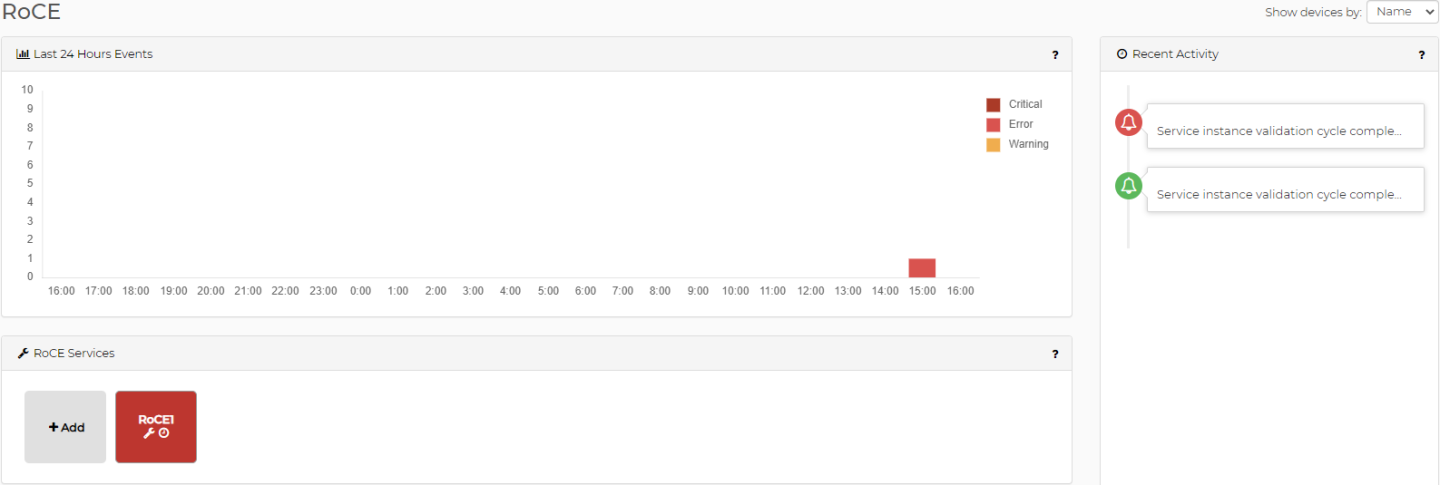
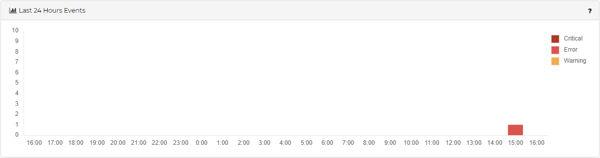
Last 24 Hours RoCE Events
Last 24 Hours Events displays the RoCE related events that occurred over the last 24 hours in a column graph, where each column accumulates events by severity, per hour. Clicking a column on the graph presents a detailed view of the events that compose it.
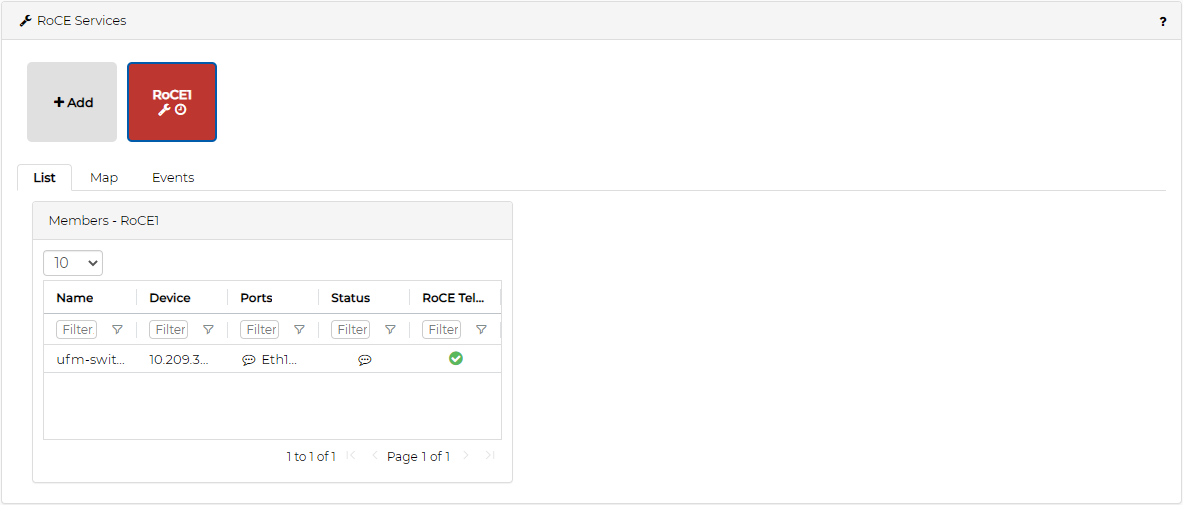
RoCE Services
The RoCE services section displays all the RoCE services and allows adding new ones and managing them.
Clicking the Add button opens the RoCE Service Creation wizard, which allows defining and configuring RoCE on the network devices. For more details, see "RoCE".
Clicking a RoCE service element will open a panel that shows details on this service.
List Tab
This tab displays all the devices managed by the service, their ports and their status. The Status column displays the device configuration and validation status, and the RoCE Telemetry column displays the RoCE traffic state for this device. High bandwidth, utilization, packet discard and other traffic related events are reflected in this column.
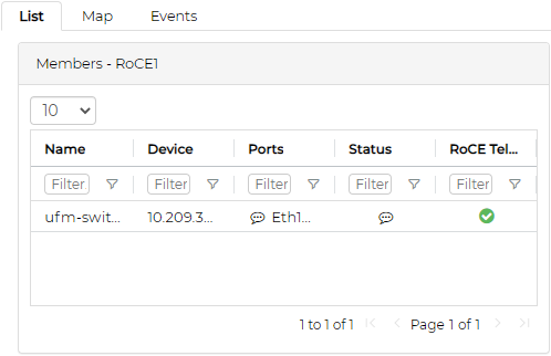
Clicking a device row opens another panel with the device ports’ details.
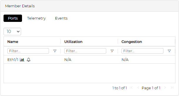
Ports Sub-Tab
This sub-tab shows a list of ports with their utilization and congestion information. The definitions of utilization and congestion vary by the type of RoCE configuration defined by this service:
|
RoCE Configuration |
Utilization Means |
Congestion Means |
|
ECN Only |
Total Port Utilization (%) |
Total Port Packet Drops (%) |
|
ECN + QoS |
RoCE Traffic Class Utilization (%) |
RoCE Traffic Class Packet Drops (%) |
|
ECN + QoS + PFC |
RoCE Traffic Class Utilization (%) |
RoCE Traffic Class Congested Bandwidth (%) |
Clicking the graph icon (

) near the port name opens the Telemetry tab, that displays telemetry data for the selected port.
Clicking the bell icon (

) near the port name opens the Event tab, that displays events for the selected port.
Telemetry Sub-Tab
This sub-tab displays a graph with the last hour values of port counters relevant to the RoCE configuration defined by this device. The displayed counters are controlled by the checkboxes below the graph. The port can be changed by the drop down list above the graph.
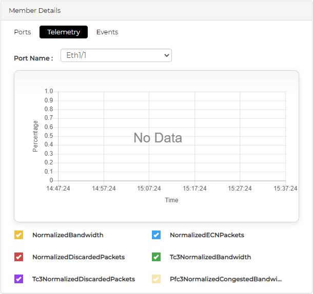
The counters are displayed according to the selected configuration:
Displayed Counters per RoCE Configuration
|
ECN |
ECN + QOS |
ECN +QOS+PFC |
|
Normalized bandwidth Normalized ECN Packets Normalized Discarded Packets |
Normalized bandwidth Normalized ECN Packets Normalized Discarded Packets TC<priority> Normalized Bandwidth TC<priority> Discarded Packets |
Normalized bandwidth Normalized ECN Packets Normalized Discarded Packets TC<priority> Normalized Bandwidth TC<priority> Discarded Packets PFC<priority> Normalized Congested Bandwidth |
The RoCE data is gathered by the Telemetry Agent if it is installed on the switch. Otherwise, NEO uses the switch JSON-API to retrieve the data.
You may change the number of allowed priorities in the SNMP Monitoring controller file, and then create a RoCE service that matches one of the selected priorities (via max_priorities=?).
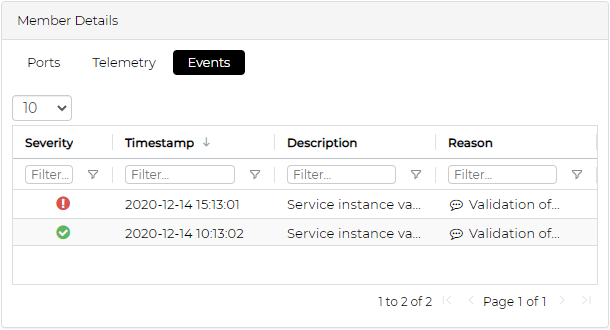
Events Sub-Tab
This sub-tab displays all the RoCE related events for this device. This includes service lifecycle events (service configuration, validation etc.), and RoCE traffic events for ports and priorities on this device.
Map Tab
This tab displays a network map with all the devices managed by this service. The color of the elements is based on their RoCE traffic state.
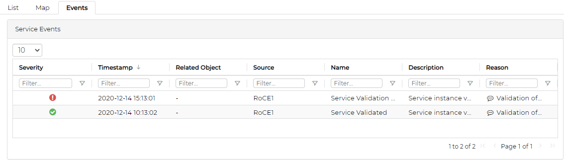
Events Tab
This tab displays all the RoCE related events for this service. This includes service lifecycle events (service configuration, validation etc.), and RoCE traffic events for ports and priorities on devices managed by this service.
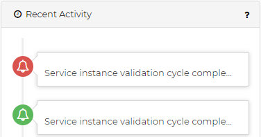
Recent RoCE Activity
The Recent Activity panel provides direct access to the most recent 20 RoCE related events, in a date descending order. Clicking an event shows its details in the events page.
This dashboard provides a graphic display for each device in the system representing its status and the severity of events reported on it.
Devices Heatmap
Devices Heatmap displays all the devices in different colors according to the severity of their health state. Once clicked on a certain device, you will be directed to the Devices tab under Managed Elements where you can access all information about that device.
The colors imply the following health states:
Green – OK
Yellow – error
Red – critical
Empty red circle – lost communication
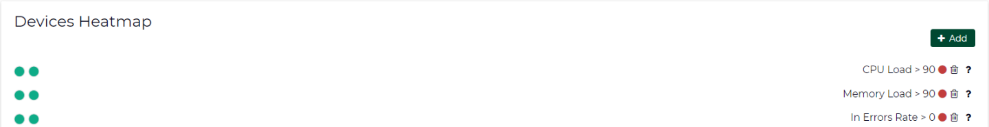
Through the Devices Heatmap panel, you can apply filters by clicking the Add button. The following filter dialog will be displayed.

After customizing a certain filter for the devices, you can choose either the red or the green color to denote the devices that match your filter.
After submitting a new filter, the customized filter will be added to the bottom of the Devices Heatmap panel in the Dashboard (see below). The filters will be stored in the browser’s local storage so on any user login or page reload, the heatmap panel will remain saved with all applied filters.
On the right side of the Devices Heatmap panel, there are:
A brief text that describes the filtered criterion, and a square icon colored with the Matching Color (in this example, CPU Load > 5, green). If you click on the description, you will be able to edit your current customized filter.
A recycle bin icon (

) that enables you to delete the filtered heatmap
A help icon (

) that displays your devices’ criteria according to the defined colors