

Quickstart Guide - Docker Compose
This Quickstart Guide provides a comprehensive step-by-step walkthrough to help you quickly set up and start using the Smart City Blueprint with Docker Compose.
Components Overview
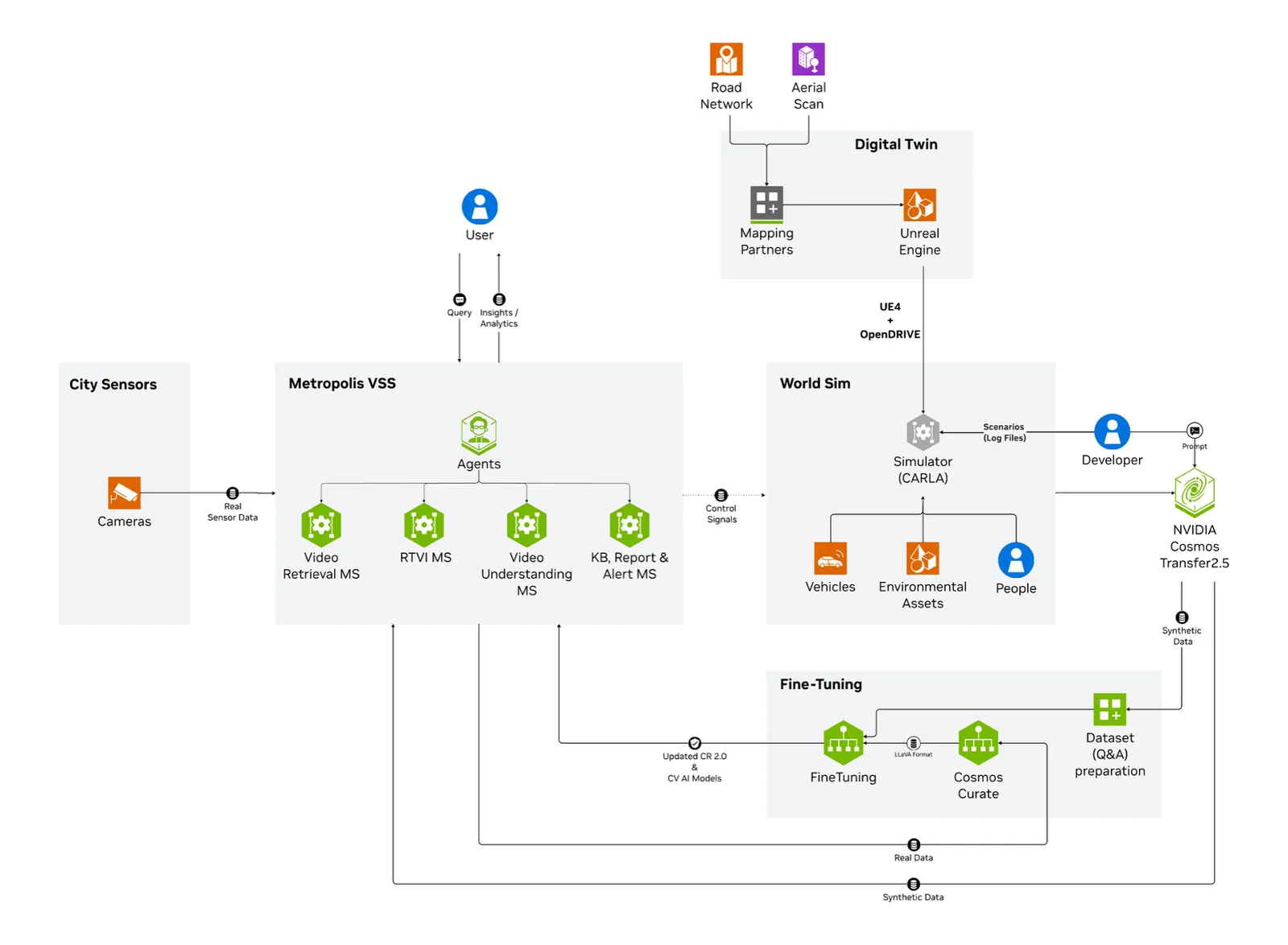
The high-level diagram illustrates the components of the Smart City Blueprint. The system features a layered architecture that comprises:
- Foundational Microservices - Based on vision language models (VLMs) and computer vision (CV) models
- Real-time Video Processing Pipelines - For processing live camera feeds
- AI Agents - For intelligent analysis and interaction
Prerequisites
Before you begin, ensure all of the prerequisites are met. See the Prerequisites page for more details.
Deployment Options
The Smart City Blueprint ships as a single unified deployment: the alerts developer
profile plus the Smart City industry overlay in
deploy/docker/industry-profiles/smartcities. The notebook applies the overlay for you
in its Smart City Customizations step; you do not select a separate “Smart City”
profile name anywhere.
The resulting deployment provides:
-
CV-based object detection and tracking using GDINO or RTDETR models via the Real Time Video Intelligence CV (RTVI CV) Microservice. The overlay sets
MODEL_NAME_2D=RTDETR, whereas the basealertsprofile defaults to GDINO. -
VLM-based verification for enhanced alert accuracy via the Alerts Microservice
-
Agents and Agent UI for natural language interaction with the system via the VSS Agents Microservice
-
Integration options:
- API
- Kibana dashboard
- Kafka event streams
- Web UI with map view
Supported Workload
This section gives the supported stream count for each model deployment configuration on each supported GPU. Use it to scope the workload for optimal operation of the blueprint, taking into account the GPU resources you have available.
- The numbers above are based on the default configurations, using streams at 1080p 10fps
- To use GDINO instead of RTDETR (the default), set
MODEL_NAME_2DtoGDINOand adjustNUM_SENSORSin the.envfile to suit your GPU
Install Smart City Blueprint
The whole deployment runs from one Jupyter notebook on the GPU server. The steps below get that notebook onto the server and open it; the notebook itself performs the prerequisites check, NGC data and model downloads, LLM/VLM configuration, deployment, and verification.
-
Create the workspace directory
Every later step, including the notebook’s teardown, is relative to this directory. Create it explicitly rather than deploying from whatever directory you happened to log in to.
Re-export
VSS_SMC_WORKSPACEandcdinto it at the start of any new SSH session. -
Install Jupyter in a Python virtual environment
-
Download the deployment notebook
Download
deploy_smartcities_launchable.ipynbfrom the repository reference selected for this documentation build, so the notebook and the deployment code it clones are the same release, and place it in${VSS_SMC_WORKSPACE}on the server. -
Launch Jupyter
Jupyter prints a URL of the form
http://127.0.0.1:8888/lab?token=<TOKEN>. Leave this session running. -
Access the interface
Open
http://127.0.0.1:8888/labin a browser and paste the token from step 4 when prompted. If you no longer have the token, run this on the server:The output includes a URL of the form
http://127.0.0.1:8888/?token=<TOKEN>. Copy the token value into the browser authentication field and select Log in. -
Open and run the notebook
The notebook is already in the working directory Jupyter was started from, so it appears in the file browser; double-click it to open. Set
NGC_CLI_API_KEYandGOOGLE_MAPS_API_KEYin Section 1, then execute the cells in order. The notebook covers the prerequisites check, Docker storage relocation and version pinning, deployment code checkout, Smart City overlay, NGC data and model downloads, deployment, verification, and teardown.
The sample data provides four SDG clips, one of which contains a collision, each one minute long. NVStreamer loops clips when they finish, so once the pipeline is warm you should see collision alerts recur at roughly one-minute intervals.
Verify Deployment
- Verify that the containers are in the running state:
-
Confirm that the streams were properly added to VST. Navigate to the VST UI (see the endpoints below) and check the Dashboard to confirm that your streams are in a healthy state. If you do not see them there, check NVStreamer or your source to confirm that they are active.
-
Check the RTVI CV frame rate to confirm that the RTVI CV microservice is running properly. View the
vss-rtvi-cvlogs with the following command and look for the FPS lines. Ensure the service is running at the expected rate (10fps with the sample streams). If the rate is lower than expected, confirm that your GPU is not oversaturated.
-
Check Kibana for traffic statistics and alerts. Go to the Kibana endpoint listed below and navigate to the dashboard.
-
Open the VSS UI (see the endpoints below) and test a few prompts once the system has been up for several minutes and alerts are present.
Endpoints
Once deployed, all browser-facing traffic is consolidated behind the HAProxy ingress on
port 7777. Prefer these ingress paths; they are the addresses the UI itself uses, and
they keep everything reachable through a single port.
These services publish their own host ports and are not behind the ingress:
The host ports are set in deploy/docker/developer-profiles/dev-profile-alerts/overrides.env
and, for the map UI and calibration toolkit, in
deploy/docker/industry-profiles/smartcities/overrides.env. Change them there if they
collide with something else on your host.
Grafana and the VST-MCP service are not in this profile’s Compose profile list and are not deployed; earlier revisions of this page listed endpoints for them.
Explore the Blueprint
Now that you have an up and running system, let’s explore the different features the Smart City Blueprint offers.
We will delve into the four salient features of the blueprint, namely: chat interface, alerts with VLM verification, metrics dashboard, and map visualization - using corresponding tabs on the top-left of the Blueprints Agent UI.
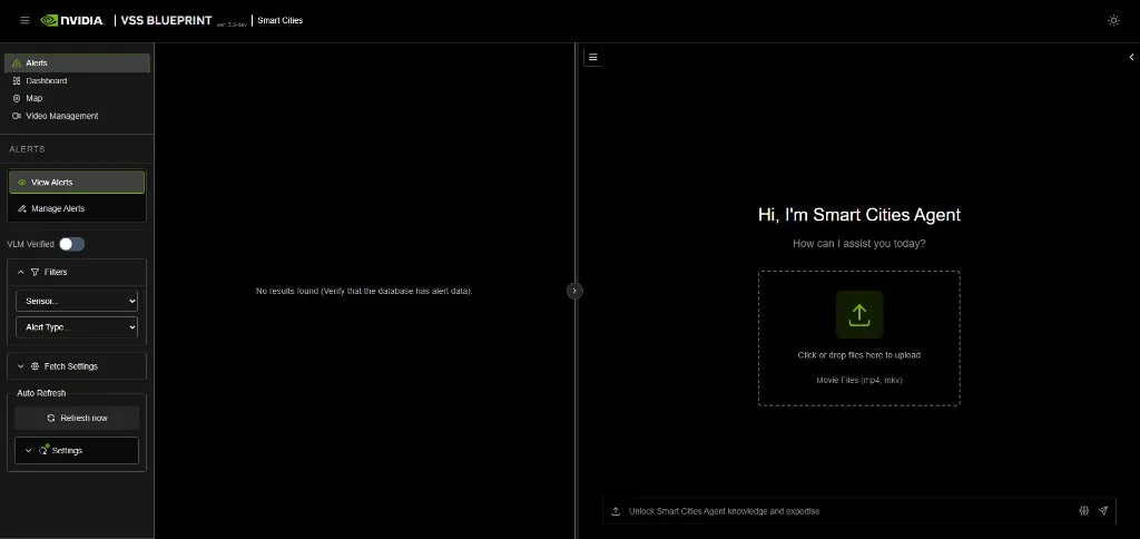
Chat
The chat allows you to interact with the system in natural language. The system is optimized to understand the different sensors and situations such as alerts.
Address sensors by their sensor ID. The agent resolves sensors by ID, so a query that names a camera any other way is likely to come back empty.
In the chat reference section below, we provide some typical prompts users can use to interact with the system. The reference below is organized from basic to advanced.
Quick Start Chat Reference
1. Sensor Discovery & Live Monitoring
- Check Availability: “What sensors are available?”
- Live View: “Can you take a snapshot of sensor [Sensor ID]?”
2. Searching for Incidents
You can filter incidents by count, specific time ranges, or location.
- By Recent Activity: “List the last 5 incidents for [Sensor ID].”
- By Time Window: “List all incidents from [Start Time] to [End Time] for sensor [Sensor ID].”
- By Duration: “Retrieve all incidents for [Sensor ID] in the last 24 hours.”
- By Location: “Retrieve all incidents for [Place Name].”
3. Reporting
Generate detailed summaries for specific events found in your search results.
- Specific Incident: “Generate a report for incident [Incident ID].”
- Most Recent: “Generate a report for the last incident at [Location/Sensor].”
4. Interactive Commands (Context Aware)
The system remembers your previous questions, allowing you to ask follow-ups without repeating details.
-
Drill-down:
- User: “List the last 5 incidents for [Sensor ID].”
- User: “Generate a report for the second one.”
-
Pagination:
- User: “List all incidents in the past 24h.”
- User: “Show the next 20 incidents.”
-
Clarification:
- User: “Are there any incidents?”
- System: “For which sensor?”
- User: “[Sensor ID]“
Alerts
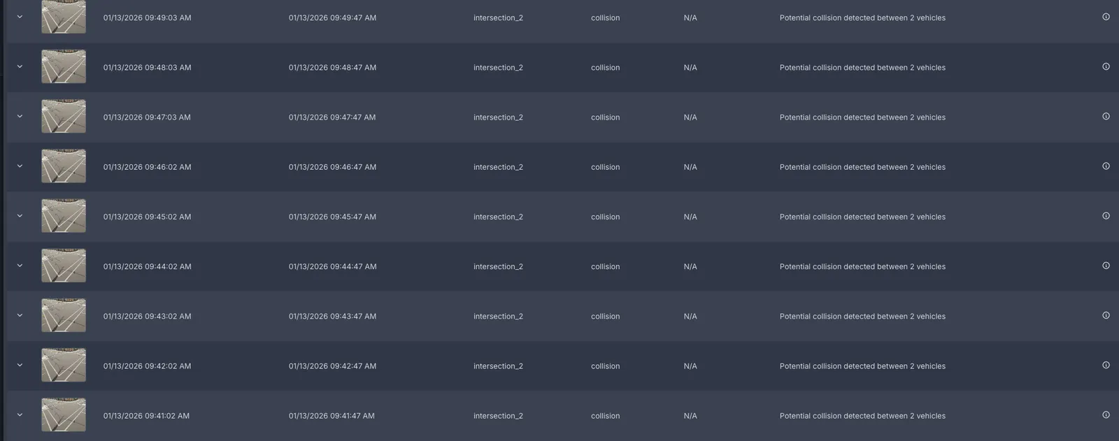
The Alerts tab is a centralized view of all alerts generated from RTVI CV metadata. The alerts can be reviewed by using the different filters available in the system. Below is a table summarizing these filters:
Dashboard
Explore the data in Kibana
You can explore traffic data in Kibana at http://<HOST_IP>:7777/kibana/. An init container imports a custom dashboard for the Smart City app and creates all the required indexes. Access the dashboard by going to Menu > Dashboard and clicking on the ITS dashboard. To see the results corresponding to a particular sensor, click on the filter button, select the sensor keyword and enter the sensor name.
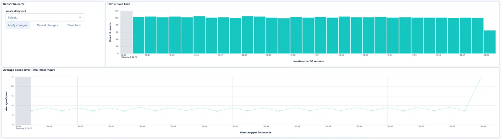
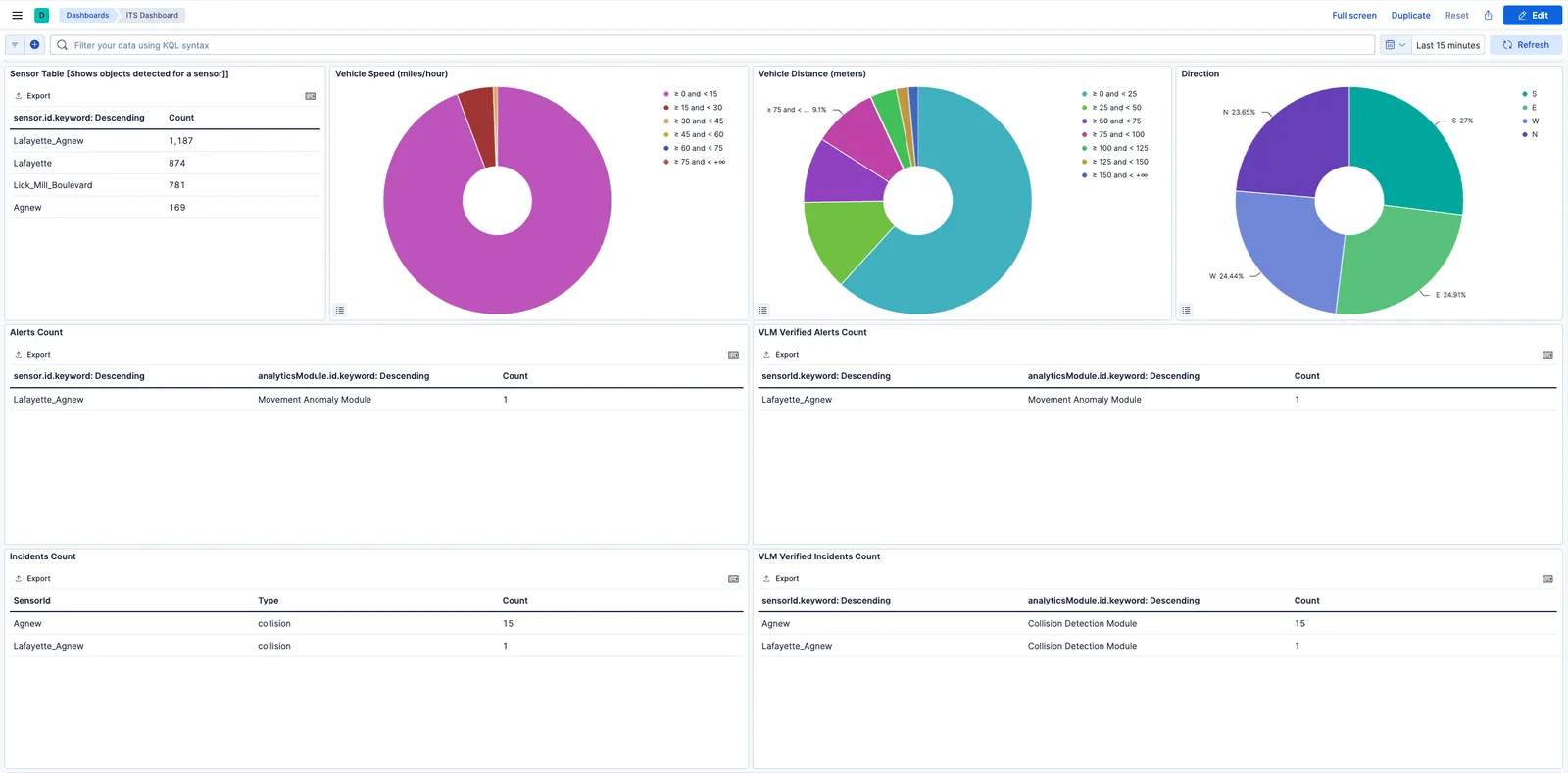
Dashboard Charts
The dashboard provides several visualizations to analyze traffic patterns:
- Sensor Table: Displays the count of objects detected per sensor, helping identify high-traffic intersections.
- Vehicle Speed: A donut chart showing the distribution of vehicle speeds in miles per hour, grouped into ranges (0-15, 15-30, 30-45, etc.).
- Vehicle Distance: Shows the distribution of distances traveled by detected vehicles in meters.
- Direction: Visualizes the directional distribution of vehicle movement (North, South, East, West).
Alerts and VLM Verified Alerts
The bottom section of the dashboard displays alert information:
- Alerts Count: Shows all alerts generated by the CV pipeline, categorized by sensor and analytics module (Stop Anomaly Module, Movement Anomaly Module).
- VLM Verified Alerts Count: Displays alerts that have been verified by the Vision Language Model (VLM). This helps distinguish true positives from false alarms by leveraging VLM reasoning capabilities.
- Incidents Count: Shows all incidents generated by the CV pipeline, categorized by sensor and type.
- VLM Verified Incidents Count: Shows incidents that have passed VLM verification, providing higher confidence results.
The Kibana dashboard is a powerful tool to visualize data. You can interact with any of the visualization panels to filter the data according to a selection. For example, clicking on the ‘west’ direction on the direction panel will filter the data across the dashboard to only show results for vehicles travelling westward. You can read more about dashboards in the official Kibana dashboard documentation.
Map
City Level View
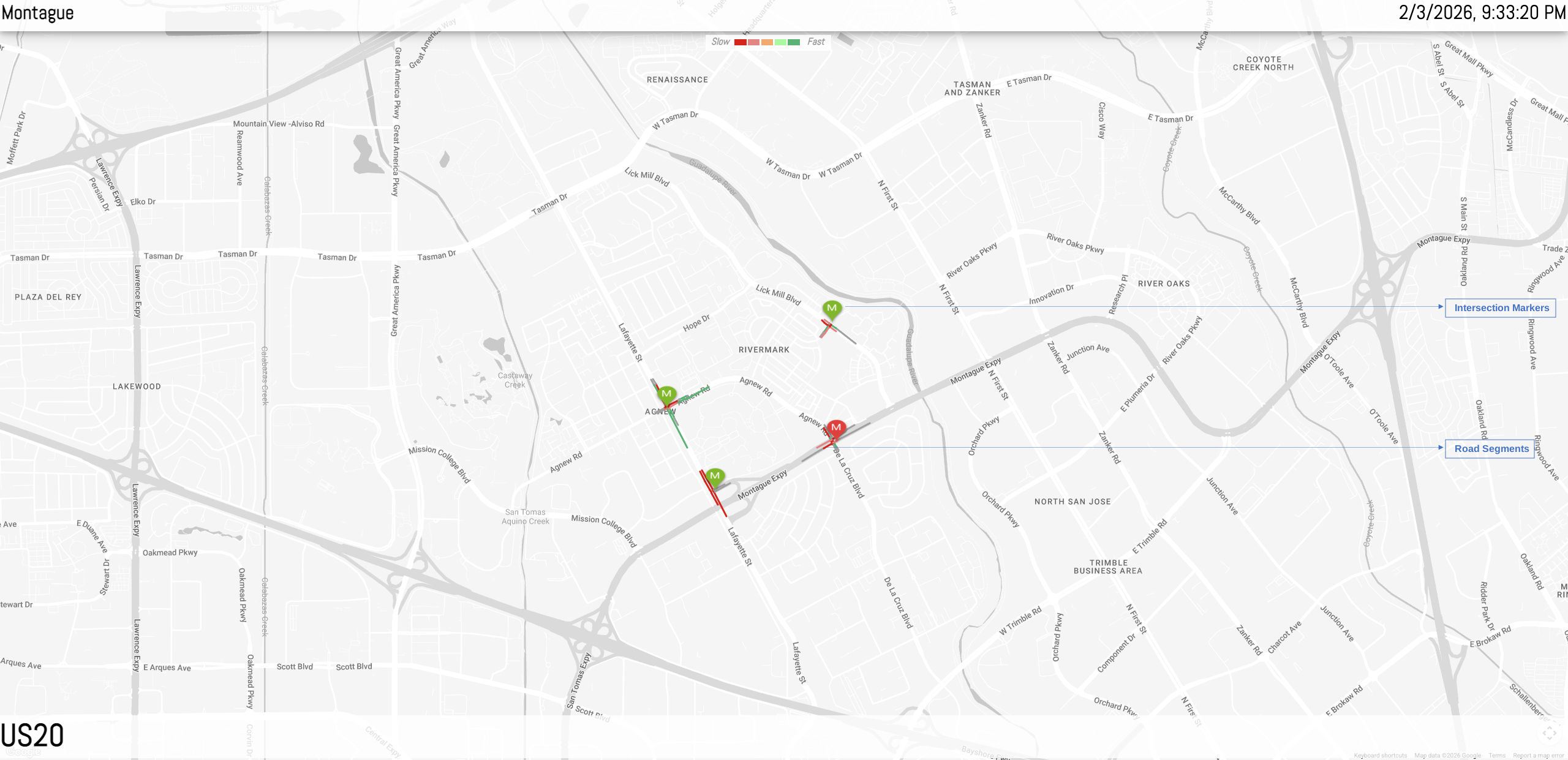
The city level view is default upon loading the web client. This section discusses in detail the specific UI features available at this view level along with intersections.
City context header bar

The city context header bar contains City Name on the left and the current UTC in GMT time for the city on the right.
Intersection markers
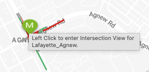
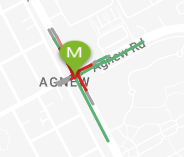
Intersection Markers can be of three colors - green, blue and red. The green color signifies active intersection, which means at least one of the cameras at the intersection is giving out data to the MDX System. The blue color signifies that the intersection belongs to the current selected corridor, (corridor selection is discussed in one of the subsections below). The red color signifies there was a recent severe alert at the intersection. To dismiss the red color that acts as an alert, the user can go inside the intersection level view of the intersection. When the user comes back to the city view, the red colored icon now shows as green or blue.
City Level Road Network
The road network is constructed of smaller road segments. Each road segment can be interacted with individually by the user.
In the image above, two of the upper horizontal road segments can be seen colored orange and green. The significance of the colors is explained in the Speed Legend sub-section. In brief, these colors depict the range of the average vehicle speed around that area on road in the real world.
The grey segments are the inactive segments: those that have not been marked active since the current instance of the web client launched. A segment is marked active once the UI has received either a positive vehicle count or an average vehicle speed for it. Hovering over an inactive segment shows a tooltip stating that the segment is inactive.
Active road segments can be interacted with further to spawn speed display boxes, which are explained in one of the following sub-sections.
Speed legend
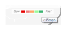
The speed legend UI component is a static component. The left most color depicts busy traffic at a road segment and the right most color depicts free flowing traffic. The colored boxes can be hovered upon to see the range of integral speed they depict.
Intersection Level Live View
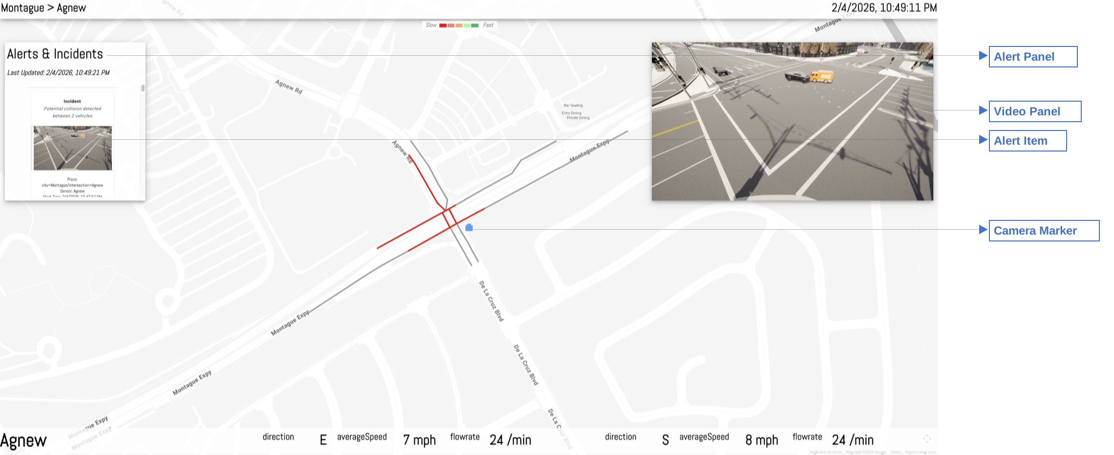
The user reaches the intersection level view for an intersection upon left-clicking an intersection icon in the city view. This section discusses, in detail, the specific UI features available at this view level.
Going back to city view

The city context header bar shows the same in the intersection view with one difference. The city name on the left of the bar now can be clicked to go back to the city view from the intersection view.
Alerts Panel
The alerts panel in the live mode, shows a list of recent alerts captured by any of the cameras at the intersection. These alerts are single clickable items. Clicking on any alert leads to the alert view mode for that alert.
The ‘Last Updated Time’ in GMT/UTC shows that time of the last event updated by the MDX detection module for any of the cameras at the intersection.
Alert View mode
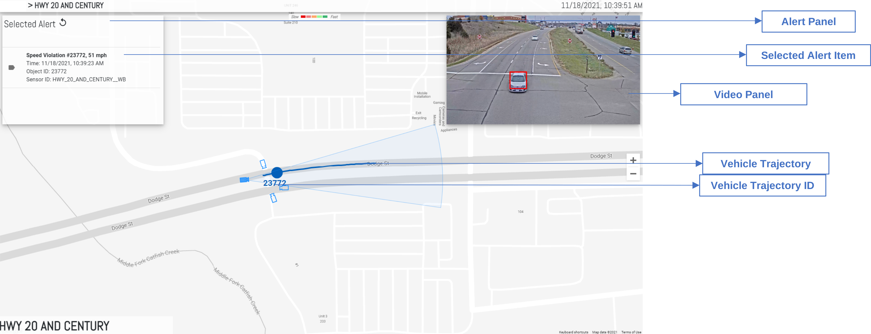
The alert view mode at the intersection level is to present a contextual graphics for a selected alert. During this mode, some of the live view mode functionalities get replaced - Alerts list, live video feed, real-time dynamic road links, KPIs.
The alerts panel in this mode shows the selected alert only along with the back button to go back to the live mode.
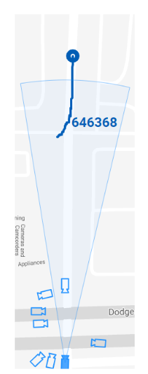
Instead of real-time dynamically changing overlaid road segments on the map, in this mode, anomaly vehicle trajectory is shown in an animated fashion. The circle icon on the trajectory line is animated over the trajectory, giving a sense of direction of movement of the vehicle. This animation helps in cases where the traveled direction by the vehicle is a lot different from the expected. The vehicle ID is the one generated by the Video Analytics layer. Change in color to grey of the animation circle icon, denotes end of the animation.
The video played in this case is the segment of the detected traffic anomaly for the alert which has been retrieved from the VMS using the MMS APIs. The anomaly video playback auto starts by default upon entering the alert view for an anomaly. The trajectory animation along with the video can help recognize the vehicle in the video more conveniently.
The KPI panel in this mode is not shown since live KPIs are incongruent with an alert recorded in past time.
‘Last Updated Time’ is also not shown in this mode.
Intersection KPIs

The KPI panel shows the same as the city level, with the difference that the KPI metrics may be different as these sets are pertaining to an intersection and not a corridor. The other difference is that the KPI panel is prepended with the current intersection name instead of a corridor name.
Cameras
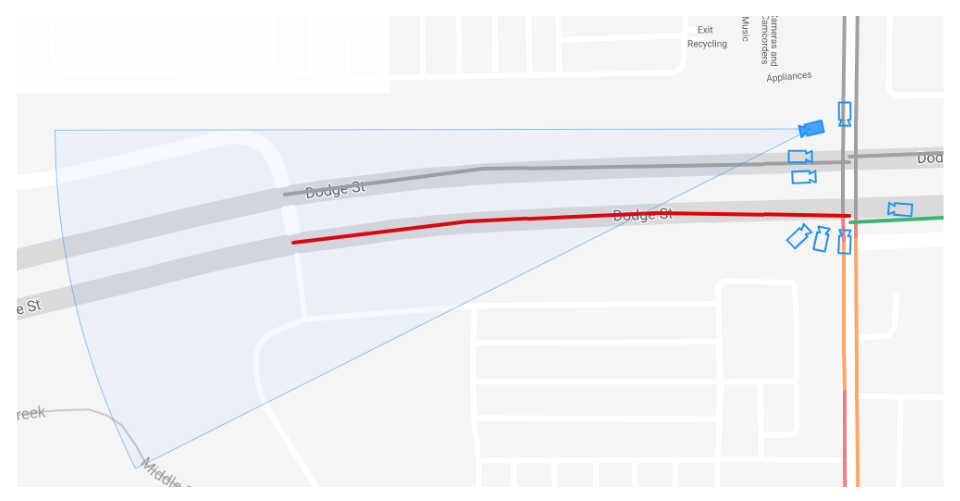
The cameras installed at an intersection in the real world are drawn as camera icons on the 2D map surface along with their real world orientation and the field of view. The radius in pixels of the field of view arc drawn is approximated to the real world distance.
A selected camera in the view is a color-filled icon, while the others are outlined only. At any moment, there can be only one selected camera.
In the live view, the video feed from the selected camera, is streamed.
Roads Network at Intersection level
The only difference between the road network shown at the intersection level and the city level is - only roads pertaining to the intersection are drawn on the map rather than a wider city. So if the map is panned away from the center of the intersection, then no other road components would be visible that were at the city level.
The colors showing the traffic density show up in the same way as the city level. The speed display boxes are also spawned and interacted in the same way as before.
Clustering Behavior
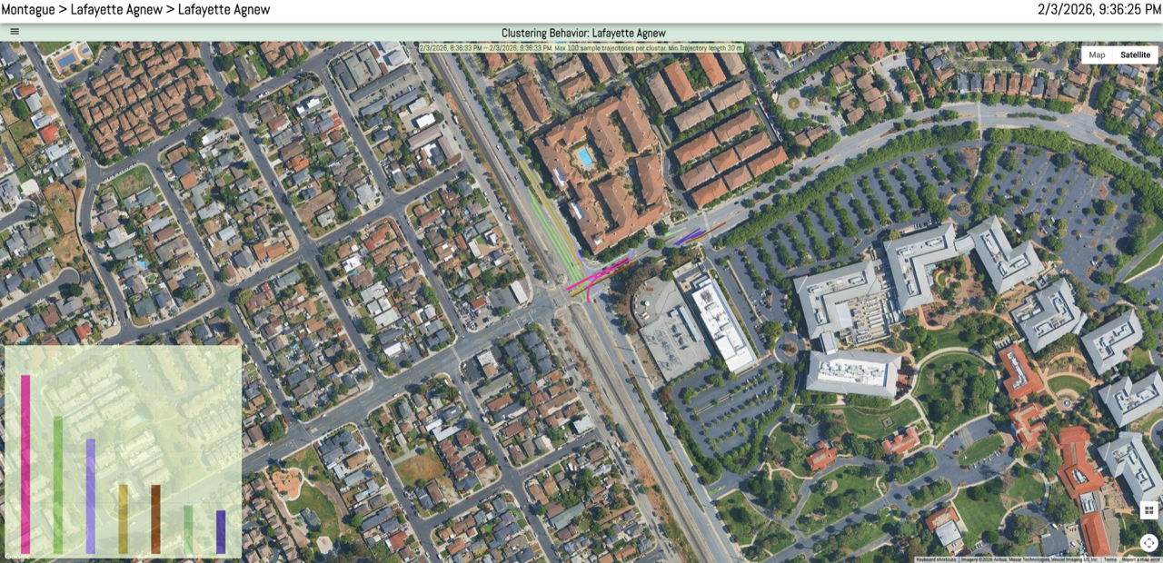
To see the clustering widget right click on a sensor in the intersection live mode. The clustering behavior is shown for a single camera. The widget has following items:
- Title bar: Shows the selected camera name
- Left top widget menu
- Left bottom Bar Chart view of Clusters
- Geo Map view of Clusters