

Classification
Binary Classification
Binary classification tasks are problems with target values that fall into two categories: one positive class, one negative class. For example, in a churn prediction problem, you want to predict whether a customer leaves your service in the near future, so you can define the labels as:
- Positive Class: the customer discontinues your service.
- Negative Class: the customer continues your service.
Whenever you write a predictive query with a target that contains a conditional operation such as =, >, or <, Kumo defines the task as a binary classification task.
The prediction output for a binary classification task is the probability that the target value belongs to the positive class. A classification threshold determines how high the predicted probability must be to be considered a positive class prediction. Kumo uses accuracy, AUROC, and AUPRC as the evaluation metrics for this task, and provides a confusion matrix and a cumulative gain chart to help understand the results.
Accuracy
Accuracy is the percentage of correct predictions: the total number of correct predictions divided by the number of samples.
AUROC
AUROC stands for area under the receiver operating characteristic curve: a curve that plots sensitivity against specificity under different classification thresholds.
Sensitivity is calculated by:
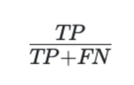
where TP (true positives) counts customers who stop purchasing and the model correctly predicts this. FN (false negatives) counts customers who stop purchasing but the model predicts they will continue.
Specificity is calculated by:
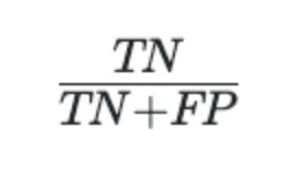
where TN (true negatives) counts customers who continue purchasing and the model correctly predicts this, and FP (false positives) counts customers who continue purchasing but the model predicts they will leave.
A perfect predictor yields an AUROC score of 1; a completely random predictor yields 0.5.
An AUROC of 0.8 is typically considered very good, though what qualifies as good enough depends on your specific business problem.
AUPRC
AUPRC stands for area under the precision-recall curve: a curve that plots precision against recall under different classification thresholds.
Precision is calculated by:
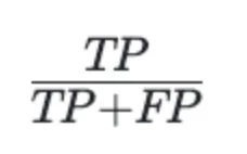
where FP (false positives) counts customers who continue purchasing with us but the model predicts they will stop.
Recall is calculated by:
A perfect predictor yields an AUPRC score of 1.
The baseline score varies by problem; specifically, it depends on how imbalanced the data is.
For example, if your problem has 10% positive class and 90% negative class, a predictor that always predicts positive would achieve an AUPRC of 0.1.
AUPRC is typically a better metric when you have imbalanced data (for example, when predicting a very rare class), since it is more sensitive to changes in performance on that rare class. By contrast, with a metric such as accuracy, you could achieve very high accuracy simply by predicting that the rare positive class never occurs.
Changing the classification threshold affects accuracy, specificity, sensitivity, precision, and recall scores. A single AUROC or AUPRC score captures overall performance across all thresholds.
Confusion Matrix
Kumo provides a confusion matrix showing the number of true positives (TP), true negatives (TN), false positives (FP), and false negatives (FN). Read the confusion matrix as follows:
A good model generally has significantly higher values in the TN and TP cells than in the FN and FP cells. Always interpret these values in the context of your specific business problem.
Cumulative Gain Chart
The cumulative gain chart shows the percentage of “gain” you can achieve in a certain class by taking a particular action. For example, suppose that the graph below is the result of a churn prediction query:
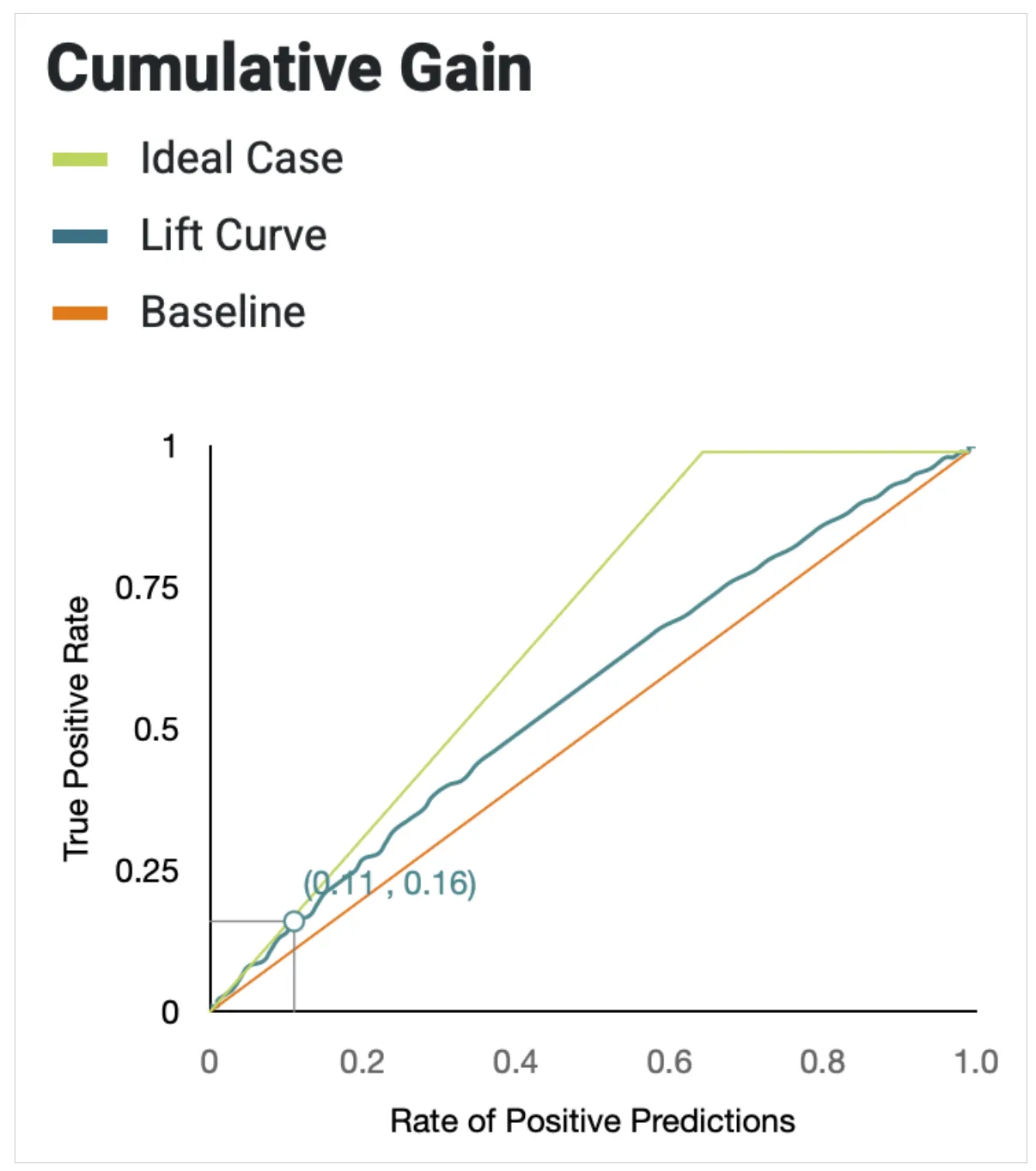
The (0.11, 0.16) datapoint means: if you reach out to 11% (the action) of all customers, you find 16% (the “gain”) of all customers who leave in the near future. The better your model, the fewer customers you need to contact to capture a disproportionately larger share of customers likely to churn.
A gain chart plots the TP rate against the rate of positive predictions. The TP rate is given by:
and the rate of positive predictions is given by:
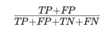
The straight orange line represents the baseline: the result of a random model.
The green curve represents the ideal model: one that is always correct when predicting the positive class. The blue curve shows your model’s actual performance. A better model has a larger area between the blue and orange curves; the two numbers shown on the graph quantify this difference.
Multiclass Classification
Kumo uses the accuracy score as the metric for multiclass classification problems. Accuracy is the percentage of correct class predictions: the total number of correct class predictions divided by the number of samples.
Multilabel Classification
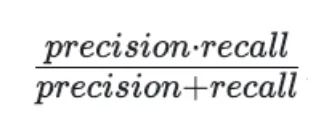
For multilabel classification, Kumo calculates the same precision and recall scores for each class as in the binary classification case. You can also view the F1 score, which takes both precision and recall into consideration, calculated by:
Kumo also provides the Hamming score as a measure of accuracy across multiple classes. The Hamming score is calculated by:
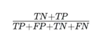
which translates to the percentage of correct predictions divided by the total number of predictions.