

Regression
For numerical predictions, Kumo provides metrics that measure the distance between predicted values and actual values (called labels).
Mean Absolute Error (MAE)
MAE is calculated by:
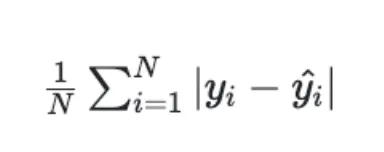
where _yi _is the _ith _label and ŷi is the _ith _predicted value.
Mean Squared Error (MSE)
MSE is calculated by:
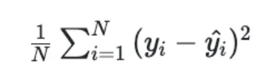
MSE focuses more on “how wrong” the prediction is. A prediction that is very far from the label contributes more to increasing the MSE than the MAE.
Root Mean Squared Error (RMSE)
RMSE is calculated by:
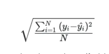
RMSE is in the same scale as the target and can be used even if a label is 0 or near 0.
Mean Absolute Percentage Error (MAPE)
MAPE is calculated by:
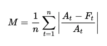
where M is the mean absolute percentage error, At is the actual value, and Ft is the forecast value.
MAPE is a common regression metric that provides an intuitive measure of accuracy.
Symmetric Mean Absolute Percentage Error (SMAPE)
SMAPE is calculated by:
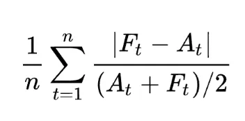
SMAPE normalizes for the scale of the labels and also for the scale of the predictions. Similar to RMSE, SMAPE is especially useful when a label is 0 or near 0.
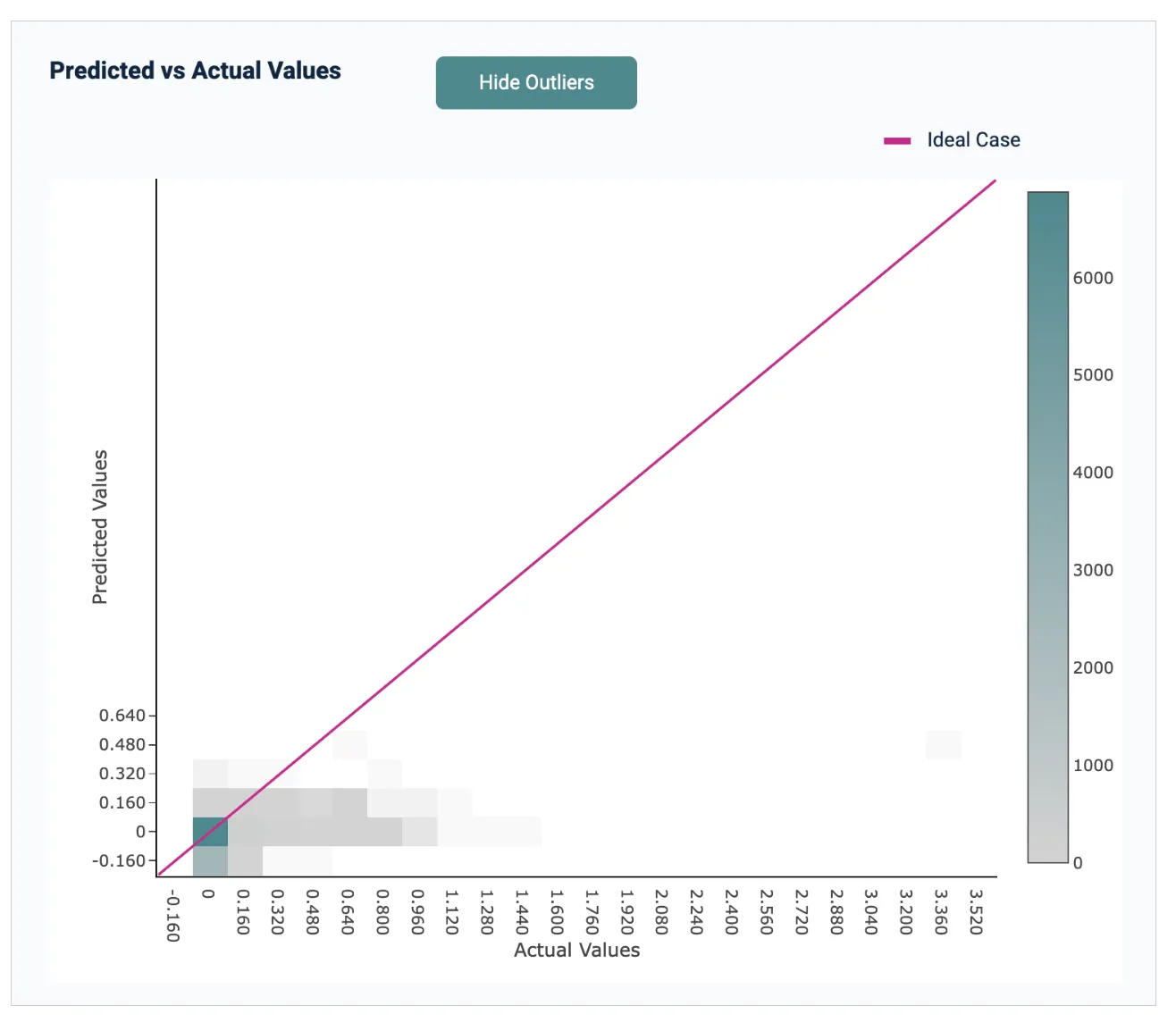
Heatmap of Predicted vs. Actual Values
Kumo provides a heatmap of predicted values versus actual target labels for all entities in the predictive query, covering the holdout and evaluation sets of the training table. Use this to spot-check the quality of your trained predictive query. Kumo generates predictions by applying the trained predictive query to every row in the training table; actuals are the target labels from that same table.
Distribution of Predictions Histogram
Kumo also provides a histogram of predicted values alongside actual target labels for all entities in the predictive query, in the holdout and evaluation sets of the training table. As with the heatmap, use this to spot-check the quality of your trained predictive query.
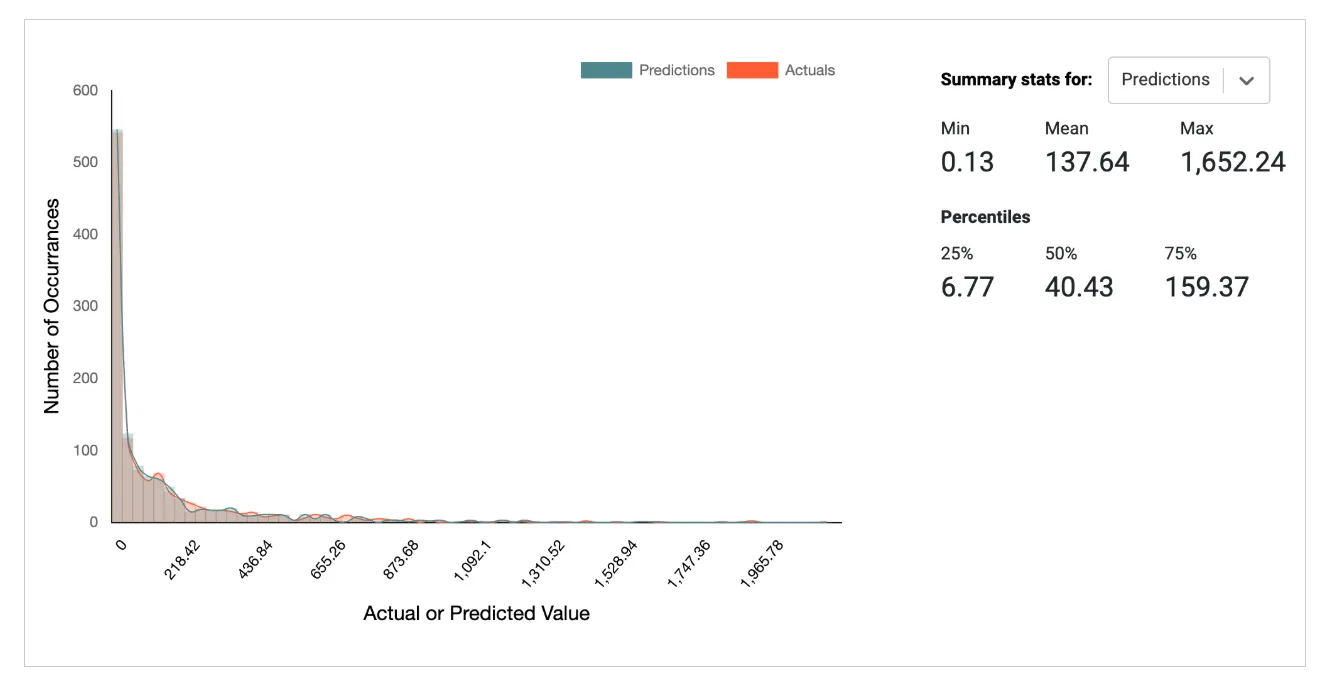
Ideally, the shape of the two distributions should match; however, some divergence should be expected in normal cases, even for well-written predictive queries.